This website contains affiliate links, and some products are gifted by the brand to test. As an Amazon Associate, I earn from qualified purchases. Some of the content on this website was researched and created with the assistance of AI technology.
Key Takeaways:
- Pastel roses beautifully complement rustic wood tones and gingham patterns
- Vibrant warm tones like oranges, corals and fuchsias evoke summer picnic vibes
- Blush, ivory and peachy roses pair perfectly with neutral farmhouse decor
- For lavender-themed tablescapes, choose roses in shades of purple and plum
- Earthy brick red, dusty terracotta and antique rose hues complement outdoor wood tables
- Amp up vintage linens and floral chintzes with bold rose colors like cerise and burgundy
- Soften lively picnic palettes by combining roses in toned-down blush and cream hues
There’s an undeniable romance intrinsic to lingering over crisp watermelon wedges and flaky buttermilk biscuits amidst a riotous profusion of lush rose blooms wafting the sweetest garden perfumes.
Yet rose varietal choices simply cannot be arbitrary when crafting evocative rustic tablescapes evoking nostalgic picnic ambiances. Each petal pigment must be thoughtfully considered to achieve flawless color harmonies that enhance rather than detract from surrounding bucolic scenery and decorative accents. From earthy terra cotta clay pots to wooden benches ornamented with antique seed packet designs, every alfresco event detail demands tonal rose companions perfectly attuned to the refined yet pastoral spirit.
Use this vibrant picnic floral planner to expertly match rose tones with your country décor. Designed for dreamers, brunchers, and stylists alike.
| 🌹 Rose Shade | 🍽️ Picnic Styling Matches | 🎨 Ideal Pairing Colors | ✨ Decorative Tips & Extras |
|---|---|---|---|
| Blush Pink Soft and romantic; a go-to for dreamy settings. |
Linen napkins, rattan chargers, lace-trimmed throws, antique silver forks. | Ivory, pale coral, baby blue, soft moss green. | Place in vintage teacups or milk glass jars; add feathergrass sprigs and velvet ribbon. |
| Lavender Charming and aromatic, perfect with herbs. |
Rustic enamel trays, herb bundles, lavender lemonade pitchers. | Butter yellow, soft plum, muted olive, antique white. | Use burlap-wrapped jars with sprigs of dried lavender, eucalyptus, and twine bows. |
| Peach Sunny and fresh; invites happiness. |
Wooden cutting boards, jam jars, lemonade stands, gingham napkins. | Dusty rose, honey cream, mint, pale copper. | Combine with citrus slices in clear vases; scatter pressed petals around the setting. |
| Creamy White Classic and clean for a French-inspired picnic. |
Galvanized buckets, linen runners, ivory platters, vanilla candles. | Navy, sage, dusty beige, charcoal gray. | Add dried lavender, rosemary stems, and aged wood trays; wrap stems in soft cotton ribbons. |
| Bright Coral Vivid, flirty, and youthful for summer pops. |
Striped tablecloths, citrus-toned cups, picnic tins, tropical napkins. | Sunset orange, teal, blush, seafoam. | Pair with pebbled glass vases or enamel mugs; contrast with wooden serving boards and wildflowers. |
| Dusty Mauve Vintage and nostalgic; pairs with old lace and wood. |
Tattered book stacks, crocheted runners, pressed flower tags. | Antique gold, lilac gray, ivory, rustic wood tones. | Tuck into old jars with twine bows, dry baby’s breath, and weathered tea tins. |
So prepare your shears for some botanical snipping as I reveal the most enrapturing rose hues for farmhouse picnics – no Instagrammable spread would be complete without these floral gems!
Don’t forget to check out my post on How to Use Lavender and Roses in Centerpieces for Brunches and share the inspiration with friends.
How to Choose Pastel Roses That Complement Wooden Picnic Décor
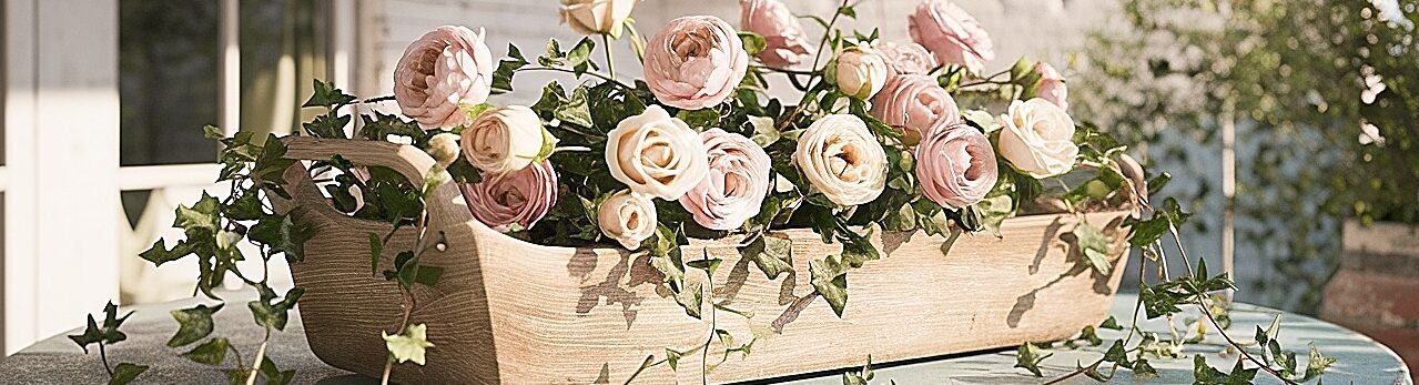
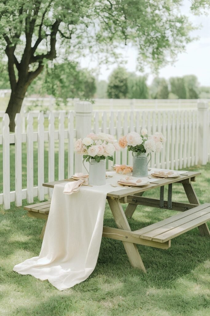
When styling floral decorations to complement natural rustic wood tones like raw oak, weathered cedar or untreated teak furnishings, I find pastel rose hues provide the most effortlessly cohesive color narrative. Those hushed yet romantic muted shades ranging from parchment and blush to fragile tea rose pinks and wispy lavender grays simply exude an old-world elegance sublime for picnicking.
For example, a watering can filled with soft pink Sir Walter and beige Mother’s Love roses achieves dreamy visual symbiosis with shabby chic farmhouse tables and benches. While petite peach-tinted Yves Piaget and pale lemon St. Parfait miniature rose clusters become charming table runners atop knotty pine buffets draped in ecru linen. Even the airiest lilac heirloom rose like Claude Thillier casts an alluring juxtaposition against rustic wooden crates used as side tables for serveware stations.
By choosing pastel roses that echo rather than overpower wooden picnic décor, you foster an organic ambiance where botanical and architectural elements harmoniously coexist. Even centuries-old patinated farmhouse beams feel refreshed when accented by demure rose petals in chalky whispers.
How to Mix Vibrant Summer Rose Colors Without Clashing
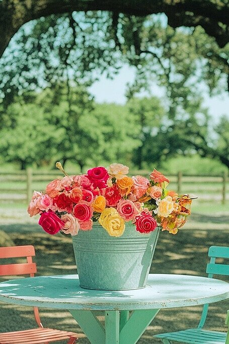
Of course, delicate pastels aren’t the only rose colors worth considering for picnics! When orchestrating daytime warm weather events under dazzling sunlight, my floral designs take on a decidedly zestier persona with eye-popping vivid rose compositions in tropical-inspired pigments. To evoke a breezy beachside atmosphere no matter your venue, revel in gloriously rich raspberry, punchy orange sorbets, blazing corals and neon magenta blooms that immediately elevate moods.
Yet even when courting visual drama through riotous rose color combinations, a masterful touch and slight restraint prove paramount to avoiding garish clashing. Rather than haphazardly cramming a bevy of neon shades together, I like to anchor vibrant statements with a tonal base varietal in a deeper ruby, burgundy or crimson red first. Those saturated yet slightly muted tones provide chromatic scaffolding to build upon with zingier hue punctuations.
For example, at the heart of a sunburst-inspired centerpiece may reside a compact of deep maroon Sahara roses surrounded by fanning sprays of tangerine Sombrero and fuchsia Freedom roses accented by golden mustard billy balls. Or a sleek rectangular iron container showcasing pops of fiery Kiss Me Kate blossoms alongside tropical Birds of Paradise blooms swirling around a core of moody Tudor splendor. Just be sure to incorporate greenery like blushing Kangaroo paw leaves to let those kaleidoscopic pigments have room to breathe.
With this type of strategically composed floral choreography, you avoid any visual cacophony while conjuring picnic tablescapes absolutely radiating summertime joie de vivre. Want to capture an even softer summertime rose aesthetic? Keep reading!
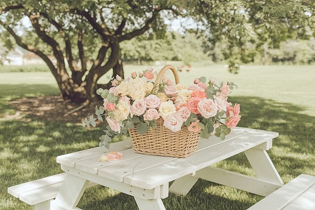
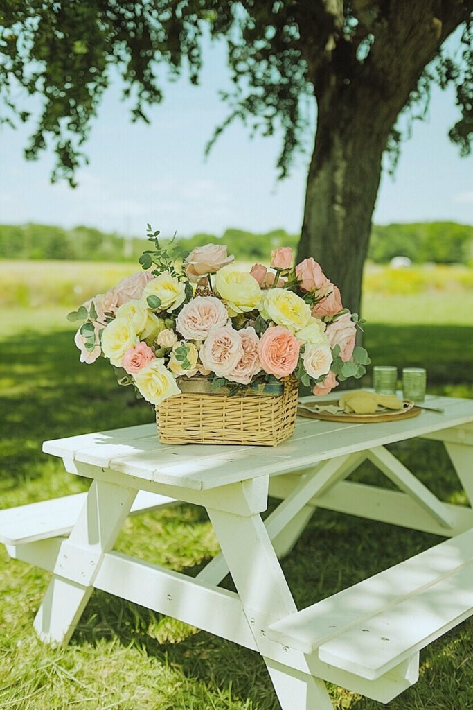
Ways to Pair White and Blush Roses with Neutral Farmhouse Tones
- Cluster petite pale pink rose buds within matte ceramic bowls resting on weathered wood dining tables for charming simplicity.
- Tuck shaggy fresh white garden rose blooms between terra cotta pots filled with burlap and heirloom silver flatware for rustic texture play.
- Line whitewashed wood porch railings with petite trios of ivory Princess Louisa and apricot Belle rose blooms in single stem milk bottle vases.
When orchestrating farmhouse picnics revolving around crisp modern neutral territory like alabaster tablecloths, driftwood folding chairs and smokey taupe glass vases, maintaining a sense of understated elegance proves key for compelling yet cohesive botanicals. That’s where rose colors like pure snow whites, fresh parchment ivories and shimmering pale peach blushes truly shine, reflecting those muted buttermilk tones in soft romantic petal form.
But don’t think these hushed rose selections remain boring just because they take a backseat in the color volume department! The key lies in allowing their sublime subtly textural qualities to radiantly unfurl through unique vase choreography, clever juxtapositions and inspired styling twists that command attention in the most effortlessly sophisticated way.
Now let’s explore ideal rose pigments for lavender-centric farmhouse picnic tablescapes!
What Are the Best Rose Hues for Lavender-Accented Picnic Tables?
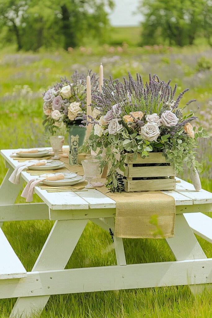
- Frilly lavender-mauve and violet rose varieties like Belle Ocie plant, Love Knot and Wistful provide seamless botanical camaraderie with fragrant lavender accents.
- Saturated reddish-purple shades reminiscent of Medieval wines like Rhapsody in Blue and Burgundy Ice provide an intoxicating burst against lavender mellowness.
- Petite coral pinks like Berkeley Rose or Adobe Sunrise infuse a whimsical burst of tart citrus zest against lavendery grace for an unexpectedly modern twist.
Ah, there’s simply nothing more swoon-worthy than harnessing the ephemeral romance of lavender into picnic tablescapes! But the key to amplifying that timeless botanical allure often lies in your choice of companion rose varietals. Certain rose colors provide far more aesthetic synergy with floral lavender details while others create beautiful counterpoints of tension.
For those seeking ultimate organic lavender-rose seamlessness across picnic tables and floral centerpieces, I always suggest sticking with soft rosy purple, pale periwinkle blue and smoky lavender-mauve tones that mimic lavender’s natural dusky hues. These nuanced shades yield the most botanical tonal harmonies perfect for an afternoon soiree straight out of a Provençal daydream.
But sometimes aiming for lush paradoxical pairings delivers even more decorative intrigue. By juxtaposing lavender’s airiness against richer blackberry or tawny oxblood rose pigments, you cultivate unexpected layers of depth and sophistication across picnicscapes. Or take the road less traveled by introducing tart coral and orange rose shades for whimsical contrast amplifying lavender’s romantic spirit.
Have I given you a lavender-rose picnic color palette you can’t wait to try out? Keep reading – more bucolic floral insights await!
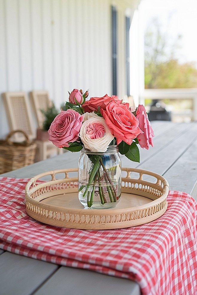
How to Choose Rose Colors That Enhance Gingham Picnic Blankets
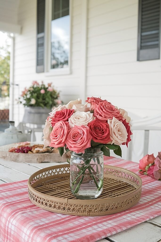
For me, no alfresco dining event epitomizes the quintessential farmhouse picnic aesthetic quite like a gingham blanket spread beneath an open meadow or manicured backyard garden. Those iconic checkered cotton patterns in dainty hues like robin’s egg blue, crimson red or sunshine yellow practically beg for complementary rose shades to fully embody summer’s nostalgic carefree spirit.
While traditional cherry reds, sunset orange and dandelion yellows obviously evoke picnic patriotism when paired with ruby or navy gingham, I prefer exploring alternative pastel takes on those classic Americana hues first. By choosing lighter petal pigments like warm peachy coral or pale butter yellow roses, you let those upbeat gingham patterns provide eye-catching tonal pop against a softer floral backdrop.
Likewise, pale dusty denim and baby blue rose varieties like Allblue and Oceania infuse an unexpected pastel spin on patriotic standards when matched with gingham patterns, providing opportunities to modernize traditional checkered motifs with unique botanical accents. Or you could go the total chameleon route by mounding masses of fresh moss green or dusky lavender roses to completely camouflage into the blanket tones – all that trailing verdant greenery makes the perfect secret garden nook!
So don’t be afraid to interpret gingham inspirations through unexpected rose shades for updated picnic tablescapes. Whether you prefer relaxing romantic neutrals or barely-there whispers of hue, those iconic checks remain the perfect stylish accompaniment to garden rose decadence.
Now what about achieving farmhouse-approved rose color coordination with classic wooden picnic tables and furnishings?
What Are the Best Rose Colors to Match Outdoor Wooden Tables?
- Shades reminiscent of natural terracotta clays like brick reds, earthy russets or smoldering paprika crimson glisten beside warm honey wood tones.
- Deep dusky cocoa, burgundy and black velvet rose hues provide powerful yet elegant contrasts against rich mahogany stains or blackened wicker accents.
- Dusty desert roses in rosy adobe and weathered peach coral tones echo weathered silvered barn woods with nostalgic floral femininity.
- Fresh fuchsia and neon raspberry gems set against neutral driftwood appear almost fluorescent for vivacious energy alongside natural finishes.
- Creamy whipped butter, pale linen and blanc rose varietals exude seaside cottage verve alongside breezy unpainted wood lattices and planked pergolas.
Few surfaces allow for more captivating rose styling moments than soulful raw wooden tables and chairs, their sumptuous planked grains simultaneously enhancing and reflecting botanical jewel tones with effortless reciprocity. But choosing the right rose shades to complement those natural patinated finishes can make all the difference between an awkward disconnected floral vibe and a thoughtfully nuanced romantic setting.
As a general rule of thumb, I suggest letting the particular wood stain or organic finish guide your varietal selections. Alongside honey, maple, caramel and fruitwood surfaces, velvety terra cotta and brick-tinged rose hues like Cinco de Mayo and Sombreros emphasize wood’s delicious caramelized warmth through their own earthy rosy pigments. While fiery fuchsia and neon raspberry pops like Freedom and Gemini bloom into electric showstoppers against nude bisque or driftwood settings by channeling nature’s own vibrant side.
For subtler rustic moments better suited to breezy cottage porches or farmhouse patios, you simply can’t surpass the tranquility of creamy butter and soft linen roses like Jennifer and Gemini accenting reclaimed or whitewashed wood furnishings. Those serene ivory, écrue and palest pink petal pigments conjure nostalgic visions of tattered romance novels, almost glowing against organic finishes with a hint of rosy effervescence.
So consider investing in a few trusty rose tone staples to keep on hand anytime garden or backyard gatherings beckon. With the right color choreography, wood and roses cultivate spellbinding botanical harmonies while elevating your event decor to haute garden chic.
How to Highlight Rose Colors with Vintage Picnic Linens
What better way to set the scene for a charming farm-fresh country picnic than by integrating a collection of tattered family vintage linens woven with nostalgic floral crewel embroidery and crocheted trim flourishes? Those sun-bleached fabrics boasting pale coral, faded french blue and forgotten meadow green motifs practically scream for vibrant rose colors like screaming lipstick red cabbage blooms or sizzling burgundy wine petals to form a striking tonal call-and-response between cloth and flora.
And of course, no vintage picnic would be complete without busting out granny’s prized stash of floral chintz china. Those fanciful painterly meadow blossoms splashed across lacey porcelain and majolica serveware feel rejuvenated when accented by just a few deep fuchsia or bold cerise rose stems punctuating the backdrop. Suddenly that heirloom crockery appears right at home amid a vibrant botanical scene where it radiates as the unintentional centerpiece.
You can even take delicious kitchy routes with vintage styling by creatively repurposing antique floral chintzes into whimsical rose vase cloches or runners cascading rose blooms and accented by ribbons of trailing English ivy or fuzzy lamb’s ear leaves. When orchestrating a retro farmhouse picnic moment, those antiqued botanical prints simply must harmonize with your rose colors and textures for maximum romantic nostalgia.
Want to explore some flower-powered harmony between roses and contemporary picnic palettes? Keep reading!
How to Combine Rose Colors with Pastel Picnic Palettes
For casual warm weather picnics revolving around sugary sweet pastel palettes in shades of lemon chiffon, sky blue and peony pink, I find the best rose accompaniments often lie somewhere between vibrant and muted for maximum impact. Too saturated or neon rose pigments can easily overwhelm soft sherbet hues, while sticking to only pastels runs the risk of appearing prematurely faded before your picnic even begins.
The key lies in thoughtfully combining dynamic rose shades alongside punchier pigments to create intentional contrast. For instance, layers of creamy apricot Sahara roses popping against lemon chiffon runners while clouds of powdery blush Sweet Avalanche petals drift across delft blue gingham blankets for soft bursts of whimsy. Or incorporate strking burgundy and cerise rose accents among baby blue and shell pink watercolor motifs for an energetic yet enchanting frolic between tones.
You can even get creative by gently pulling subtle undertones from your chosen pastel backdrop shades to use as rose petal inspiration. For example, hints of sage green within grassy field pastels could inspire using cooled jade rose tones, while banana custard hints may craving warm tangerine rose pops. And of course, dusty rose pigments provide the most romantic complements to any powder puff palettes grounded in ethereal pale pink and faded lavender hues.
By curating surprising yet nuanced rose color combinations with pastel picnic palettes, you ultimately avoid saccharine overkill while still cultivating a flirtatious botanical charm perfect for leisurely alfresco fêtes. So never underestimate the power of a few strategic contrasting rose hues – they’ll instantly modernize and elevate any confectionary colored theme!
Conclusion
Even the simplest backyard picnic becomes infinitely more captivating with the addition of elegantly curated rose decor punctuating the scenery. While their luxuriant perfumed presence alone evokes romantic bucolic nostalgia, it’s choosing the perfect rose colors in sync with your overall farmhouse picnic aesthetic that transforms those botanical gems into spellbinding decorative accents.
From the soulful patinated hues of wood picnic tables to the refreshing crispness of sunny gingham blankets and rustic terra cotta clay pots, every surface provides inspiration to guide thoughtful rose varietal selections emphasizing harmonious color stories. Just keep an open mind to unique pigment pairings beyond obvious choices, like lush rose shades of violet and plum coexisting with lavender accents or neon poppy roses electrifying crisp pastel palettes.
With this masterful art of rose color curation, you essentially take your farmhouse picnic decor from delightful to transcendent. Suddenly those simple country tablescapes appear almost plucked straight from a Rococo still life, infused with levels of botanical romantic grandeur so enchanting you want to linger indefinitely over each buttery homemade biscuit and pitcher of sangria. Carefully placed rose blossoms can absolutely amplify every nuance of rustic alfresco ambiance through thoughtful pigment choreography alone.
So next time you find yourself planning a charming picnic amongst farmhouse surroundings, don’t simply default to standard crimson rose hues! Take a stroll through the garden and experiment with alternative varietals whose shades harmonize, complement or even juxtapose against that surrounding country scenery. With just a few floral blooms radiating the perfect pigments, you elevate the entire experience to haute pastoral heights where nostalgic whimsy seamlessly fuses with lush garden artistry.
This website contains affiliate links, and some products are gifted by the brand to test. As an Amazon Associate, I earn from qualified purchases. Some of the content on this website was researched and created with the assistance of AI technology.