This website contains affiliate links, and some products are gifted by the brand to test. As an Amazon Associate, I earn from qualified purchases. Some of the content on this website was researched and created with the assistance of AI technology.
Key Takeaways
- Color banding creates perceived fullness through strategic color placement rather than maximum plant density
- Three-color bands offer optimal visual complexity without chaos when colors share tonal relationships
- Center band weight concentrates the boldest color midpoint, creating focal mass that reads as abundant
- Long trough planters excel with horizontal banding that emphasizes their linear form
- Two-tone layouts work brilliantly in compact bistro planters where simplicity prevents visual clutter
- Band direction, side-to-side versus front-to-back, dramatically changes how arrangements read from different viewing angles
- Multi-planter color banding creates cohesive patio-wide compositions that amplify individual container impact
Making spring tulips planters look fuller by color banding exploits a visual principle that interior designers have used for decades: the human eye reads organized color transitions as intentional abundance rather than accidental scattering. I discovered this accidentally five years ago when I planted leftover bulbs in distinct color groups rather than mixing them randomly, creating unintentional bands of white, pink, and purple that made the planter look twice as full as my carefully mixed containers using the same bulb count. That accidental success sent me down a rabbit hole of experimenting with deliberate color banding that’s completely changed how I approach tulip planter compositions.
Color banding means organizing tulips into distinct color zones within a single container, not mixing colors randomly throughout but creating intentional sections where each color dominates its designated area. This organization creates visual structure that eyes recognize as designed rather than random, and that recognition translates into perceived generosity even when actual plant counts stay modest. The bands create rhythm, the rhythm creates movement, and movement creates energy that sparse or randomly mixed planters never achieve. Getting the technique right requires understanding color relationships, band proportions, and viewing angles, but once you’ve mastered it, you’ll wonder why anyone plants tulips any other way.
This table makes color banding with Spring Tulips simple. Pick a band layout, choose the best direction for your viewing angle, and use quick blending rules to avoid harsh stripes. You’ll also get easy “do/avoid” steps and copy-ready checklists so your planters look fuller without stuffing stems.
Color Banding With Spring Tulips: Make Planters Look Fuller
Color banding makes Spring Tulips look denser because grouped color reads like “mass.” Use soft seams, correct band direction, and clean base finishing to get a full look without stuffing stems.
| Band Style | Best For | How It Looks Fuller | Do / Avoid |
|---|---|---|---|
| Outdoor + Indoor3-Band Gradient | Dining tables, consoles, counters | Dense “center mass” + wider edges | DO: blend edges 10–15% AVOID: hard stripes |
| Outdoor + Indoor2-Tone Split + Soft Seam | Bistro tables, small planters | Two solid blocks read denser | DO: add a blend seam AVOID: sharp split line |
| IndoorMicro Bands (A-B-A) | Small rooms, tiny surfaces | More structure = fuller look | DO: subtle repeats AVOID: loud contrast |
| OutdoorCenter Band Weight | Welcome tables, patio centerpieces | Eye reads center as “density” | DO: deepest tone center AVOID: deep tone on edges |
| Outdoor + IndoorBand Direction | Main viewing angle styling | Faces the densest band to viewer | DO: front-to-back for seated views AVOID: wrong direction |
| Outdoor + IndoorMini Repeat (1 Tone) | Full-room / full-patio effect | Space feels fuller without stuffing | DO: repeat anchor tone once AVOID: repeating everywhere |
Band styles that look full
Center mass + lighter edges. Blend seams lightly.
Two blocks with a blend zone to avoid hard splits.
Small-space structure that looks denser.
Direction and weighting
Deep tone in center reads as density.
Front-to-back for seated views, side-to-side for standing views.
Room/patio fullness (without stuffing)
Repeat ONE anchor tone in a mini nearby.
How to Color Band Spring Tulips in Patio Table Planters Without Looking Striped
The striped flag effect happens when color bands get too rigid, too equal in width, and too perfectly separated. I created this disaster myself two springs ago with a planter featuring four equal bands of red, white, pink, and yellow tulips separated by precise two-inch gaps. The result looked like I’d planted the French flag with an extra stripe, not like an organic garden composition. Visitors literally asked if I was making some kind of patriotic statement.
Avoiding the striped look requires irregular band proportions and softened transitions. Instead of four equal bands, I now use three unequal ones, maybe 40% of the planter in one color, 35% in another, and 25% in the third. This asymmetric proportion creates visual interest while preventing the regimented appearance that equal bands produce. The math doesn’t need to be exact; it just needs to be noticeably unequal to human perception.
The transition zones between colors matter enormously. Hard edges where one color stops abruptly and another begins create that striped effect. I now plant a few bulbs of each adjacent color into the neighboring band’s territory, maybe three white tulips sneaking into the pink zone, four pink ones drifting into the purple area. This color bleed creates soft transitions that read as naturalistic rather than paint-by-numbers rigid. The bleed zone might be just eight to twelve inches wide, but that’s enough to prevent harsh color boundaries that scream “striped.”
Viewing angle affects stripe perception dramatically. Bands running parallel to the most common viewing direction, typically front-to-back from the patio door, create gentler transitions than perpendicular bands that viewers see head-on. I orient my bands to run away from primary sight lines rather than across them, which means the eye travels along color zones gradually rather than encountering them as distinct stripes, and for additional techniques on making tulip planters look full through strategic placement, there are complementary approaches that work beautifully with color banding, share this with anyone tackling spring planter projects!
The anti-stripe principles establish how to organize colors without rigidity, and the three-color palette concepts ahead demonstrate specific color combinations that maximize fullness perception.
What Are the Best 3-Color Band Palettes for Spring Tulips on Outdoor Dining Tables
Three colors hit the sweet spot for color banding, enough variety to create interest without the chaos that four or more colors introduce. Two colors can feel stark or incomplete, while four requires serious skill to prevent visual noise. Three colors organized in bands create rhythm that reads as intentional design.
The color relationships matter more than the specific hues. I’ve tested dozens of combinations and found that palettes sharing either temperature (all warm or all cool) or tonal value (all pastels or all saturated) consistently outperform combinations mixing these characteristics.
1. Coral, Cream, and Soft Yellow for Warm Harmony
This warm-toned palette creates sunny abundance perfect for outdoor dining tables where morning or afternoon light hits directly. The coral provides vibrant energy without aggression, cream offers gentle rest for eyes between bolder sections, and soft yellow adds cheerful brightness. I arrange these in 40% cream center band flanked by 30% coral and 30% yellow outer bands, creating a light-centered composition that draws attention inward. The shared warmth prevents color clashing while the value range from bright yellow through medium coral to pale cream creates tonal variety maintaining visual interest. This palette photographs exceptionally well in natural light, maintaining color accuracy that cooler palettes sometimes lose in bright sun.
2. Lavender, White, and Deep Purple for Cool Sophistication
Cool-toned palettes create elegance that warm combinations can’t replicate. This progression from pale lavender through pure white to deep purple provides dramatic tonal range while staying within the purple color family, creating cohesion through hue similarity. I position the white as the center band at 35%, flanked by lavender at 35% and deep purple at 30%, creating a gradient effect moving from light center to darker edges. The white amplifies both purple shades through contrast while preventing them from muddying together visually. This palette excels in evening light or shaded patio areas where warm colors can appear washed out but cool tones maintain their integrity and richness.
3. Pink, Peach, and Burgundy for Blended Warmth
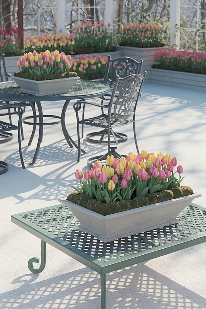
This sophisticated warm palette moves through related hues creating seamless color flow that feels cohesive rather than fractured. The pink-to-peach-to-burgundy progression shares red undertones preventing color clashing while the value range from light pink through medium peach to dark burgundy creates dimensional interest. I arrange these in graduated order, burgundy 25% at the back, peach 40% center, pink 35% front, creating depth through color intensity that makes arrangements appear larger than they are. This palette works brilliantly for outdoor dining tables where the composition gets viewed from multiple angles since the color progression reads logically from any direction rather than looking organized only from one specific viewpoint.
These three-color palettes demonstrate how relationships between colors matter more than the specific shades chosen, and the center band weight technique ahead shows how to use color placement strategically.
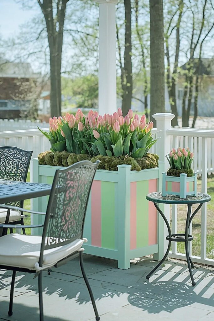
How to Use “Center Band Weight” to Make Spring Tulips Outdoor Planters Look Denser
Center band weight means placing your boldest, most saturated color in the planter’s central zone, creating visual mass that anchors the composition. The eye naturally travels toward the highest contrast or brightest element, so positioning that element center-stage creates perceived density even when total plant count stays modest.
I learned this from studying professional arrangements at botanical gardens where designers consistently positioned the most visually powerful elements at composition centers, not scattered throughout. Applying this to tulip color banding means putting your deep purple, vibrant coral, or saturated yellow in the center band while flanking it with softer, less demanding colors that support rather than compete.
The center band should occupy 40-50% of the planter’s total volume, substantial enough to create genuine presence but not so large it eliminates the supporting bands. I typically plant this zone three to four inches deeper than the flanking bands, creating slight height elevation that amplifies the center’s visual dominance. The elevated center rises slightly above the sides, creating dimensional interest that flat uniform height can’t match.
Surrounding colors need to defer to the center weight. If my center band is deep burgundy, my flanking bands become pale pink or cream, colors that complement without challenging. If the center is bright coral, the flanks might be soft peach or white. The key: supporting colors should be either lighter in value or less saturated than the center, ensuring the eye travels inward to the weighted band rather than getting pulled to the edges.
The center weight principle creates focal mass that prevents sparse appearance, and the long trough banding ideas ahead adapt this concept to linear containers with different proportions.
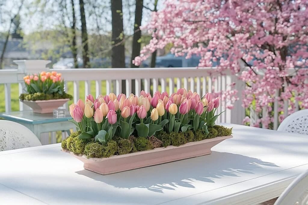
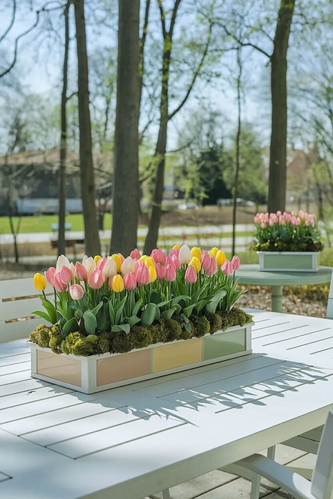
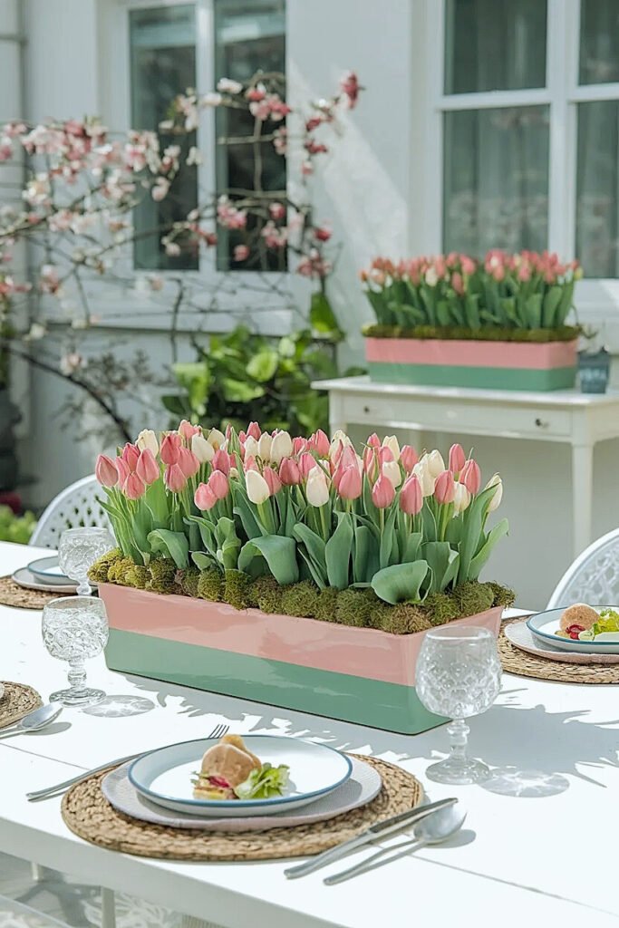
Ideas for Color Banding Spring Tulips in Long Trough Planters on Outdoor Benches
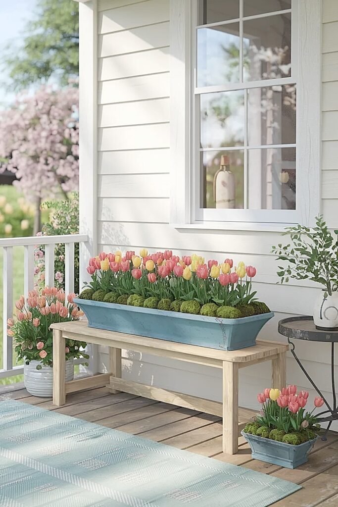
Long trough planters emphasize horizontal lines that color banding can either enhance or fight against. Fighting the form creates visual tension; enhancing it creates harmony that makes arrangements look intentional and full.
Troughs typically measure thirty-six to forty-eight inches long by eight to twelve inches wide, dramatically different proportions than round or square planters. This linearity demands different banding strategies.
1. Five-Band Graduated Sequence for Linear Flow
Create five narrow bands running the trough’s full length, graduating colors from light to dark and back to light in a rainbow-like progression. I might use: pale yellow, medium coral, deep burgundy, medium coral, pale yellow, creating symmetry through color repetition that emphasizes the trough’s linear form. Each band occupies roughly eight inches of the thirty-six-inch length, creating rhythm through repetition while the graduated intensity from edges toward center creates depth. This works brilliantly for benches where viewers approach from the ends and see the full linear progression unfold.
2. Thirds Division with Contrasting Ends and Light Center
Divide the trough into three equal sections, positioning the same bold color at both ends with a contrasting light center. Deep purple at both twelve-inch ends with white or cream filling the central twelve inches creates bookend effect that frames the arrangement while making it appear longer than actual dimensions. The repeated end colors create visual rhythm while the light center draws the eye inward, preventing the arrangement from feeling heavy or bottom-weighted.
3. Asymmetric Quarter Division for Modern Appeal
Divide the trough asymmetrically, one-quarter in one color, three-quarters in another, creating modern composition that breaks symmetry expectations. I position the quarter section at one end with a bold contrasting color, letting the remaining three-quarters showcase a softer hue. This 25/75 split creates visual interest through imbalance while the generous proportion given to one color creates perceived abundance through color mass rather than plant count.
4. Repeating Two-Color Alternation for Pattern Energy
Alternate two colors in six-inch bands running the full trough length, creating A-B-A-B-A-B pattern that generates visual energy through repetition. This works best with high-contrast pairs like white and purple or yellow and burgundy where the alternation creates strong rhythm. The pattern energy makes the arrangement appear more complex and fuller than the actual two-color palette suggests, as eyes perceive the multiple repetitions as generous abundance.
5. Diagonal Bias Banding Across the Length
Rather than orienting bands perpendicular to the trough length, angle them at roughly thirty degrees creating diagonal color zones that add unexpected interest. This requires planning during planting, I use stakes and string to mark diagonal zones before positioning any bulbs. The diagonal breaks the expected horizontal banding creating surprise that draws attention and makes the arrangement memorable. Works brilliantly for benches positioned at angles where straight bands would appear misaligned.
These trough-specific techniques leverage linear form through strategic banding, and the swing table concepts ahead address compact containers with intimate viewing distances.
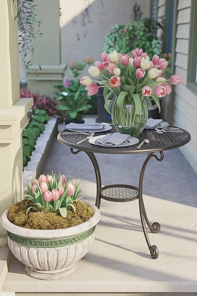
Ways to Color Band Spring Tulips in Porch Swing Side Table Planters
Porch swing side tables sit at arm’s length from seated occupants, creating intimate viewing distances where color relationships become especially important. Overly complex banding reads as busy at close range; simplified combinations read as sophisticated.
The small container size typical of side tables, usually ten to fourteen inches diameter, limits how many distinct bands work visually.
1. Half-Moon Split for Bold Contrast
Divide the planter exactly in half with one color occupying one semicircle and a contrasting color filling the other. This creates drama appropriate for close viewing where subtle transitions might not register. Position the dividing line perpendicular to the swing’s seating position so occupants see both colors equally rather than one dominating their view.
2. Thirds with Center Emphasis
Use three colors in one-third proportions but concentrate attention through color choice rather than placement variation. Position the boldest color centrally with supporting colors flanking it. The equal proportions create balance while center emphasis creates focus preventing the eye from wandering aimlessly.
3. Concentric Ring Banding
Create color bands as concentric rings, one color forming the outer perimeter ring and another filling the center circle. This works beautifully in round planters viewed from above by seated swing occupants. The ring pattern creates target-like focus drawing eyes inward to the center color while the outer ring frames the composition.
4. Front-to-Back Gradient
Orient three bands front-to-back moving from light to dark, creating gradient that adds depth when viewed from the swing seat. The darkest band at the back appears to recede while the lightest band in front advances visually, creating dimensional illusion that makes the planter appear larger than its actual footprint.
5. Asymmetric Two-Thirds/One-Third Split
Give one color two-thirds of the planter and a contrasting accent color the remaining third, positioned at the front edge visible from the swing. This creates generous color mass through the dominant hue while the accent adds interest without demanding equal visual weight. The imbalance feels modern rather than accidental.
The side table banding adapts to intimate viewing distances, and the bistro planter layouts ahead address small containers for outdoor dining settings.
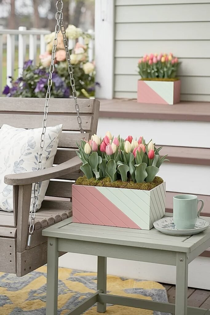
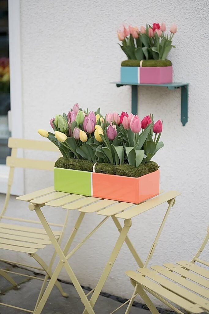
What Are the Best Two-Tone Color Band Layouts for Spring Tulips in Outdoor Bistro Planters
Bistro planters typically measure ten to twelve inches, compact containers that pair with small outdoor dining setups. Two-tone banding provides optimal color impact without overwhelming these intimate-scale containers.
Two colors create clean, sophisticated compositions perfect for bistro settings where simplicity reads as elegant rather than insufficient.
1. Side-by-Side Equal Division for Modern Balance
Split the planter vertically down the center with each color occupying exactly half the container. This creates clean modern aesthetic appropriate for contemporary bistro furniture. I use high-contrast pairs like white and deep purple or coral and cream where the division creates obvious intentional design. The equal proportion creates balanced composition that works from any viewing angle around the bistro table. This layout photographs exceptionally well for social media sharing, making it ideal when aesthetics need to document beautifully.
2. Nested Circles with Perimeter Ring and Central Cluster
Create an outer ring using one color around the planter perimeter with the center filled by a contrasting color. This works brilliantly in round bistro planters where the circular form echoes the ring-and-center layout. I position eight bulbs in the outer ring and seven in the center cluster, creating fullness through strategic placement rather than maximum density. The ring-and-center creates focal emphasis that draws eyes inward while the ring frames the composition preventing it from feeling scattered.
3. Diagonal Slash Division for Dynamic Energy
Divide the planter diagonally from corner to corner rather than straight down the middle, creating dynamic division that adds energy to small containers. The diagonal creates visual movement that straight divisions lack, making the composition feel more interesting despite the two-color simplicity. This layout works particularly well when bistro tables sit at angles where straight divisions would appear misaligned to primary sight lines.
4. Thirds with Repeated End Color Bookends
Use 40% center band in one color with 30% sections at each end in a contrasting color, creating bookend framing effect. This three-section division provides rhythm through repetition while the color reduction to just two hues maintains simplicity appropriate for small bistro planters. The repeated end colors create visual balance while the center band establishes focal point.
5. Front-Weighted Asymmetry with 70/30 Split
Position one color occupying 70% of the planter with an accent color taking just 30%, placed at the front edge closest to diners. This creates generous color mass while the accent prevents monotony. The front positioning ensures the accent color gets noticed from seated dining positions while the dominant color provides backdrop fullness. Works brilliantly when the dominant color is soft (cream, pale pink) and the accent is bold (burgundy, deep coral).
The bistro layouts optimize two-color combinations for compact containers, and the directional guidance ahead explains how band orientation changes visual impact.
What Are the Best Band Directions for Spring Tulips in Outdoor Planters: Side-to-Side vs Front-to-Back
Band direction, how you orient color zones relative to primary viewing angles, dramatically affects whether banding enhances or undermines fullness perception. I spent an entire season testing identical color combinations with different orientations before understanding how much direction matters.
Side-to-side bands run perpendicular to the primary viewing direction, creating stripes visible head-on. Front-to-back bands run parallel to sight lines, creating color progression viewed through the arrangement’s depth rather than across its width. Neither is universally superior; context determines which works.
Side-to-side banding works brilliantly when planters get viewed from consistent single directions, like containers on porch railings always viewed from the porch side, or planters against walls approached from one angle. The perpendicular stripes create clear color definition that emphasizes the planter’s width, making it appear larger laterally. I use side-to-side for planters positioned where width emphasis enhances the space.
Front-to-back banding excels for all-around viewing situations, planters on tables surrounded by chairs, or containers positioned where people walk past from multiple directions. The parallel bands create color progression that reveals gradually as viewing angle changes rather than presenting all colors simultaneously. This revelation-through-movement creates interest that side-to-side banding can’t replicate.
For planters receiving multi-directional traffic but having one dominant approach vector, I orient bands at forty-five-degree angles splitting the difference between side-to-side and front-to-back. This compromise creates visual interest from multiple angles without optimizing for one specific direction.
Testing before planting helps enormously. I use colored paper placed in empty containers and view from various angles before committing to band direction, adjusting based on what actually looks best from the real sight lines rather than theoretical plans.
The directional principles show how orientation affects perception, and the multi-planter coordination concepts ahead demonstrate creating cohesive looks across entire patios.
Ideas for Color Banding Spring Tulips Across Multiple Outdoor Tables for a “Full Patio” Look
Coordinating color banding across multiple planters creates patio-wide compositions that amplify individual container impact through collective rhythm and repetition.
The coordination doesn’t require identical arrangements; it requires related color schemes that create conversation between containers.
1. Same Palette, Different Proportions
Use identical three-color palettes in all planters but vary the band proportions, one planter might be 50% coral, 30% cream, 20% yellow while another is 40% yellow, 40% cream, 20% coral. The shared palette creates cohesion while varied proportions prevent boring repetition. I position these around the patio perimeter where the color relationships read as intentional rather than accidental, creating sophisticated composition across the entire outdoor space.
2. Progressive Color Shift Across Tables
Create gradual color progression across four or more planters, starting with all light colors in planter one and progressively darkening through subsequent planters until reaching all dark colors in the final container. This creates gradient effect across the entire patio that makes the space feel curated and intentional. Works brilliantly for dining areas with multiple tables where the progression unfolds as guests move through the space.
3. Alternating Dominant Colors in Repeated Positions
Use two contrasting colors across multiple planters but alternate which color dominates, planter A is 70% purple, 30% white while planter B is 70% white, 30% purple. Position these alternating planters around the patio creating rhythm through color repetition and proportion reversal. The alternation prevents visual monotony while the repeated palette creates clear relationship.
4. Matching Bookend Pairs with Unique Center
Position identical color-banded planters at two patio edges (bookends) with a unique color combination in the center position, creating framed composition across the space. The bookend planters anchor the arrangement while the unique center becomes focal point. This works for patios with clear three-position layouts, two ends and one middle, where the architectural framework supports the planting composition.
5. Themed Color Stories in Zones
Divide the patio into zones, dining area, lounge area, entry area, with each zone receiving distinct but related color palettes. Dining might use warm corals and yellows, lounge cool purples and whites, entry a mixed bridge palette combining elements from both. This creates interest through variety while the zone-specific palettes prevent visual chaos that completely random color mixing would produce.
Conclusion
Color banding transforms modest tulip counts into arrangements that read as abundant through strategic color organization rather than maximum plant density. The techniques here emerged from recognizing that eyes respond to pattern, rhythm, and intentional color relationships more than raw numbers. A planter with fifteen tulips arranged in thoughtful color bands consistently looks fuller than one with twenty-five tulips scattered randomly. Start with simple two-tone banding this season, master those proportions and transitions before attempting complex three-color compositions. The fuller-looking planters you create through color banding will change how you approach every future planting project, tulips or otherwise.
This website contains affiliate links, and some products are gifted by the brand to test. As an Amazon Associate, I earn from qualified purchases. Some of the content on this website was researched and created with the assistance of AI technology.