
This website contains affiliate links, and some products are gifted by the brand to test. As an Amazon Associate, I earn from qualified purchases. Some of the content on this website was researched and created with the assistance of AI technology.
Key Takeaways
- Keep profiles low and eye contact clear: compact rose arrangements at or below palm height make dinner feel intimate, not theatrical.
- Work in modules: build small, liftable clusters you can place on chargers, runners, and sideboards for fast styling and easy edits.
- Control texture and sheen: matte linens, brushed metals, and soft velvet let fresh roses glow without glare.
- Anchor a disciplined palette: pick a dominant rose tone, then add one or two supporting shades for depth without chaos.
- Protect surfaces and flow: use coasters, moss pockets, and felt pads; leave obvious lanes for hands, plates, and glassware.
Creating a romantic Valentine’s Day table settings with fresh roses live or die by restraint. I learned this the night a towering bouquet blocked my date’s face and the appetizers. Since then, I design for conversation first, then atmosphere: roses low enough for eye contact, light warm enough for skin, textures soft enough to invite touch. The goal isn’t a showroom; it’s a lived-in, cinematic table where every detail supports the story.
I work the room like a director: establishing shots (the centerpiece), supporting actors (chargers, napkins, sideboard), and quiet extras (velvet, glass, pewter) that never upstage the leads. Fresh roses do the heavy lifting if you give them space to breathe. Let’s map the builds, color logic, and little mechanics that make the evening feel expensive without shouting.
Romantic Valentine’s Day Table Settings with Fresh Roses – Quick Planner
Use this planner to design a romantic Valentine’s table step by step: start with your color base, then layer centerpieces, place settings, surrounding furniture and windows, and finally finishing touches and guest experience.
| Key Part of the Post | Where to Focus | Core Styling Actions | When This Matters Most |
|---|---|---|---|
|
1. Foundation & Palette Set the mood with color, surfaces, and overall feel. |
Overall dining room view, table surface or cloth, napkin colors, and any nearby consoles that should echo the same palette. |
|
When you’re just starting and want every detail to feel
intentional, romantic, and consistent from table to background surfaces.
|
|
2. Rose Centerpieces & Runners Build the main floral story in the center of the table. |
Middle of the dining table: single focal centerpiece, a line of clusters, or a loose rose-and-greenery runner. |
|
Ideal when you want the table to feel romantic at first glance,
with roses clearly leading the Valentine’s theme.
|
|
3. Place Settings & Guest Details Small rose touches each guest interacts with. |
Individual plate settings, napkin presentation, glass placement, and any handwritten notes or name cards at each seat. |
|
Most important when you want a date-night feel where each
guest notices thoughtful, intimate rose details at their spot.
|
|
4. Furniture, Windows & Flow Extend your rose story beyond the main table. |
Sideboards, consoles, shelves, window sills, and any small tables that sit within view of your Valentine’s table. |
|
Perfect when your table sits in an open-plan space and you
want everything around it to feel softly romantic too.
|
|
5. Finishing Touches & Experience Final tweaks that make everything feel effortless. |
Every angle guests see: sitting at the table, entering the room, or glancing at windows and surrounding furniture. |
|
Essential right before guests arrive, when you want the
table to feel relaxed, inviting, and ready for a long, romantic meal.
|
Where to focus: table surface or cloth, napkin colors, and any nearby consoles in view.
- Pick your rose colors (deep red, blush, cream).
- Decide on bare table vs. cloth vs. runner-only.
- Match napkins and small accents to the palette.
Where to focus: center of the table, from one end to the other.
- Use low rose arrangements for clear conversation.
- Link multiple clusters with simple greenery.
- Balance color and height along the full length.
Where to focus: individual plate settings, napkin wraps, small notes.
- Tie mini rose or greenery bundles to napkins.
- Add a place card or tiny note at each seat.
- Leave enough space for plates and glasses.
Where to focus: sideboards, window ledges, shelves, and small side tables.
- Place small rose clusters on consoles and shelves.
- Style simple rose moments on window sills.
- Keep traffic paths open and comfortable.
Where to focus: views from each seat and from the room entrance.
- Edit out clutter and leave breathing room.
- Check sightlines from key chairs and adjust roses.
- Make sure rose scent feels soft, not overpowering.
| Category | Essentials | Colors | Where to Use |
|---|---|---|---|
| Roses | Red, blush, cream stems; mini buds | Red, blush, ivory | Centerpieces, napkins, garlands |
| Linens | Runners, napkins, placemats | Soft pink, white, warm nude | Tabletops, buffets, coffee tables |
| Props & Accents | Ribbon, lace, matte vases | Rose gold, silver, cream | Sideboards, windows, shelves |
| Candles | Soft pillar candles, frosted votives | Warm white | Table runners, corners, nooks |
| Extras | Loose petals, heart charms | Pink, red, ivory | Place settings, final layer |
How to Style Romantic Valentine’s Rose-Filled Charger Plates

I love chargers as quiet stages. I start with neutral plates, matte bone, hand-thrown stoneware, or brushed pewter, because high shine competes with petals. I place a thin moss ring or a linen round at the charger’s center to create a cushion. Then I seat a micro-bundle: two small rose heads (one deeper tone, one lighter) with a short cedar or olive tip for silhouette. Everything stays under an inch tall, so the dinner plate nests easily.
To avoid mess, I cap stem ends with floral tape and a bead of clear wax, then hide them under the moss. If I expect a coursed meal, I switch to “lift-and-set”: the micro-bundle lives on a tiny saucer or coaster that moves aside when food arrives. The trick is consistency, repeat the same micro-bundle language at every seat so the table reads cohesive on camera and in person.
Build low-profile rose minis on a soft base, keep stems sealed, and present them on removable coasters for easy plating. For more sectional builds that translate to mantels and rails, peek at Christmas Party Favor Ideas Using Small Rose Bundles, and if this helps, share this post with a friend who loves a quietly theatrical table. There’s more ahead, keep reading for an exacting color playbook.
What Are the Best Rose Colors for Elegant Valentine’s Settings?

- Deep Crimson
Crimson anchors the palette with cinematic weight. Under candlelight, it reads velvety, not loud, and pairs perfectly with matte pewter and walnut. I use it as the base note in centerpieces and as micro-accents on chargers. In dim rooms, crimson prevents the table from washing out while keeping skin tones warm. One caution: avoid glossy linens around it, matte textures protect that velour-like finish and keep things editorial rather than prom-night shiny. - Soft Blush
Blush diffuses intensity. I deploy it as a halo around deeper tones, especially in tight dining rooms where heavy color can feel claustrophobic. Blush petals catch low light and bounce it gently into faces, which flatters candid photos. Pair blush with bone linens and frosted glass for a cloudlike atmosphere. It can skew bridal if you overdo white; ground it with a touch of olive foliage or a pewter accent to keep the look adult and modern. - Cream/Ivory
Cream acts like an internal light source. I cluster ivory near candles and reflective surfaces to create soft highlights that make the deeper reds glow. It also broadens the table visually without increasing height. Use cream sparingly in the centerpiece and more generously at place settings, where it calms busy flatware and patterned china. Keep the supporting greenery cool-toned (olive, seeded eucalyptus) so cream reads sophisticated rather than yellowed. - Black Cherry/Burgundy
Burgundy introduces drama and shadow. I tuck it deep in the arrangement’s interior to simulate depth of field, then let a few heads peek along the runner. It photographs beautifully, especially with micro-lights tucked under foliage. Use it to punctuate transitions between blush and crimson; a few strategically placed blooms can make a small centerpiece feel layered and expensive. Avoid pairing with bright gold; brushed brass or pewter is kinder. - Antique Pink (Dusty Rose)
Dusty rose bridges modern and nostalgic. It’s the link that lets vintage glassware play nicely with contemporary plates. I use it in napkin ties and sideboard minis where I want whisper-notes of color without commanding attention. Dusty rose also tempers stark black or charcoal flatware, creating a more forgiving gradient across the tablescape. To prevent muddiness, keep foliage tidy and matte; shiny leaves can make antique pink look dated.
Choose one anchor (crimson or burgundy), one diffuser (blush or cream), and one bridge tone (dusty rose) for depth without clutter. More craft ahead, keep reading to tie roses into napkins without stealing elbow room.
How to Style Rose Napkin Ties for a Romantic Valentine’s Plate Setting

Napkins carry intimacy; they’re the first thing your guest touches. I fold a bone-linen napkin into a soft rectangle, set a tiny spray-rose bud and an olive tip at the center, then tie a 3/8-inch velvet ribbon, claret for warm metals, cream for brass-heavy settings. I aim the knot off-center so the composition feels relaxed, not regimented. The bundle must lift cleanly with the napkin, so I keep stems at 3 inches or less.
For practicality, I pre-wire the bud with 26-gauge floral wire, wrap the neck with floral tape, and cover with ribbon so no sticky bits touch fabric. If the dinner runs long, I slip a micro water tube behind the napkin fold for live roses; otherwise, I condition buds hard beforehand so they hold shape for hours. The point is tactile luxury with zero fidgeting once seated.
Wire and tape a single bud, keep stems short, and tie off-center with velvet over bone linen for a touchable, travel-safe napkin accent. There’s color choreography next, keep reading to mix shades across runners without visual noise.
Ideas for Mixing Rose Shades Across Valentine Table Runners and Textures

- Gradient Drift
Run a linen or raw-silk runner down center, then blend from burgundy at one end through crimson to blush and cream at the other. Place micro-clusters every 10–12 inches, with seeded eucalyptus stitching the seams. The gradient guides the eye and stretches the table visually. It also lets you seat bolder personalities near the dark end and quieter diners near the pale end, a subtle social cue that sounds odd until you see the harmony it creates. - Cream Core with Red Shores
Build a creamy nucleus along the runner’s middle, ivory and blush with fine olive tips, then bank deeper reds toward both ends. This keeps conversation bright at the center while the ends read moody and romantic in photos. Use brushed pewter votives along the cream core to amplify that built-in glow. It’s fantastic on narrow tables where too much red at center would feel heavy. - Checkerboard Clusters, Softened
Alternate small clusters of red and blush along the runner, but blur edges with eucalyptus and moss so it never looks rigid. The “soft checker” works with patterned dishes because it introduces rhythm without competing. Keep cluster sizes uneven and avoid strict spacing; the charm is in the hand-done imperfection that still reads considered and calm.
Pick one layout logic and repeat it calmly, gradient, cream core, or softened checker, for a runner that reads rich but breathable. Fabrics are up next, keep reading to wrap napkin rolls that feel tailored, not crafty.
Ideas for Styling Rose-Wrapped Linen Napkin Rolls for Valentine’s Day

- Velvet Cuff with Single Bud
Roll a linen napkin into a slim cylinder, sleeve it with a 1-inch velvet ribbon cuff, and tuck a wired bud under the cuff seam. The velvet grips the linen, so nothing slides when passed hand-to-hand. Choose ribbon color to echo your centerpiece’s anchor tone. This approach looks tailored and stacks neatly if you’re plating multiple courses quickly. - Twill-and-Seam Wrap
Use cotton twill tape to spiral-wrap the lower third of the napkin roll, leaving a 1/4-inch reveal between passes to show texture. Slide a miniature place card beneath the final pass and add a tiny olive tip. It reads artisan without fuss, and the twill withstands fingerprints better than satin. Perfect for casual-elegant menus where guests serve themselves bread or antipasti. - Linen Sleeve with Deckle Tag
Sew simple linen sleeves that slide over rolled napkins. Add a deckle-edge tag tied with waxed thread and a micro spray rose at the top seam. The sleeve protects fabric from any damp stems and formalizes the look just enough for a tasting menu. Keep sleeves bone or taupe so they harmonize with both blush and deep red petals.
Choose a secure wrap, velvet cuff, twill spiral, or linen sleeve, that resists slip and frames a single bud with intention. Sideboards matter too, keep reading to style a romantic support display that doesn’t block service.
How to Style a Romantic Sideboard Display with Valentine Roses

Sideboards do double duty: eye candy and logistics. I push décor to the back edge, leaving a clean front lane for bottles and dessert plates. I start with a narrow linen runner and a pencil-thin olive garland. Then I drop three micro-clusters of roses at the sideboard’s visual thirds: cream-forward near the lamp, richer tones near the far end where shadows gather. Each cluster sits on a pewter saucer so petals never touch wood.
Lighting seals the mood. I swap scented candles for unscented pillars in frosted sleeves and add a small lamp with a warm bulb set to 30–40% brightness. The frosted glass turns cream petals luminous and burgundy velvety. If the party runs buffet-style, I build the clusters on tiny trays so I can lift them out before setting hot dishes. Function first; romance follows.
Stage clusters on protective saucers along the back edge, light with frosted, unscented candles, and keep liftable modules ready for service. Layering comes next, keep reading to pair soft pink with deep reds across the table.
Ideas for Layering Soft Pink & Deep Red Roses Across a Valentine Table

- Halo and Heart
Seat a heart of deep red roses at the centerpiece core and surround it with a halo of soft pink spray roses. The halo softens the edge, preventing the center from feeling dense. Use olive to thread between layers so transitions feel intentional, not abrupt. - Stripe and Scatter
Create two subtle stripes down the runner, one blush-heavy, one red-forward, then scatter a few opposite-color buds across each stripe. It looks spontaneous but photographs as controlled movement. Keep heights even to avoid a bumpy visual horizon. - Islands and Inlets
Design small “islands” of red at the runner’s thirds and let blush form the inlets between. Micro-lights under foliage at island edges add glow without visible bulbs. The negative space makes the table feel generous and calm.
Choose a layering logic, halo, stripe, or islands, and keep heights tight with one greenery vocabulary. Velvet is coming, keep reading to marry roses with textiles that feel like evening wear.
How to Pair Fresh Roses with Velvet Accents for a Romantic Valentine’s Table

Velvet loves roses because both swallow light. I use velvet sparingly and strategically: a narrow runner, ribbon ties on napkins, or a small stack of velvet coasters under glassware. Brushed finishes avoid glare and photograph like candle smoke. Match velvet to your anchor rose tone or go tonal-neutral (taupe, bone) if your palette already runs hot. Avoid velvet placemats under heavy plates, they drag and wrinkle.
Mechanically, velvet sheds pressure marks, so I keep it lifted off hard edges with a linen underlay. If drinks sweat, those coasters earn their keep. For floral ties, velvet bands cover mechanics beautifully; I wire buds first, tape the necks, then wrap with velvet so the fabric never touches sap or moisture. The result reads tailored and soft without veering into costume.
Deploy velvet as trims and touchpoints, runners, ribbons, coasters, paired with wired-and-taped rose buds so luxe meets practical. Now the star, keep reading to build a centerpiece that glows and behaves.
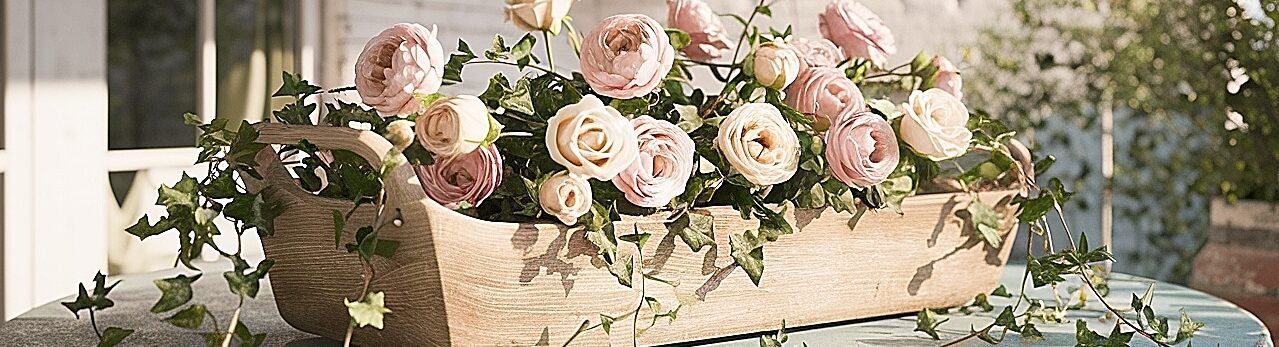
How to Build a Romantic Valentine’s Centerpiece with Red and Cream Roses

I build low and modular. In a shallow bowl or pewter compote, I set a pin frog or a taped grid. I make pods, three roses each, two red and one cream, bound at staggered heights with floral tape. Each pod gets a small olive or seeded eucalyptus tip. I seat pods into the base, aiming faces slightly forward, and keep the profile under five inches so conversation flows. Empty pockets get preserved moss to hide mechanics.
Conditioning matters. I cut stems at 45 degrees, hydrate in lukewarm water with a pinch of sugar and a drop of bleach for 30 minutes, then work quickly. I place frosted votives at the centerpiece’s quadrants to cross-light petals, making cream read luminous and red read velvety. For staying power, I tuck micro water tubes on the hottest spots or swap a pod mid-evening if needed. Edit once: remove one flourish before guests sit.
Bind rose pods, seat in a stabilized low vessel, fill gaps with moss, and cross-light with frosted votives for that quiet cinematic glow. There’s more nuance above, keep reading the full article for color ratios, napkin mechanics, and sideboard flow you can apply tonight.
Conclusion
A romantic Valentine’s table isn’t louder; it’s closer. Keep roses low, palettes disciplined, and textures honest, bone linen, brushed metal, a slice of velvet. Build in movable modules so plating stays smooth. Tie napkins with wired buds that behave, light with frosted glass at a warm dim, and protect finishes with saucers and moss. Choose an anchor color, add a diffuser and a bridge, and repeat that language across chargers, runners, and sideboards. Edit once before the doorbell rings. Then sit, breathe, and let the table do the talking.
This website contains affiliate links, and some products are gifted by the brand to test. As an Amazon Associate, I earn from qualified purchases. Some of the content on this website was researched and created with the assistance of AI technology.