This website contains affiliate links, and some products are gifted by the brand to test. As an Amazon Associate, I earn from qualified purchases. Some of the content on this website was researched and created with the assistance of AI technology.
Key Takeaways
- Emerald green reads as sophisticated and jewel-toned, making it ideal for formal Saint Patrick’s Day celebrations where elegance matters
- Hunter green brings moody, luxurious depth that works beautifully for evening entertaining and intimate dinner parties
- Kelly green, the brightest of the three, requires careful handling to avoid looking cheap or cartoonish, but done right it delivers festive energy nothing else matches
- Mixing all three greens successfully depends on establishing clear hierarchy with one dominant shade and two supporting accents
- Lighting conditions dramatically affect how each green appears, making indoor and outdoor settings require different approaches
Creating a Saint Patrick’s Day tablescape color guide starts with understanding that “green” isn’t one color, it’s an entire spectrum with wildly different personalities. I learned this lesson the hard way at my first serious Saint Patrick’s Day dinner party when I threw together every green item I owned and ended up with a table that looked like a craft store explosion rather than a curated celebration.
The three greens you’ll encounter most frequently in Saint Patrick’s Day decorating, emerald, hunter, and kelly, each bring distinct moods, pair differently with roses and other elements, and perform uniquely under various lighting conditions. Choosing the wrong one for your setting or mixing them carelessly creates visual chaos that undermines even the most thoughtful planning. But understanding their individual characteristics and how they interact opens up design possibilities that transform ordinary tables into genuinely memorable celebrations.
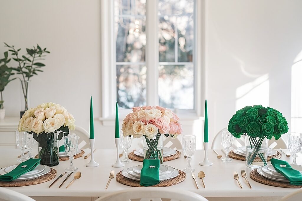
Use this quick color guide to choose the best green for your Saint Patrick’s Day rose tablescape; emerald, hunter, or kelly. Match it to your room, your lighting, and your party style. You’ll get instant pairings for roses, napkins, painted pots, and where each shade looks best indoors and outdoors.
Pick one main green: Emerald, Hunter, or Kelly. Then match your napkins, painted terracotta pots, and mini repeats on counters + outdoor tables.
| Green Shade | Best Room + Light | Rose Pairing + Textures | Use It Like This (Quick Rules) |
|---|---|---|---|
|
Emerald
Clean, rich, “classic Irish party” energy.
|
Indoor dining
Kitchen counters
Covered patios
|
Creamy white roses
Deep red roses
Emerald greenery
|
|
|
Hunter
Moody depth, “expensive dinner party” vibe.
|
Buffet/sideboard
Living rooms
Outdoor porch corners
|
Creamy roses
Deep red accents
Hunter foliage
|
|
|
Kelly
Bright pop, fun party energy (use carefully).
|
Outdoor tables
Drink stations
Small accents indoors
|
Cream roses (main)
Red roses (tiny)
Kelly accents
|
|
|
One-Green Rule
Fastest way to avoid clashing greens.
|
Any room
Indoor-outdoor flow
Last-minute party
|
Cream roses
Deep red accents
One chosen green
|
|
Emerald
Best for: base color tablescapes
▾
Best Room + Light
Indoor dining, kitchen counters, covered patios. Great in bright or neutral rooms.
Rose Pairing
Cream roses as main. Deep red as small “punch” points. Emerald greenery trimmed low.
Use It Like This
Base-color rule: emerald runner + emerald napkins. Add mini emerald pots on counter + patio table.
Hunter
Best for: depth + contrast
▾
Best Room + Light
Buffets, living rooms, porch corners. Great when you want a richer, moodier look.
Rose Pairing
Hunter is a frame: keep foliage low at the base. Cream roses keep photos readable.
Use It Like This
Depth rule: hunter stays low. Use hunter napkins at 2 seats only. Minis on buffet + porch console.
Kelly
Best for: accent-only pops
▾
Best Room + Light
Outdoor tables, drink stations, small indoor accents. Looks best in daylight.
Rose Pairing
Keep roses calm (cream main). Kelly appears in tiny touches: ties, tags, one mini pot.
Use It Like This
Accent-only rule: limit to 3 touchpoints. Minis on bar cart + outdoor bistro table.
One-Green Rule
Best for: no-clash shortcut
▾
Best Use Case
Last-minute parties or when you’re scared of clashing greens. Works anywhere.
Core Rule
Pick one green. Repeat it on table + counter + outdoor surface. Keep roses the same.
Placement Shortcut
Low wide bowl + tight clusters + trimmed greens. Reduce napkin color first if it feels loud.
How to Choose Emerald Green vs Hunter Green vs Kelly Green for a Saint Patrick’s Day Tablescape
The choice between these three greens isn’t about which is “best”, it’s about matching the green to your specific setting, formality level, and desired atmosphere. Each serves different purposes beautifully when deployed appropriately.
I’ve used all three extensively over years of Saint Patrick’s Day entertaining, and I can tell you that context determines everything about which one succeeds.
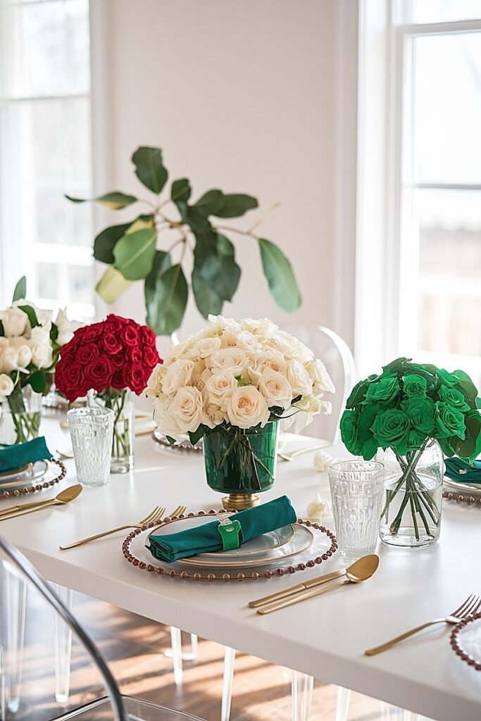
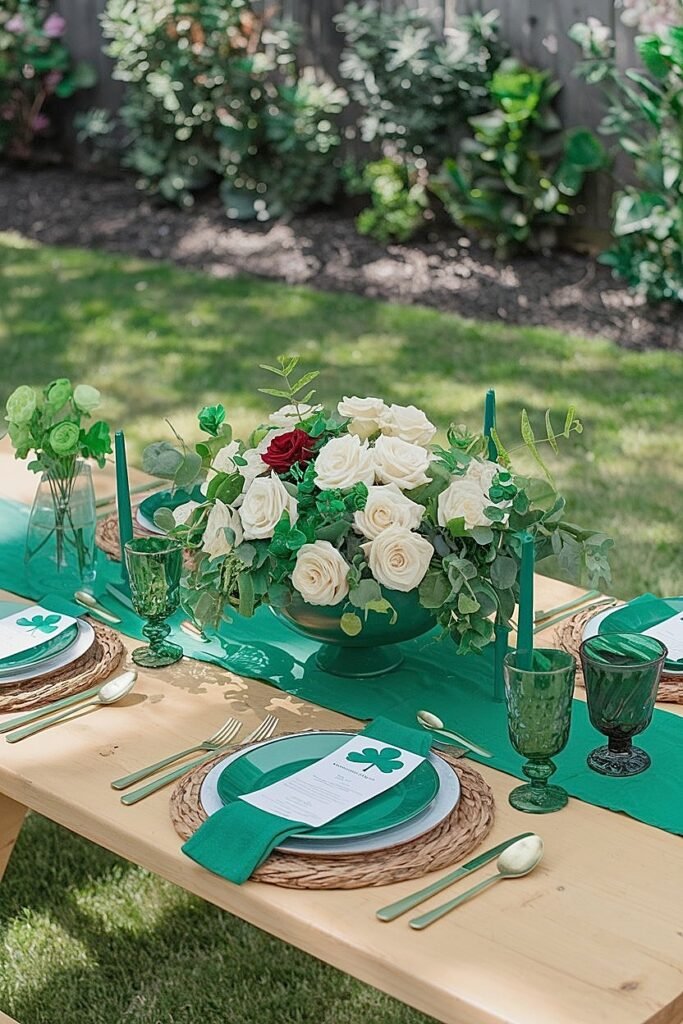
Emerald green sits in the jewel-tone family, rich and saturated with slight blue undertones that give it sophistication. Think of the green in expensive jewelry or luxury car paint. This depth makes emerald ideal for formal occasions where you want elegance rather than festivity. Hunter green goes darker still, with more black and brown in its makeup. It reads as mature, serious, almost masculine, perfect for moody, intimate gatherings. Kelly green is the brightest, most saturated option, pure green without the blue of emerald or the darkness of hunter. It’s immediately recognizable as “Saint Patrick’s Day green” but walks a fine line between festive and cheap.
Your venue and lighting should guide your choice. Bright afternoon light washes out subtle emerald tones but makes kelly pop beautifully. Evening candlelight deepens hunter green gorgeously but can make kelly look garish. Your tablecloth, dishes, and existing decor also factor in, hunter green disappears against dark wood tables while kelly practically vibrates. For more on integrating green tones into your tablescape, explore this guide to Saint Patrick’s Day table decor using roses and green napkins that shows these principles in action. If you’re finding this color guidance helpful, pass it along to friends planning their own March celebrations. But choosing a dominant green is just the beginning, rose pairings make or break your final presentation, so keep reading.
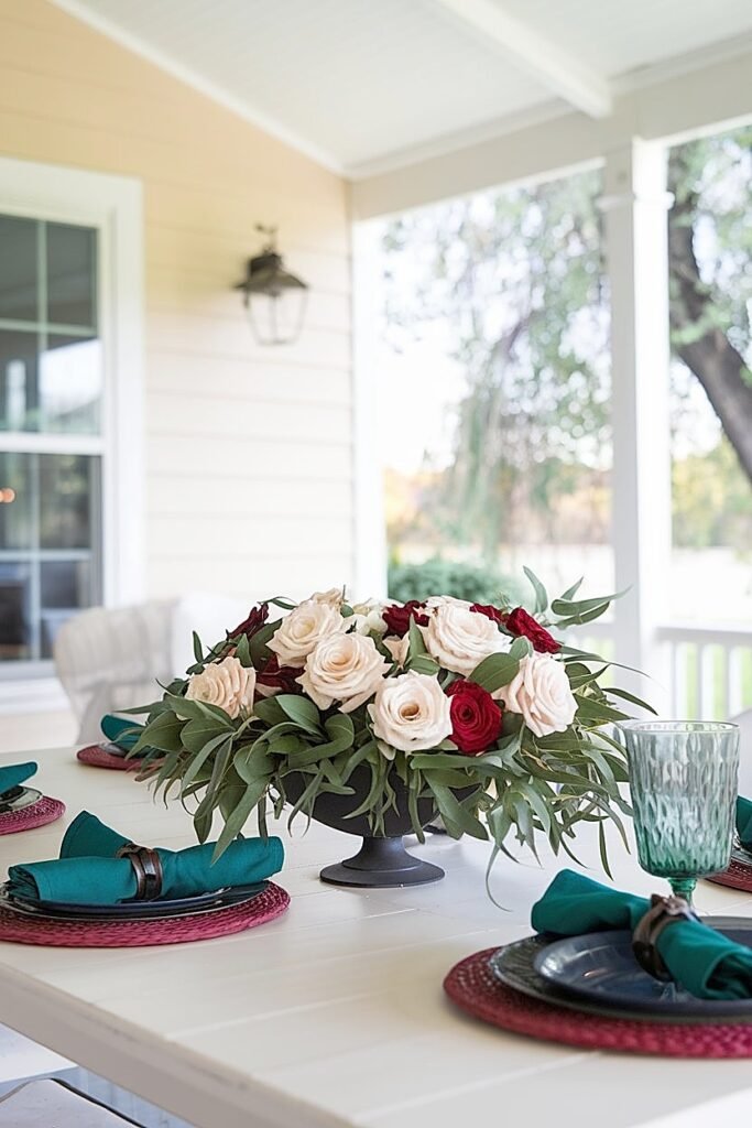
What Are the Best Rose Pairings for Emerald Green Saint Patrick’s Day Tablescapes?
Emerald green’s jewel-tone sophistication demands rose pairings that match its elevated personality. The wrong roses look out of place, too casual or too bright against emerald’s refined depth.
I’ve tested countless combinations and found that certain rose colors consistently enhance emerald while others create unfortunate clashes.
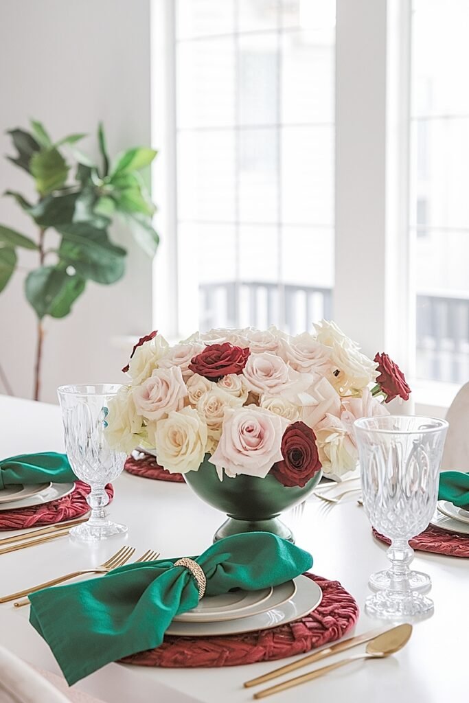
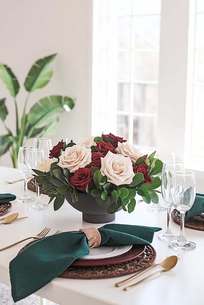
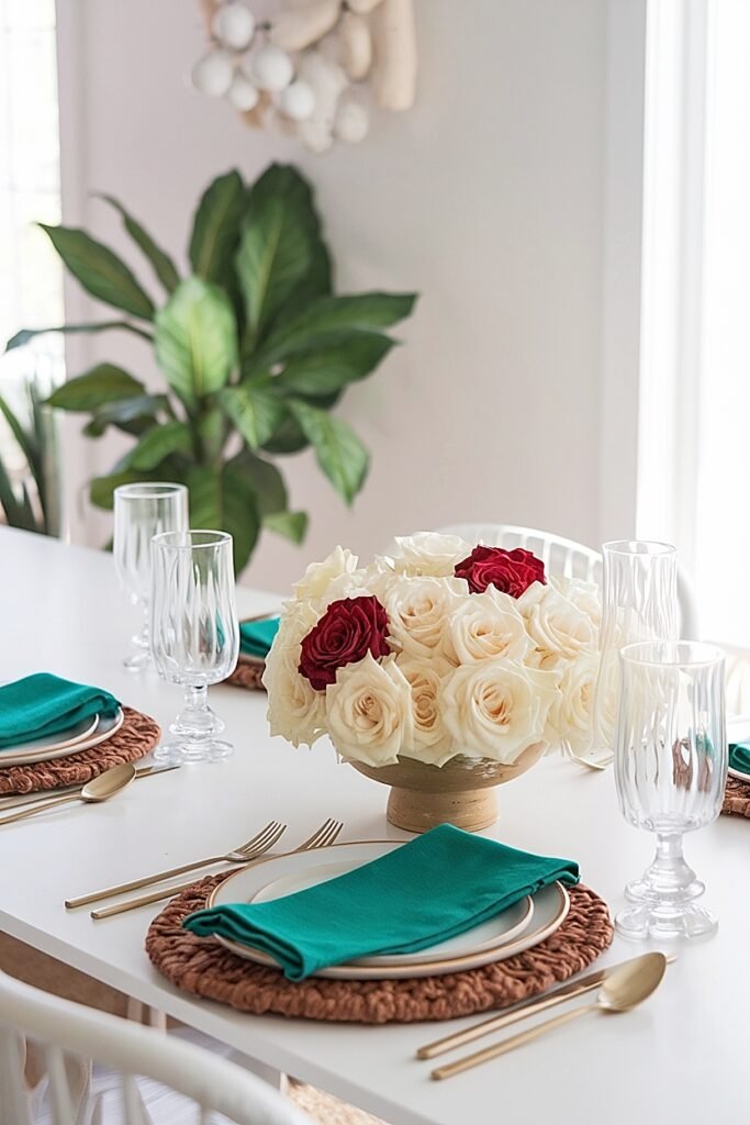
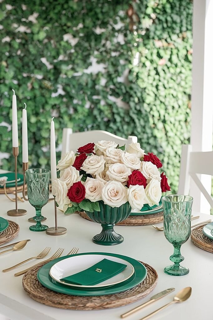
1. Cream and Ivory Roses These soft neutral tones create stunning contrast against emerald’s richness without competing for attention. The warmth of cream complements emerald’s cool blue undertones beautifully, creating balance that feels luxurious rather than stark. Ivory roses particularly excel because their subtle yellow hints add dimension. Use cream roses abundantly in your centerpiece, they’re the workhorse that makes emerald tablescapes feel complete rather than monochromatic or cold.
2. Blush and Dusty Rose Varieties Pink-toned roses bring unexpected warmth to emerald tablescapes, creating a color story that transcends typical Saint Patrick’s Day palettes. The combination reads as sophisticated rather than holiday-specific, which works beautifully for formal dinner parties where you want festive elegance without cartoon leprechaun vibes. Dusty rose particularly complements emerald’s depth because both colors share a slightly muted, vintage quality.
3. Deep Burgundy Roses For dramatic evening tablescapes, burgundy roses against emerald green create rich, moody impact that feels almost decadent. This pairing works best for intimate dinner parties where candlelight deepens both colors. The combination evokes old-world luxury, think Irish manor houses rather than casual pub celebrations. Use burgundy sparingly as an accent rather than the dominant rose color to prevent the table from feeling too dark.
4. True Green Roses Monochromatic green arrangements using roses like Super Green or Jade varieties create modern, architectural tablescapes with emerald linens or accents. The tone-on-tone approach feels intentional and contemporary. Varying the green shades between roses and table elements adds depth without introducing competing colors. This minimalist approach suits modern dining rooms and guests who appreciate restrained elegance.
5. White Roses with Emerald Foliage Crisp white roses surrounded by dark emerald greenery reverse the typical centerpiece formula, making white the star and green the supporting player. This approach keeps your table from becoming overwhelmingly green while maintaining the color story. The high contrast photographs beautifully and works in any lighting condition, a practical consideration for entertaining.
Emerald pairs beautifully with sophisticated roses, but hunter green creates entirely different opportunities, continue reading for moody, luxurious hunter green approaches.
Ideas for Hunter Green Saint Patrick’s Day Tablescapes That Feel Moody and Luxe
Hunter green naturally gravitates toward evening aesthetics, intimate gatherings, and settings where mood matters more than bright festivity. The darkness in hunter’s makeup creates depth that candlelight absolutely loves.
I tend to reach for hunter green when hosting smaller dinner parties where atmosphere takes priority over overt holiday celebration.
1. Velvet Everything Approach Use hunter green velvet for napkins, table runners, and even charger plates if you can find them. Velvet’s light-absorbing quality intensifies hunter’s moodiness while adding tactile luxury guests notice immediately. The fabric catches candlelight differently than matte surfaces, creating subtle shimmer across your table.
2. Brass and Gold Metallics Hunter green with brass accents creates warmth that prevents the dark palette from feeling cold or funeral. Add brass candlesticks, gold-rimmed glassware, or metallic charger plates beneath your dishes. The warm metals glow beautifully in evening light while complementing hunter’s brown undertones.
3. Black Accent Integration Don’t fear black with hunter green, the combination creates sophisticated drama impossible with brighter greens. Black candles, dark dinnerware, or onyx-colored table accessories ground the hunter green while adding edge. This approach suits modern, minimalist aesthetics perfectly.
4. Layered Texture Variety Combine matte, glossy, and textured hunter green elements for depth that prevents flat, monotone presentations. A glossy hunter green bowl on a matte tablecloth beside textured ceramic plates creates visual interest even within a single color. The varied surfaces interact with light differently throughout your meal.
5. Dried Floral Integration Incorporate dried grasses, preserved eucalyptus, or pampas grass alongside fresh roses in hunter green tablescapes. The dried elements add organic texture while their neutral tones don’t compete with the deep green palette. This combination feels collected and artistic rather than overly styled.
Hunter green delivers moody sophistication, but kelly green presents different challenges, read on for techniques that keep bright green looking intentional rather than cheap.
Ways to Use Kelly Green Without Making a Saint Patrick’s Day Tablescape Look Cheap
Kelly green’s brightness makes it the trickiest of the three to execute well. Too much kelly, or kelly in cheap-looking materials, instantly cheapens your entire presentation. But handled correctly, kelly brings festive energy nothing else matches.
I’ve seen kelly green tablescapes go spectacularly wrong and gloriously right, and the difference comes down to specific techniques.
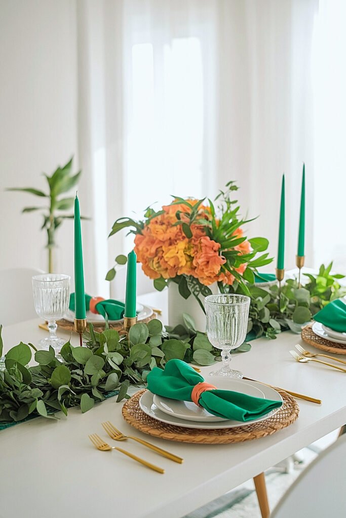
1. Limit Kelly to Accent Roles Only Never make kelly your dominant tablescape color. Use it strategically, napkin rings, small decorative objects, ribbon accents, while letting neutral or darker green elements dominate. This restraint allows kelly’s vibrancy to energize without overwhelming. Think of kelly as the punctuation mark rather than the sentence itself.
2. Choose Natural Fabrics Exclusively Synthetic materials in kelly green scream “party supply store” immediately. Linen, cotton, and silk kelly green items look intentional and quality. The natural fabric texture breaks up kelly’s intensity in ways that cheap polyester cannot achieve. Invest in quality kelly green napkins rather than disposable alternatives, the difference is immediately visible.
3. Pair with White Extensively White creates visual rest that prevents kelly green from exhausting the eye. A white tablecloth with kelly accents, white roses with kelly greenery, or white dishes on kelly placemats, all create breathing room that makes the bright green feel fresh rather than overwhelming. The contrast also photographs beautifully.
4. Add Organic Elements for Grounding Natural wood, woven baskets, live plants, and organic textures alongside kelly green items communicate “garden fresh” rather than “plastic party.” The natural elements anchor kelly’s brightness in something real and substantial. A kelly green napkin looks entirely different on a wooden charger versus a plastic plate.
5. Use Kelly in Three-Dimensional Elements Flat kelly green surfaces (tablecloths, placemats) can look cheap, but three-dimensional kelly green objects (folded napkins, ceramic vases, sculptural candles) gain legitimacy from their form. The shadows and highlights created by dimension break up kelly’s flatness in pleasing ways. Prioritize kelly in objects with shape over kelly in flat surfaces.
Kelly requires careful handling, but what about combining all three greens together? That ambitious approach follows.
How to Mix Emerald Green, Hunter Green, and Kelly Green in One Saint Patrick’s Day Tablescape (Without Clashing)
Combining all three greens successfully requires understanding hierarchy and relationship. Without clear organization, multiple greens create chaos rather than sophistication.
I attempted this mixed approach prematurely once and created a table that looked like I couldn’t decide what I wanted. Learning proper mixing techniques changed everything.
Establish one dominant green that covers the most surface area, your tablecloth, primary linens, or major decorative elements. This dominant green sets the overall mood: hunter for moody sophistication, emerald for jewel-toned elegance, or kelly for bright festivity. Then introduce the second green as significant accents occupying maybe 30% of the visual space, napkins, charger plates, or the centerpiece container. Finally, use the third green sparingly for small highlights, ribbon details, scattered leaves, or single stems.
The natural world provides the best mixing template. Look at actual plants where different green shades coexist harmoniously, deep hunter stems supporting emerald leaves highlighted with kelly new growth. Nature mixes greens through gradual transition rather than sharp contrast. Apply this principle by placing your greens where they can blend at edges rather than creating harsh boundaries. A centerpiece using all three green rose varieties transitions smoothly in ways that kelly napkins next to hunter placemats cannot. Outdoor patios offer unique opportunities for emerald green, keep reading for those specific strategies.
How to Build a Saint Patrick’s Day Outdoor Patio Tablescape Using Emerald Green
Outdoor light interacts with emerald green differently than indoor conditions, requiring adjustments to make this sophisticated shade perform at its best on patios and decks.
I’ve found emerald particularly rewarding outdoors because natural light reveals its complexity in ways artificial illumination simply cannot match.
Afternoon sunlight brings out emerald’s blue undertones beautifully, making the color appear more vibrant than under indoor conditions. This works to your advantage, items that seem dark inside glow with rich saturation outdoors. However, harsh midday sun can also expose any variation in your emerald shades that weren’t visible indoors, so ensure your emerald elements truly match before committing to the patio.
For outdoor emerald tablescapes, lean into the natural setting by combining emerald elements with actual greenery from your garden or landscape. The living plants create seamless transitions between your decorated table and its environment. Choose patio furniture that complements emerald, neutral wood tones, black metal, or white painted pieces all work beautifully. Avoid competing with emerald by keeping surrounding cushions, umbrellas, and décor in neutral tones that let your table take center stage. Weight all elements adequately for wind resistance, and choose containers that won’t tip in outdoor conditions. Hunter green offers different outdoor opportunities, continue reading for those recommendations.
What Are the Best Hunter Green Choices for Outdoor Saint Patrick’s Day Dining Tables?
Hunter green outdoors requires careful consideration because its darkness can disappear against certain backgrounds or become oppressively heavy under bright conditions.
I approach outdoor hunter green tablescapes differently than indoor ones, adjusting for light and environment.
1. Matte Finishes Over Glossy Outdoor light creates glare on glossy surfaces that washes out hunter green’s depth. Matte fabrics, ceramics, and containers maintain hunter’s richness without reflecting harsh sunlight. This finish choice matters more outdoors than any other factor for preserving hunter green’s characteristic moodiness in natural light.
2. Contrast with Bright Metallics Hunter green absorbs light significantly, which can make outdoor tables feel dark despite full sun. Counter this by introducing bright silver, polished brass, or copper metallics that reflect light back into the setting. The metallics add sparkle that keeps hunter green lively rather than heavy outdoors.
3. White Accent Integration Incorporate substantial white elements, tablecloths beneath hunter runners, white roses, white ceramic pieces, to prevent outdoor hunter tablescapes from becoming too dark. The white creates lift and freshness that balances hunter’s weight. Aim for at least 30% white in your overall presentation.
4. Textured Natural Elements Add woven baskets, rough wood surfaces, or linen textures to outdoor hunter tablescapes. These organic textures break up hunter’s density while connecting your table to the natural outdoor setting. Smooth hunter surfaces can feel heavy; textured ones feel grounded and intentional.
5. Strategic Shade Placement Position outdoor hunter green tablescapes in partially shaded areas rather than full sun. The softer light allows hunter’s depth to read correctly without becoming oppressive. Morning light or late afternoon golden hour showcases hunter green beautifully, avoid harsh midday positioning when possible.
Hunter performs well outdoors with adjustments, but emerald on casual picnic tables presents unique considerations, those ideas follow.
Ideas for an Emerald Green Saint Patrick’s Day Tablescape on an Outdoor Picnic Table
Picnic tables occupy a design space where casual atmosphere meets legitimate celebration. Emerald’s sophistication might seem mismatched for rustic picnic settings, but thoughtful execution bridges that gap beautifully.
I love the unexpected combination of refined emerald green on unpretentious picnic surfaces, the contrast creates visual interest.
1. Layered Table Runner Approach Use an emerald table runner down the picnic table center rather than attempting to cover the entire rustic surface. The runner creates a sophisticated “stripe” against weathered wood while embracing the casual setting. The exposed wood edges keep things grounded while the emerald runner elevates the presentation with jewel-toned elegance.
2. Mixed Metal Serving Ware Combine brass, copper, and gold-toned serving pieces with emerald napkins and accents. The warm metallics complement emerald’s sophistication while the variety of metals keeps the setting casual enough for picnic vibes. Avoid matching everything perfectly, the collected look suits outdoor casualness.
3. Abundant Fresh Greenery Supplement emerald table elements with generous fresh foliage, eucalyptus runners, fern fronds, ivy trails. The living green connects your emerald accents to the natural outdoor environment while adding organic abundance that softens the sophisticated color. Fresh greenery reads as appropriate for picnics in ways that formal elements alone might not.
4. Casual Vessel Choices House your emerald-toned arrangements in unexpected containers, galvanized buckets lined with emerald fabric, mason jars wrapped with emerald ribbon, or wooden boxes with emerald napkin linings. These casual vessels ground the sophisticated color in picnic-appropriate practicality. The juxtaposition feels intentional rather than mismatched.
5. Weighted Windproof Elements Prioritize emerald elements with sufficient weight to resist wind, ceramic plates, heavy glass containers, stone accessories. Lightweight emerald decorations blowing across your picnic table undermine any sophistication you’ve built. Choose substantial emerald pieces that stay put regardless of conditions.
Outdoor settings present specific challenges, but indoor dining tables have their own rules, keep reading for those guidelines.
What Are the Best Indoor Dining Table Rules for Emerald Green vs Hunter Green vs Kelly Green?
Indoor dining tables allow precision and delicacy impossible outdoors, but each green shade interacts with artificial lighting, wall colors, and room temperatures differently.
I approach indoor green selection by considering the room’s existing conditions before choosing which green to feature.
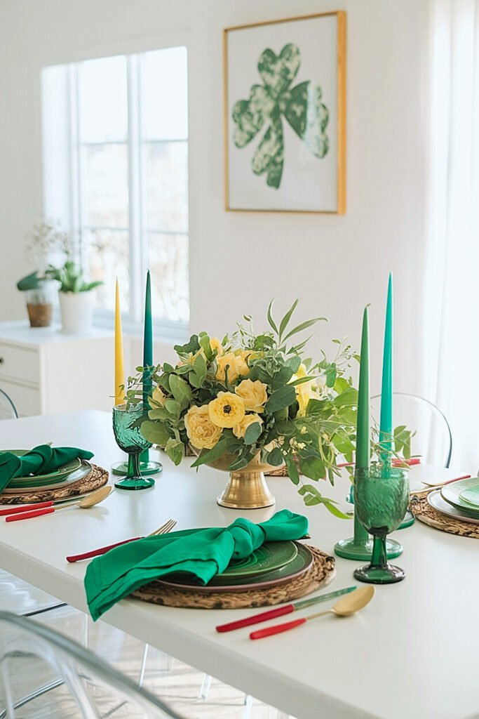
1. Match Green Undertones to Room Temperature Emerald’s cool blue undertones work beautifully in rooms with blue, gray, or white walls but can clash with warm terracotta or yellow spaces. Hunter green’s warmer brown undertones complement earth-toned rooms while potentially muddying in cool-colored spaces. Kelly green’s pure saturation adapts more broadly but demands neutral surroundings. Analyze your dining room’s existing colors before selecting your dominant green.
2. Consider Light Bulb Color Temperature Warm incandescent bulbs deepen all greens, making emerald richer and hunter darker, sometimes too dark. Cool LED lighting brightens kelly green while potentially making hunter look washed out. Test your chosen green under your actual dining room lighting before committing. Colors that looked perfect at the store may disappoint under your specific bulbs.
3. Scale Green Intensity to Room Size Large dining rooms handle abundant kelly green without overwhelm because square footage dilutes the brightness. Small dining spaces benefit from sophisticated emerald or moody hunter that don’t visually shrink the room further. Match green intensity to room proportions, the more square footage available, the more saturated green you can safely use.
4. Coordinate with Existing Wood Tones Dark wood dining tables pair beautifully with emerald and kelly green but can make hunter green disappear entirely. Light wood or white tables showcase all three greens effectively. The contrast between your table surface and chosen green determines whether your tablescape pops or fades into its surroundings.
5. Balance Green with Dining Chair Colors Your guests sit surrounded by chair fabric, making chair colors significant factors in overall green presentation. Neutral chairs allow green tablescapes to shine uninterrupted. Colored chairs demand careful coordination, complementary colors create harmony while similar shades may compete or clash awkwardly. Consider the entire visual field guests experience, not just the table surface.
Conclusion
Understanding emerald, hunter, and kelly green as distinct colors with individual personalities transforms Saint Patrick’s Day decorating from guesswork into intentional design. Each green serves specific purposes beautifully when deployed appropriately, emerald for sophisticated elegance, hunter for moody luxury, kelly for bright festivity.
The key lies in matching your green choice to your specific setting, lighting conditions, and desired atmosphere rather than defaulting to whatever green items you happen to own. Consider your room’s existing colors, your lighting source, and your formality level before selecting. And when mixing greens, establish clear hierarchy with one dominant shade supported by two accent tones. These principles create cohesive, impressive tablescapes that make guests remember your celebration long after March ends.
This website contains affiliate links, and some products are gifted by the brand to test. As an Amazon Associate, I earn from qualified purchases. Some of the content on this website was researched and created with the assistance of AI technology.