This website contains affiliate links, and some products are gifted by the brand to test. As an Amazon Associate, I earn from qualified purchases. Some of the content on this website was researched and created with the assistance of AI technology.
Key Takeaways
- Natural outdoor light creates harsh contrasts that make certain tulip colors wash out or oversaturate in photographs
- Mid-tone tulips in coral, peach, and lavender photograph more consistently than pure whites or deep purples
- Color pairings should create tonal harmony rather than high-contrast drama for cleaner outdoor photos
- Morning and late afternoon “golden hour” light renders tulip colors most accurately without blown-out highlights
- Background elements, table finishes, patio surfaces, greenery, dramatically affect how tulip colors read in photos
Choosing spring tulip colors that photograph well outdoors requires understanding how natural light behaves completely differently than indoor artificial lighting. I learned this frustration after styling what looked like a stunning outdoor tablescape in person, only to discover my photos showed washed-out whites, muddy purples, and colors that bore almost no resemblance to what my eyes actually saw. The camera doesn’t lie, but it definitely interprets outdoor light in ways that can sabotage even the most beautiful tulip arrangements.
The challenge stems from outdoor light’s intensity and variability. Midday sun creates harsh shadows and blown-out highlights that obliterate subtle color nuances, while overcast conditions flatten everything into dull sameness. Your tulip color choices need to account for these photographic realities if you’re documenting outdoor gatherings or creating content meant to be shared.
I’ve spent years testing which tulip colors consistently deliver in outdoor photos across different times of day, weather conditions, and background contexts. The patterns that emerged surprised me, some of my favorite in-person tulip shades became my least favorite photographically, while colors I’d overlooked proved to be absolute stars on camera.
Use this quick color guide to pick Spring Tulips palettes that look bold in photos without making your table feel crowded. It’s built for real life, food-first layouts, tidy greens, and easy indoor/outdoor swaps. Tap to expand on mobile, then hit “Copy checklist” to save your exact setup.
Spring Tulips Outdoor Photo Color Guide (Bold + Clean)
Pick colors that read sharp in sun, keep greens controlled, and protect “food space.” Use the checklists to repeat a palette across surfaces without clutter.
| Scene | Bold Spring Tulips palette (B) | Keep it clean | Photo checklist |
|---|---|---|---|
OutdoorDeck dining table
|
Bold White + Deep Purple + Coral/Orange
|
|
|
OutdoorPicnic table
|
Bold Red + Yellow + White
|
|
|
OutdoorSide tables
|
Bold Pot A: Purple • Pot B: Yellow • Bridge: White
|
|
|
IndoorKitchen counter
|
Bold Red + White + Deep Purple
|
|
|
Deck dining table (Outdoor)
White + Deep Purple + Coral/Orange
Cluster tight, base-only greens, leave 2 serving lanes.
3 colors max, matte container, repeat palette once nearby.
Picnic table (Outdoor)
Red + Yellow + White
Small footprint, greens hidden, open space for boards/plates.
Low centerpiece, one mini-repeat, remove extra colors nearby.
Side tables (Outdoor)
Pot A: Purple • Pot B: Yellow • Bridge: White
Two small pots, short stems, leave mug space.
Match pot style, repeat bridge color once, wipe surfaces.
Kitchen counter (Indoor)
Red + White + Deep Purple
Off-center, base-only greens, keep 1 prep zone clear.
Low crock, 3-color limit, optional mini-repeat on shelf.
How to Choose Spring Tulips Colors That Photograph Clean on Patio Tables 🌷
Patio tables present relatively controlled outdoor photography contexts since they’re typically near homes where you can manage backgrounds and leverage architectural elements to your advantage. The “clean” look in outdoor photos means colors that render true to life without color casts, maintain detail in both highlights and shadows, and create obvious separation from table surfaces and surroundings.
I’ve discovered that the patio table’s material dramatically influences which tulip colors photograph cleanly. Light wood surfaces can reflect warm tones onto petals, creating yellow or orange color casts that muddy your intended palette. Dark surfaces absorb light, potentially underexposing your tulips unless you compensate. Glass tables create reflections that can be beautiful or chaotic depending on tulip colors chosen.
My clean-photographing strategy starts with mid-tone tulips that sit in the middle of the lightness spectrum. Pure white tulips blow out easily in bright sun, losing all petal detail and rendering as featureless blobs. Deep burgundies or purples photograph nearly black in shadows, losing their richness. But tulips in that middle range, soft corals, peachy pinks, buttery yellows, medium lavenders, hold detail beautifully across varying light conditions.
I also consider how tulip colors interact with typical patio elements. Most patios feature neutral grays, tans, or natural wood tones, which means your tulip colors need enough saturation to register clearly against these subdued backgrounds without oversaturating on camera. I test this by taking quick phone photos before committing to arrangements, if the tulips disappear into the background or scream with unnatural intensity, I adjust my color selection.
The time-of-day factor can’t be overstated. I schedule outdoor patio photography for early morning or late afternoon when light angles create dimension without harshness. Midday overhead sun flattens everything, eliminating the shadow play that gives photos depth. Those golden hour times render tulip colors with warmth and accuracy that midday simply can’t match, and for additional insights on outdoor tulip styling across different table contexts, there are excellent techniques worth exploring, share this with anyone who loves photographing outdoor gatherings!
These foundational principles apply across outdoor settings, and the color pairing strategies ahead address how to combine multiple tulip shades without creating photographic chaos.
Ideas for Spring Tulips Color Pairings That Don’t Glare on Outdoor Dining Tables
Glare happens when contrasting colors create visual tension that cameras amplify into uncomfortable clashes. What looks vibrant and energetic to your eye can photograph as jarring and unpleasant. I approach color pairings with tonal harmony as the guiding principle, colors should relate through shared undertones even when their hues differ.
The outdoor context intensifies color interactions because natural light doesn’t soften contrasts the way indoor lighting can. Bright sun exaggerates differences between paired colors, making subtle mismatches glaringly obvious in photos.
1. Coral and Cream Pairing
Combine coral tulips like ‘Apricot Beauty’ with cream varieties such as ‘Maureen’ for warmth without harshness. The colors share peachy undertones that create cohesion, while their lightness values sit close enough to prevent jarring contrast. This pairing photographs beautifully in bright sun because neither color oversaturates, the coral stays soft and the cream maintains detail without blowing out. The overall effect reads as gentle and spring-appropriate, perfect for outdoor dining tables where you want elegance without aggression.
2. Soft Pink and Lavender Combination
Pair blush pink tulips with medium lavender for cool-toned harmony that photographs as sophisticated rather than sweet. Both colors sit in similar lightness ranges, preventing the high-contrast issues that plague darker/lighter pairings. The pink’s slight warmth plays beautifully against lavender’s coolness without fighting, creating dimensional interest that cameras capture well. This combination works particularly well on gray or white patio furniture where the soft colors pop gently without overwhelming neutral backgrounds.
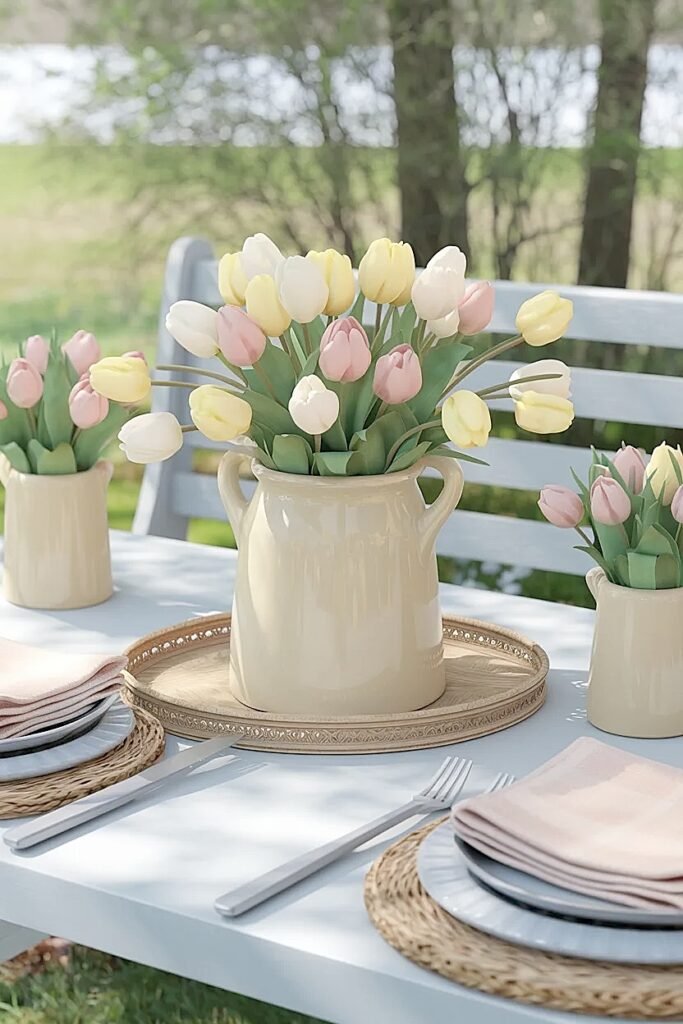
3. Butter Yellow and White Mix
Mix butter yellow tulips, not bright lemon, with soft white for classic pairing that stays clean in photos. The yellow’s muted tone prevents it from screaming against white, while the white provides rest points that let the yellow breathe. I use roughly 60% yellow to 40% white for balance that favors warmth without losing the white’s brightening effect. This pairing handles varying light conditions well, maintaining clarity in both harsh sun and softer overcast situations.
4. Monochromatic Pink Gradient
Layer three shades of pink tulips from pale blush to medium rose for tonal progression that photographs as intentional rather than random. The shared pink family creates automatic harmony while the gradual deepening adds interest without contrast shock. Cameras love monochromatic schemes because they eliminate color clashing entirely, focusing attention on form and light instead. This approach works brilliantly when you want substantial color presence that still reads as restrained and sophisticated.
5. Peach and Pale Yellow Blend
Combine peachy-coral tulips with pale yellow for warm harmony that evokes sunrise. Both colors share orange undertones that create seamless blending, while their similar saturation levels prevent either from dominating. This pairing photographs particularly well in morning light when the sun’s warmth echoes the flowers’ tones, creating cohesive compositions where natural light and tulip colors feel intentionally coordinated. The overall warmth reads as cheerful without veering into garish territory.
These pairing strategies eliminate the guesswork from color combining, and the deck table guidance ahead addresses how weathered wood surfaces influence color choices.
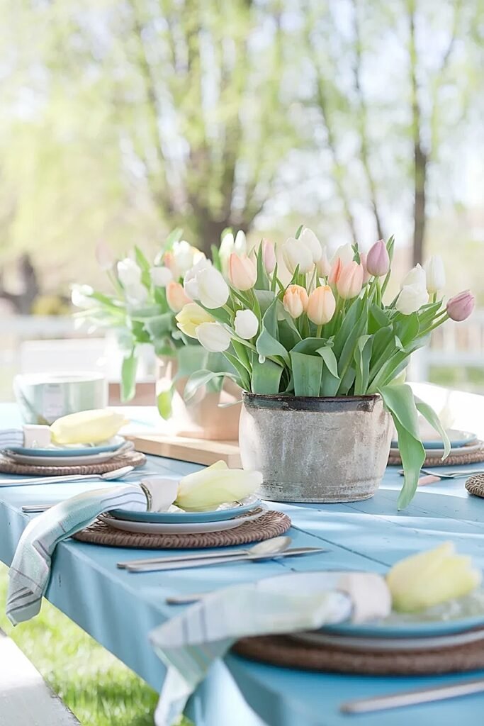
How to Choose Spring Tulips Colors That Look Bold on a Deck Dining Table 🌷
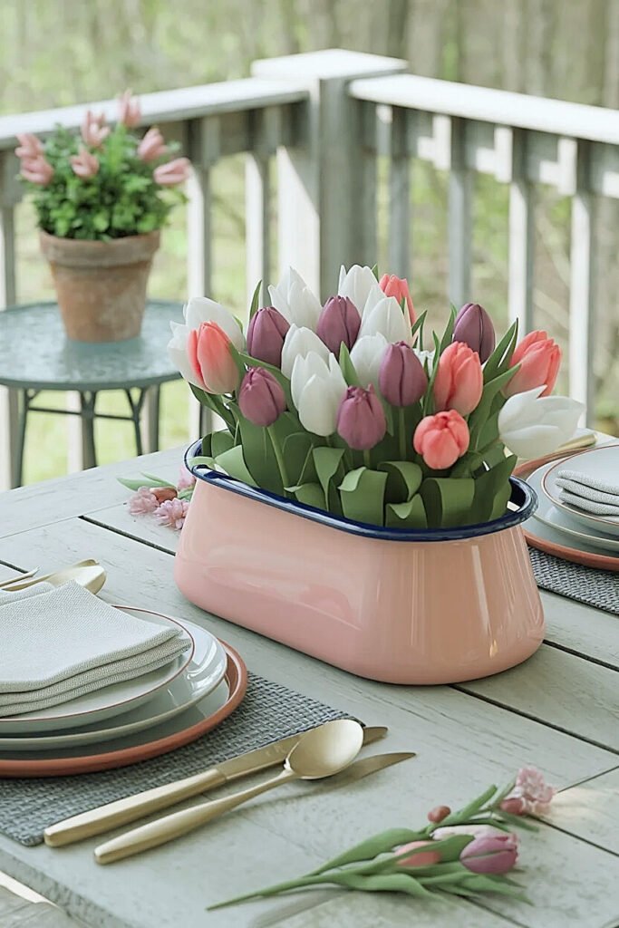
Deck tables almost always feature wood surfaces, sometimes natural, often stained in grays, browns, or reds. This woody context creates warm backgrounds that can either enhance or muddy your tulip colors depending on what you choose. Bold doesn’t mean garish; it means colors that command attention and photograph with clarity against wood’s textured, often busy surface.
I’ve found that deck photography requires more saturated tulips than other outdoor contexts because wood grain creates visual noise that competes with flowers. Soft pastels can disappear against weathered wood, reading as washed out or insignificant. Bold choices cut through that background complexity.
My deck strategy favors tulips in saturated, clear colors without muddiness. Think bright coral, vivid purple, clean white, rich pink, colors with punch that don’t get lost against wood tones. I avoid anything dusty or grayed, as these read as tired against weathered decking rather than intentionally muted.
The wood’s color matters enormously. Gray-stained decks provide neutral backgrounds where almost any bold tulip shines. Natural cedar or redwood decks bring warm orange undertones that can clash with cool-toned purples or clash with warm orangey-reds. I test color compatibility by holding tulip samples against the actual deck surface before buying, if the combination feels off in person, it’ll photograph worse.
I also consider deck furniture, which often introduces additional wood tones or painted finishes that affect the overall color story. A teal-painted Adirondack chair suggests I might echo that coolness in lavender tulips, while natural teak furniture calls for warmer coral or peach tones that harmonize with the wood’s honey color.
Light conditions on decks can be tricky, many decks include partial shade from house overhangs or trees, creating dappled light that changes throughout the day. I choose bold tulip colors that maintain their identity even in shadows, avoiding subtle shades that need perfect light to show their nuance.
These deck-specific considerations recognize how wood surfaces and variable shade patterns demand different color strategies, and the outdoor bench approaches ahead address rustic contexts that invite casual color choices.
Ways to Choose Spring Tulips Colors That Pop Gently on Outdoor Bench Tables
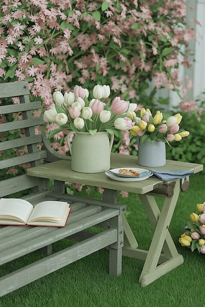
Outdoor benches carry rustic, casual associations that call for tulip colors balancing visibility with restraint. “Pop gently” might sound contradictory, but it perfectly describes colors that catch attention without shouting, they register clearly in photos without overwhelming the composition’s overall softness.
Bench contexts typically involve weathered wood, chippy paint, or raw metal surfaces that create character-rich backgrounds. Your tulip colors need enough presence to stand out against these textured surfaces while maintaining the relaxed vibe benches naturally project.
1. Single Saturated Color Against Neutral Bench
Choose one saturated tulip color, maybe deep coral or rich lavender, displayed against a neutral white or gray painted bench. The monochromatic tulip approach keeps things simple while the saturated color ensures photographic visibility. I use fifteen to twenty tulips in identical shades, creating mass that photographs as intentional color statement rather than scattered accents. The neutral bench provides clean backdrop that lets the tulip color shine without competition. This combination photographs cleanly because the color story stays controlled, one bold tulip shade against one neutral surface creates clarity cameras love.
2. Warm Tulips on Cool-Toned Metal Bench
Pair warm tulip colors, peachy pinks, coral oranges, butter yellows, with cool-toned metal benches in galvanized silver or painted blue-gray. The temperature contrast creates pop through opposition without requiring high saturation. I favor mid-tone warm tulips rather than neon brights, achieving gentle pop through complementary temperature relationships. Metal’s smooth, reflective surface provides distinct visual texture against tulips’ organic softness, adding dimensional interest that elevates photographs beyond flat color studies. The warm/cool dynamic photographs as sophisticated color theory rather than random selection.
3. Gradient Arrangement from Light to Dark
Create pop through tonal progression by arranging tulips in gradients from pale to saturated within one color family. Start with near-white pink on one end, progressing through blush to medium rose to deep pink. The gradient creates visual journey that cameras capture beautifully, showing intentional design rather than random color mixing. This works particularly well on long benches where the color progression can unfold across the length. The gentle aspect comes from keeping everything within one color family, no jarring shifts between unrelated hues, while pop emerges through the deliberate tonal movement.
These bench-specific approaches leverage rustic contexts while maintaining photographic clarity, and the buffet table strategies ahead prioritize preventing visual chaos when multiple food and flower elements compete.
What Are the Best Spring Tulips Colors for Outdoor Buffet Tables Without Color Chaos?
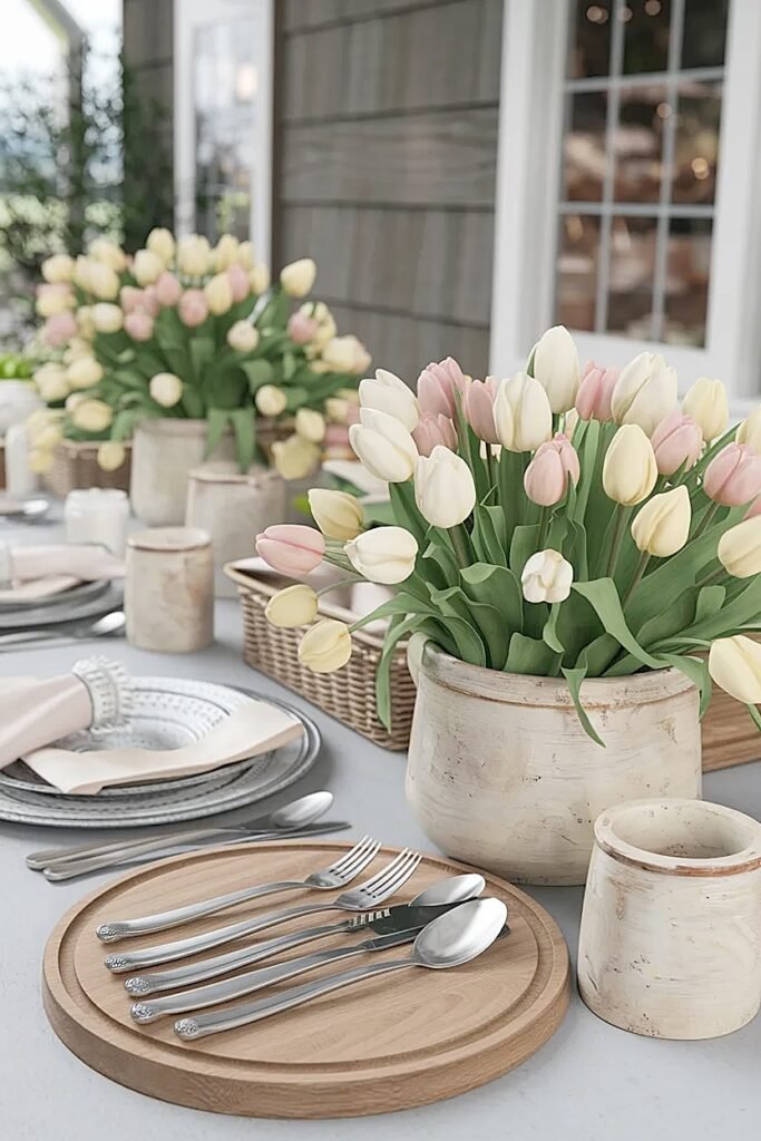
Outdoor buffet tables present maximum chaos potential, you’ve got food in various colors, serving dishes, linens, and decorative elements all competing for visual attention. Adding tulips to this crowded landscape can either enhance the presentation or push it into overwhelming territory. The photographic challenge involves creating cohesive compositions where tulips contribute beauty without adding noise.
My buffet approach prioritizes restraint and coordination. I choose tulip colors that either echo or complement the food’s natural palette rather than introducing completely new color stories that fragment the overall composition.
1. Pure White Tulips for Universal Coordination
White tulips coordinate with literally any food color or serving dish finish, providing neutral floral presence that enhances without competing. I position white tulips at buffet ends or corners where they frame food displays rather than interrupting them. White photographs cleanly against the typical outdoor buffet backdrop, wood tables, greenery beyond, while adding brightness that lifts the entire presentation. The universality prevents color clashing regardless of menu choices or dish selections.
2. Soft Yellow for Warm Food Harmony
Butter yellow tulips harmonize beautifully with warm-toned foods, golden breads, roasted vegetables, cheeses. The yellow echoes food colors without matching exactly, creating cohesive warmth across the buffet. I avoid bright lemon yellows that might clash with certain foods, instead choosing muted buttery tones that blend into warm palettes. This color photographs particularly well in outdoor buffet contexts because it reads as sunshine and spring without demanding center stage from the food itself.
3. Lavender for Cool Contrast Without Chaos
Medium lavender tulips provide gentle cool contrast against typical buffet foods without creating jarring opposition. The color sits firmly in “clearly not food” territory, preventing any visual confusion while adding elegant sophistication. Lavender photographs beautifully against green salads, white platters, and wooden serving boards, all common buffet elements. The soft saturation prevents the color from screaming, instead offering refined accent that elevates rather than overwhelms the food presentation.
4. Coral for Outdoor Warmth and Energy
Coral tulips bring vibrant energy appropriate for outdoor entertaining while maintaining enough softness to avoid overwhelming buffets. The color reads as celebratory and spring-forward without the aggressive intensity of pure orange or hot pink. Coral coordinates particularly well with outdoor buffets featuring fruits, pastries, or Mediterranean-inspired dishes. It photographs with warmth and life, adding visual interest that supports rather than competes with food as the buffet’s primary focus.
5. Monochromatic Cream-to-Tan Gradient
Layer cream, ivory, and pale tan tulips for subtle monochromatic presence that adds dimension without color chaos. This neutral approach provides visual interest through tonal variation while completely avoiding color competition with food. The gradient photographs as intentional sophistication, showing restraint and design awareness. This works phenomenally when your buffet already features bold food colors, the neutral tulips provide elegant framing without adding to the existing color complexity.
These buffet-focused colors recognize that food must remain the star while tulips play supporting roles, and the kitchen counter guidance ahead addresses how indoor/outdoor threshold spaces affect color perception.
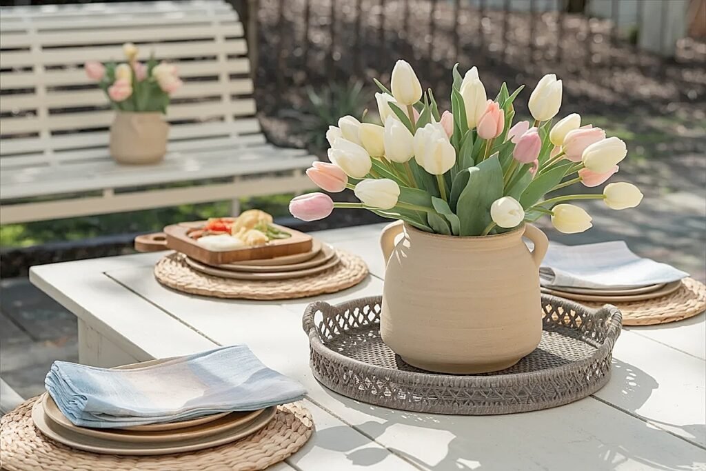
How to Choose Spring Tulips Colors That Pop on a Kitchen Counter Without Looking Loud 🌷
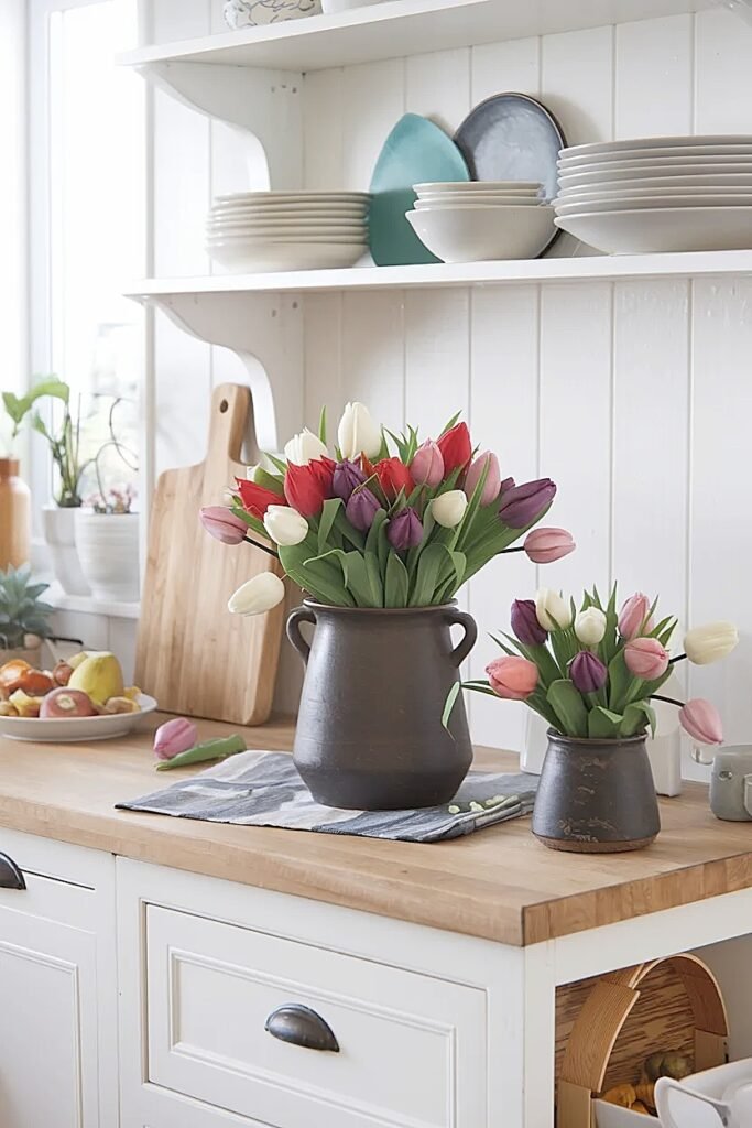
Kitchen counters visible from outdoor spaces through open doors or windows create unique photographic contexts where indoor and outdoor light mix. The transition zone demands tulip colors that work in both lighting conditions, they need to photograph well in softer indoor light while also handling the bright outdoor light that streams through openings.
I treat these threshold locations as requiring extra versatility in color selection. Tulips that only work in controlled indoor light or only succeed in bright outdoor sun won’t photograph consistently as light conditions shift throughout the day.
My counter strategy favors tulips in the coral-to-peach-to-pink range because these colors handle mixed lighting beautifully. They’ve got enough warmth to glow under indoor lighting but sufficient saturation to hold their own when outdoor light floods the space. I avoid both very pale colors that need perfect light and very deep colors that go muddy in shadows.
The counter’s material influences color choices just as patio tables do. White quartz or marble provides clean backgrounds where almost any tulip color pops cleanly. Darker granite or butcher block requires more saturated tulips to stand out. I photograph test arrangements at different times of day to see how changing light affects color rendering, morning sun through east windows creates different conditions than afternoon light from the west.
I also consider what’s visible through windows behind the counter. If greenery shows through, I choose tulip colors that either harmonize with or clearly contrast against that green rather than fighting it awkwardly. Pink, coral, and lavender all play beautifully against green backgrounds, creating natural color relationships that photograph as intentional.
The “pop without loud” balance comes from choosing clear, medium-saturated colors rather than muted or neon extremes. Think vibrant but not garish, colors with enough intensity to register clearly in photos without overwhelming the kitchen’s overall aesthetic or shouting in mixed lighting conditions.
These counter-specific considerations bridge indoor and outdoor photography challenges, and the color blocking techniques ahead explore how strategic color placement creates photographic interest.
Ideas for Spring Tulips Color Blocking on Outdoor Side Tables
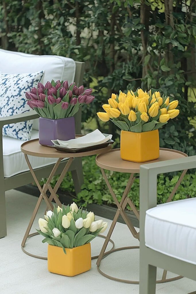
Color blocking arranges distinct color zones rather than mixing colors throughout an arrangement. This technique photographs exceptionally well outdoors because it creates clear, graphic compositions that cameras capture decisively. The separation between color blocks prevents the muddiness that can happen when colors blend together under bright natural light.
Side tables offer perfect canvases for color blocking because their smaller scale suits bold graphic approaches that might overwhelm larger surfaces.
1. Half-and-Half Color Split
Divide your arrangement into two equal sections of contrasting colors, maybe soft pink on one side and white on the other. The clean split creates striking visual that photographs as intentional design choice rather than random color mixing. I use a physical divider like floral foam cut in half or two separate vessels positioned side-by-side within one basket. Each color mass should contain at least seven stems for sufficient presence. This graphic approach works particularly well against neutral backgrounds where the color division reads clearly.
2. Three-Color Vertical Stripe Blocking
Create three vertical color zones using tulips in related tones, perhaps pale yellow, medium coral, and soft pink arranged in distinct stripes. The vertical orientation adds height interest while the color progression creates visual journey across the arrangement. I ensure each color zone contains enough stems (five to seven) that it registers as intentional block rather than scattered accent. This technique photographs beautifully because the color transitions happen at clear boundaries rather than blending gradually, giving cameras obvious structure to capture.
3. Outer Ring, Inner Core Color Blocking
Arrange one color in a ring around the arrangement’s perimeter with a contrasting color filling the center core. This creates target-like pattern that photographs as sophisticated geometry. I might use white tulips forming the outer ring with lavender filling the center, or coral ringing a cream core. The circular color blocking reads clearly from all viewing angles, important for side tables approached from multiple directions. The technique works best with at least twenty total stems to create sufficient mass in both zones.
4. Diagonal Color Divide
Create a diagonal line dividing the arrangement into two color zones, adding dynamic energy to the composition. The angled division feels more interesting than straight horizontal or vertical splits while remaining clear enough for cameras to capture decisively. I use roughly 60/40 proportions rather than perfect halves, creating asymmetric balance that feels more organic. This approach photographs particularly well when the diagonal angles toward an interesting background element, creating compositional flow that guides the viewer’s eye.
5. Checkerboard Color Pattern
Alternate individual tulips or small clusters in two colors throughout the arrangement, creating checkerboard effect. This requires more stems and careful placement, maybe twenty-four tulips total with every other one in the alternate color. The regular pattern photographs as intentional design rather than random mixing, while the close alternation creates visual texture that adds sophistication. This technique works best with two colors of similar lightness values to prevent the pattern from becoming too high-contrast and busy.
These color blocking approaches provide graphic clarity that outdoor photography loves, and the porch welcome table strategies ahead address first-impression contexts that demand immediate visual impact.
Ways to Choose Spring Tulips Colors for a Porch Bench Welcome Table
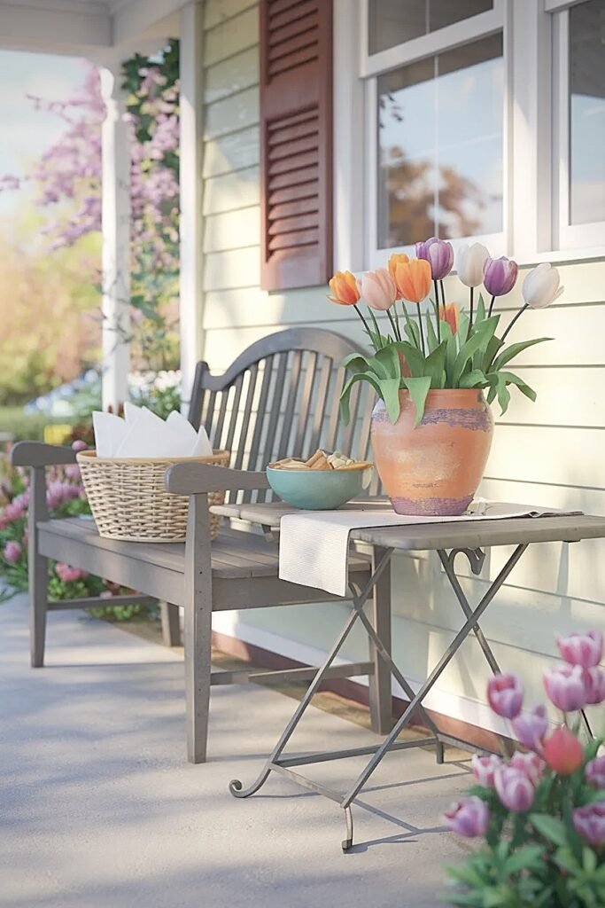
Porch welcome tables greet every visitor before they’ve entered your home, making them high-stakes photographic subjects. The colors you choose communicate mood and personality instantly, and they need to photograph well for social media shares, documentation, or simply capturing your porch’s seasonal evolution.
The porch context typically includes architectural elements, siding, trim, door colors, that constrain or inform tulip color choices. I never select tulip colors for porch tables without considering the backdrop they’ll photograph against.
1. Echo Architectural Accent Colors
Choose tulip colors that echo your home’s accent colors, maybe coral tulips if your door is painted coral, or soft blue-toned lavender if shutters are gray-blue. This creates cohesive relationship between flowers and architecture that photographs as intentional design coordination. I don’t demand exact color matches, instead seeking harmonious relationships where tulip and architectural colors clearly relate. The coordination signals thoughtful attention to detail that elevates photographs beyond random seasonal decoration into curated presentation.
2. Classic White for Universal Welcome
White tulips provide clean, universally welcoming presence that photographs beautifully against any architectural color or material. The simplicity reads as elegant rather than boring, while white’s brightness draws eyes to the welcome table immediately. I use generous quantities, twenty to thirty stems, because white’s impact comes from mass rather than color saturation. White also handles varying light conditions well, maintaining detail in both bright sun and porch shadows where colored tulips might go muddy.
3. Vibrant Single Color for Bold Statement
Choose one saturated color, deep coral, rich purple, or bright yellow, displayed in abundance for confident welcome statement. The monochromatic approach keeps things simple while the saturated color ensures the arrangement photographs with impact from the street or driveway. I select colors with enough intensity to read clearly at distance, since porch welcome tables often get photographed from farther away than other arrangements. The bold choice signals personality and confidence that translates into memorable first impressions.
4. Seasonal Color Progression Strategy
Select tulip colors that progress through spring, starting with pastels in early March, moving to brighter tones by April, finishing with saturated colors in late spring. This strategy keeps your porch welcome table photographically fresh across the entire season rather than static. I document the progression, creating photo series that shows seasonal evolution rather than single moment. Each color change signals attention and care, making the welcome table an ongoing project rather than set-and-forget decoration.
5. Complementary Color Pairing for Visual Interest
Pair complementary colors, purple and yellow, or coral and pale blue, for visual interest that photographs as sophisticated color theory. The complementary relationship creates vibration that draws attention without relying on high saturation or masses of flowers. I use roughly 70/30 proportions rather than equal amounts, letting one color dominate while the other provides accent. This prevents the pairing from becoming too busy or competitive, maintaining welcome table’s role as greeting element rather than demanding all attention.
These welcome table strategies recognize that first impressions matter both in person and photographically, creating opportunities for documentation that captures your home’s seasonal character.
Conclusion
Choosing spring tulip colors that photograph well outdoors requires thinking beyond what looks good to your eye in the moment. Cameras interpret light, color relationships, and backgrounds differently than human vision does, demanding extra consideration about saturation, tonal harmony, and context. The colors that consistently deliver in my outdoor photography fall in that mid-tone range, saturated enough to hold detail in bright sun but not so deep they go muddy in shadows. Start by testing your tulip color choices at different times of day with quick phone photos before committing to full arrangements. Notice what washes out, what oversaturates, and what maintains its beauty across varying conditions. These observations will guide you toward colors that work reliably in your specific outdoor contexts, lighting situations, and photographic goals.
This website contains affiliate links, and some products are gifted by the brand to test. As an Amazon Associate, I earn from qualified purchases. Some of the content on this website was researched and created with the assistance of AI technology.