This website contains affiliate links, and some products are gifted by the brand to test. As an Amazon Associate, I earn from qualified purchases. Some of the content on this website was researched and created with the assistance of AI technology.
Key Takeaways
- Crocks provide rustic vessels that complement tulips’ cottage garden aesthetic while anchoring arrangements securely
- Counter placement requires balancing visual appeal with functional kitchen workflow zones
- Color selection should harmonize with existing kitchen finishes, cabinetry, and hardware tones
- Farmhouse pastels create softer tulip displays than saturated springtime brights
- Strategic positioning near prep zones adds organic beauty without interfering with cooking activities
Styling spring tulips in a crock on your kitchen counter transforms your most-used space into something that genuinely lifts your mood every single time you brew coffee or chop vegetables. I started doing this five years ago after realizing my kitchen, the room where I actually spend most of my waking home hours, had zero fresh flowers while my rarely-used dining room got weekly arrangements. That priority seemed backwards.
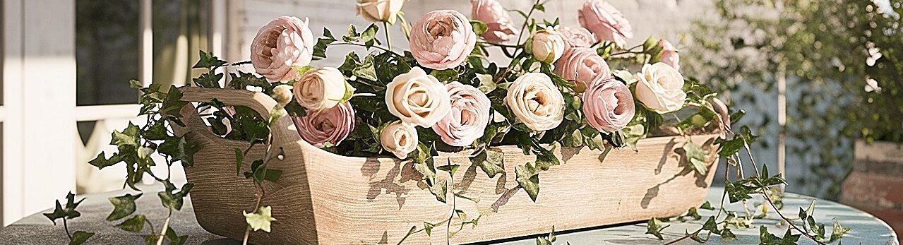
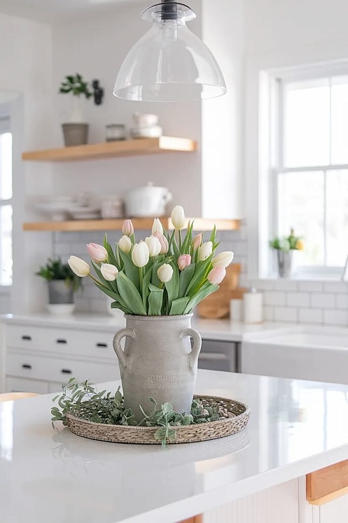
Crocks solve problems that traditional vases create in kitchens. They’re stable enough to withstand the inevitable elbow bumps and reaching-across moments that happen constantly at counters. Their wide mouths accommodate tulips’ tendency to continue growing and shifting after cutting, and the opaque ceramic hides stems and water that might look messy in clear glass. The farmhouse aesthetic of stoneware crocks feels authentically at home in kitchens, these vessels were literally designed for food preparation and storage, so they belong on counters in ways that formal crystal never quite achieves. Getting the styling right means understanding how tulips behave, where counters get used most intensely, and how color choices either enhance or fight your kitchen’s existing palette.
Not sure where your Spring Tulips crock should go—or how big it should be? This quick guide makes it easy. Pick your counter type, your goal (cozy, clean, or hosting), and get a ready-to-copy setup plan. It’s simple, practical, and designed for real kitchens.
Spring Tulips Crock Counter Planner (Cozy + Farmhouse)
Pick your counter situation → copy the checklist → build a tulip setup that stays practical.
Where it goes
Back corner of the kitchen counter, not on the front edge. Leave a “working lane” in front.
Tulip palette
Mostly creamy white + 2–4 blush stems. Calm colors make the counter feel bigger.
Container + scale
Matte crock. Short and sturdy. Arrangement stays below eye level.
Keep it tidy
Tuck greens tight. Trim any leaf that sticks out past the crock’s widest point.
Where it goes
Behind the cutting board, angled slightly to one side, so the center stays open.
Tulip palette
White + pale peach for warmth. Greens kept tight so nothing crowds the board.
Container + scale
Medium crock. Low profile. Wide footprint so it feels stable and intentional.
Keep it tidy
Use a small bowl + folded linen nearby. Looks styled, but it’s still a working counter.
Where it goes
Centered on the island, set back just enough to keep a clear serving lane.
Tulip palette
White + soft pink + a hint of pale yellow. Bright, but still cozy.
Container + scale
Short crock. Wider arrangement. Nothing tall that blocks sightlines.
Keep it tidy
Pair with plates + fruit bowl. Looks lived-in and ready for guests.
Where it goes
Back third of the counter. Leave a clear “snack zone” near the front.
Tulip palette
White base + 3–5 blush stems. Clean + welcoming without shouting.
Container + scale
Medium crock. Short height. Wide base so it feels stable and neat.
Keep it tidy
Tray your napkins + plates. Tulips sit beside it, not in the way.
Copy buttons: “Copy checklist” grabs the full plan. “Copy short” grabs a quick version.
How to Style Spring Tulips in a Crock on the Kitchen Counter
Kitchen counters aren’t neutral decorating territory, they’re active work surfaces where function absolutely trumps form. I learned this when my first beautiful tulip arrangement got shoved aside three times in one evening because it occupied prime real estate next to the stove. Your crock placement needs to respect the kitchen’s operational demands while still delivering that spring beauty you’re after.
I start by identifying my counter’s “dead zones”, those spots that rarely see action during cooking or cleanup. That back corner near the coffeepot works beautifully because nothing happens there except the morning coffee routine. The space between the sink and the wall often sits empty despite being visible from the main living areas. These neglected spots become perfect tulip territory.
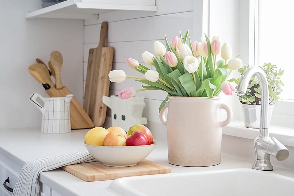
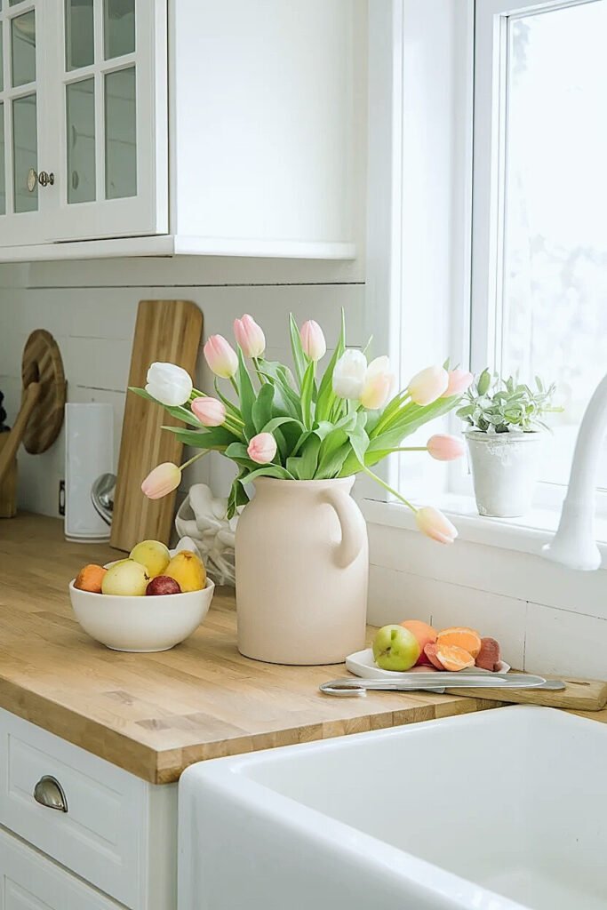
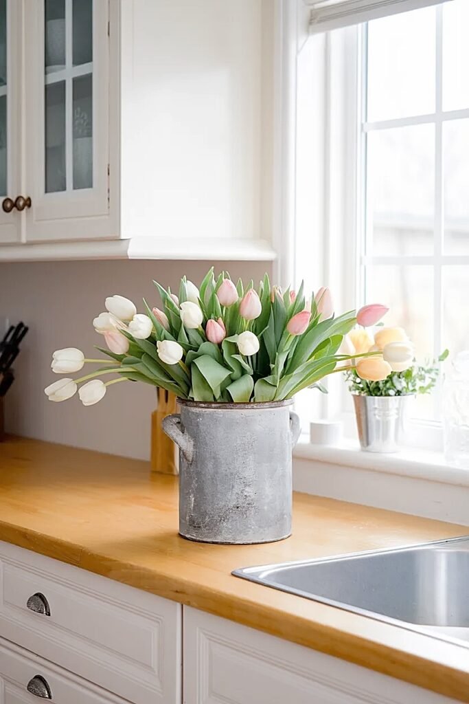
The crock itself matters more than you’d think. I favor vessels between eight and ten inches tall, tall enough to support tulips’ long stems but not so towering they block sightlines or create visual barriers in an open-concept space. Width matters too; a six-inch diameter provides stability without claiming excessive counter frontage. I’ve collected probably a dozen crocks over the years from antique stores and flea markets, choosing cream, white, and soft gray finishes that work across seasons.
Filling technique influences longevity dramatically. I cut tulip stems at sharp angles, remove any leaves that would sit below the waterline, and fill the crock with cool water. Tulips drink heavily, so I check water levels daily. The arrangement itself should feel abundant but not crammed, maybe nine to twelve stems depending on bloom size. I let some tulips stand taller while others nestle lower, creating natural height variation rather than that forced, uniform dome shape.
The counter location determines viewing angles. A crock positioned at a peninsula gets seen from multiple sides, demanding a rounded arrangement. Against a backsplash, you can build more of a one-sided display with taller stems at the back. I test my placement by walking through typical kitchen pathways, from refrigerator to stove, from sink to table, ensuring the tulips enhance these routes without obstructing them. When exploring complementary seasonal decorating with natural elements, you’ll find principles that translate beautifully across different flowers and settings, share this with anyone who loves bringing fresh elements into their home!
The foundational placement strategies inform every subsequent styling decision, and the color selection guidance ahead addresses how tulip hues interact with your kitchen’s existing palette.
What Are the Best Spring Tulips Colors for a Cozy Farmhouse Kitchen Counter?
Farmhouse kitchens typically feature neutral bases, white shaker cabinets, butcher block counters, subway tile backsplashes, which means your tulip color choice either harmonizes with this restrained palette or fights against it. I’ve experimented extensively with various tulip colors, and certain hues consistently deliver that cozy farmhouse feeling while others read as jarring or too contemporary.
The key lies in choosing colors with enough saturation to register as intentional but enough softness to feel welcoming rather than aggressive. Farmhouse aesthetics celebrate comfort over drama, so your tulips should enhance that gentle, lived-in quality.
1. Soft Blush Pink Tulips
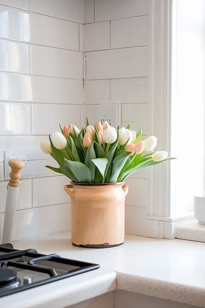
Blush pink brings warmth without the valentine intensity of true red or hot pink. These tulips read as romantic and gentle, complementing cream cabinets and brass hardware beautifully. I gravitate toward varieties like ‘Angelique’ with their doubled petals that create extra fullness. The peachy-pink undertones work particularly well in kitchens with warm wood tones or copper accents. As the blooms age, they fade to even paler shades that extend their visual appeal rather than looking tired. This color choice feels inherently feminine without being precious, creating inviting energy perfect for kitchens where people naturally gather.
2. Creamy White with Yellow Centers
Pure white tulips can feel stark, but cream varieties with buttery yellow centers add just enough warmth to feel cozy. I love how these catch morning light streaming through kitchen windows, almost glowing from within. The neutral color works universally, it won’t clash with anything in your kitchen palette. Varieties like ‘Maureen’ provide that classic tulip shape with substantial size. These become workhorses in farmhouse kitchens because they complement every season, every holiday, every mood. The yellow centers prevent the sterile hospital feeling that pure white sometimes creates, adding organic warmth that feels genuinely springlike.
3. Lavender Purple Tulips
Lavender brings unexpected sophistication to farmhouse kitchens while maintaining softness that prevents overpowering the space. I choose mid-toned lavenders rather than deep purples, something like ‘Purple Prince’ delivers color without darkness. These tulips pair beautifully with gray-painted islands or stainless appliances, creating color harmony through cool-toned alignment. The purple registers as definitively springtime, evoking lilacs and early garden blooms. In crocks, lavender tulips create focal points that draw eyes without shouting for attention, providing exactly the right balance for cozy farmhouse aesthetics.
4. Soft Coral-Peach Tulips
Coral-peach occupies that perfect zone between pink and orange, delivering warmth and cheerfulness without veering into tropical brightness. Varieties like ‘Apricot Beauty’ provide this color beautifully, with blooms that photograph gorgeously in natural kitchen light. These tulips complement both warm wood tones and cool marble surfaces, making them incredibly versatile. The color feels optimistic and energizing, exactly what you want when facing morning kitchen routines. As they age, coral tulips often develop deeper salmon tones that add richness without losing their essential warmth. This color choice works year-round in farmhouse kitchens but feels especially appropriate for spring.
5. Butter Yellow Tulips
Yellow brings sunshine into kitchens regardless of weather conditions outside. I prefer softer butter yellows over neon brights, something like ‘Cream Upstar’ or ‘Yokohama’ delivers cheerful color without overwhelming. These tulips create instant happiness, scientifically proven to elevate mood through their association with light and warmth. In white or cream crocks, yellow tulips pop beautifully while maintaining farmhouse restraint. They complement both traditional and modern farmhouse kitchens, working with everything from vintage linens to contemporary pendants. Yellow also hides less gracefully as it ages compared to other colors, so I replace these arrangements slightly more frequently.
These color selections establish visual harmony within farmhouse spaces, and the coordination strategies ahead explore how counter displays relate to other tulip arrangements in your home.
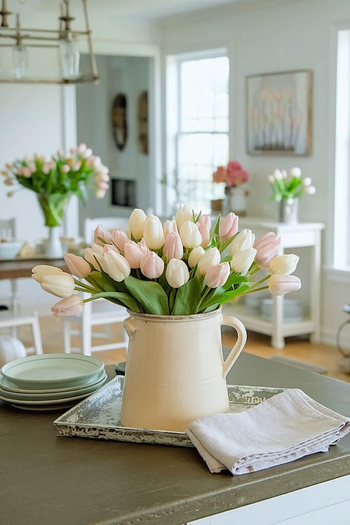
How to Match Spring Tulips on the Counter with a Dining Table Tulip Display
Creating visual conversation between kitchen counter tulips and dining table arrangements requires intentionality without forcing exact duplication. I think of these as related statements, they share vocabulary but express different ideas based on their distinct functions and viewing contexts.
The counter arrangement operates as daily companion, seen constantly during routine activities. The dining table display functions more formally, showcased during meals and entertaining. This functional difference suggests your counter crock should feel slightly more casual while the dining table earns more elaborate treatment.
Color provides the easiest connection point. If my counter crock features blush pink tulips, I might use those same tulips on the dining table but add white or cream varieties for tonal complexity. The shared pink creates obvious relationship while the additional colors prevent boring repetition. Alternatively, I’ll flip the ratio, maybe the counter gets mixed blush and white while the table showcases predominantly blush with just a few white accents.
Vessel choice reinforces the casual-formal distinction. My counter crock stays rustic and simple, while the dining table might feature a more refined ceramic pitcher or ironstone tureen. The materials relate, both are ceramic, both read as farmhouse, but the finishes differentiate their purposes. This subtle hierarchy feels appropriate rather than creating identical twin arrangements that lack individual character.
Scale matters tremendously. Counter crocks need restraint because they share space with functional kitchen items, the coffee maker, knife block, fruit bowl. I keep counter arrangements compact, maybe nine stems maximum. The dining table enjoys more spatial generosity, allowing for larger arrangements with fifteen to twenty tulips that create substantial presence. This size difference prevents the counter from competing with or diminishing the dining table’s impact.
I also consider height relationships. If my counter tulips stand twelve inches tall in their crock, I might build the dining table arrangement to fifteen or eighteen inches, establishing subtle hierarchy through vertical variation. The counter display doesn’t need to be dwarfed, but the dining table arrangement should feel more significant as befits its more formal setting.
These coordination principles create cohesive home styling without demanding exact matching, and the corner placement strategies ahead address specific counter geography challenges.
What Are the Best Spring Tulips “Counter Corner” Placements in a Cozy Kitchen?
Corner spaces on kitchen counters present both opportunities and constraints. They’re often underutilized, making them prime real estate for decorative elements, but they also create viewing angle challenges since corners get approached from multiple directions. Tulip crocks in corners need to look intentional rather than shoved aside.
I’ve identified corner placement strategies that maximize these spaces’ potential while respecting their geometric limitations and multi-directional visibility requirements.
1. Back Corner Against Backsplash and Wall Junction
Position your tulip crock in the absolute back corner where counter meets both backsplash and perpendicular wall. This anchors the arrangement in the kitchen’s most protected zone, completely removed from active workspace. The crock sits tight against both walls, creating a nested effect that feels secure and intentional. I arrange tulips facing outward toward the room, building fuller density on the room-facing side while allowing stems to sit closer together on the wall-facing backs. This placement works brilliantly near sinks or at counter ends, creating decorative punctuation without claiming functional space.
2. Diagonal Corner Orientation with Outward Presentation
Angle the crock diagonally in the corner rather than pushing it straight back against walls. Position it so the arrangement’s front faces diagonally outward into the room, creating a welcoming presentation visible from both adjoining counter runs. This diagonal orientation maximizes viewing angles, people approaching from either direction see the tulips attractively rather than viewing them from awkward side angles. I leave about four inches of space between the crock and corner walls, preventing the cramped appearance of arrangements jammed into tight spots. This technique suits larger kitchens where corner space isn’t desperately needed for appliances.
3. Elevated Corner Placement Using Small Riser or Cutting Board
Raise the tulip crock above counter level using a small wooden riser, vintage cutting board, or stack of coordinating cookbooks positioned in the corner. The elevation creates visual interest through height variation while the corner location keeps the raised platform from interfering with workflow. I use risers about two to three inches tall, enough to create distinction without precariousness. The platform itself becomes part of the display, a beautiful cutting board or vintage books add farmhouse character that complements the tulips. This approach works particularly well in corners that might otherwise feel like dead zones.
These corner-specific placements transform underutilized spaces into intentional decorative moments, and the prep zone pairing concepts ahead integrate tulips into active cooking areas thoughtfully.
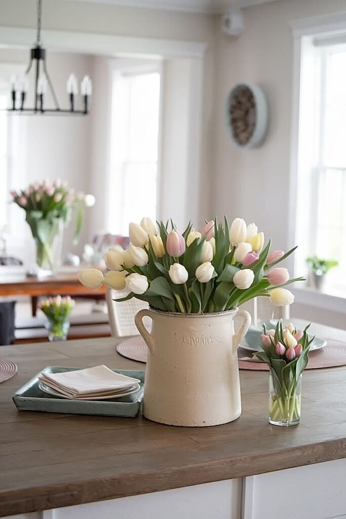
Ideas for Spring Tulips in a Crock Paired with a Cutting Board “Prep Zone”
Combining tulips with cutting board prep zones creates visual storytelling that celebrates both cooking and beauty simultaneously. This pairing signals that your kitchen serves dual purposes, it’s functional workspace and life-giving home heart. I love this integration because it refuses the false choice between practical and pretty.
The challenge lies in positioning tulips near prep areas without them becoming obstacles or contamination concerns. Fresh flowers and food preparation occupy the same general territory, so thoughtful spacing prevents any awkwardness.
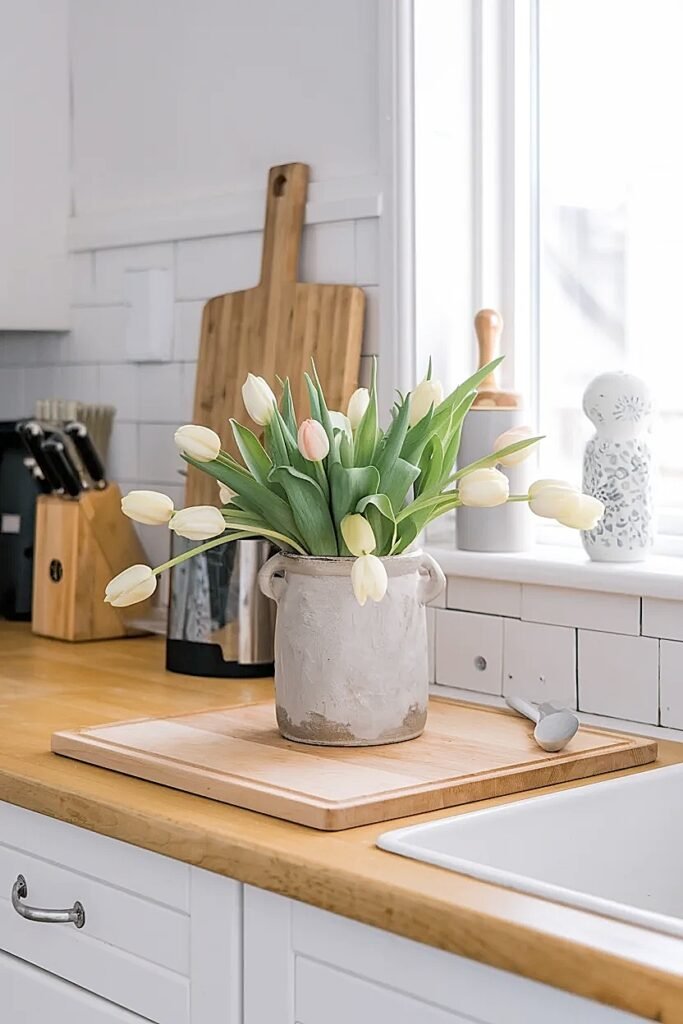
1. Side-by-Side Linear Arrangement with Crock Behind Cutting Board
Position a large wooden cutting board flat on the counter as your primary prep surface, placing the tulip crock directly behind it against the backsplash. This creates a linear arrangement where the cutting board occupies the front functional zone while tulips provide backdrop beauty. I leave about six inches between the board’s back edge and the crock’s front face, ensuring no flower petals or falling pollen can reach the food prep area. The tulips stay visible and attractive while the cutting board remains completely accessible for chopping, slicing, and other tasks. This setup works phenomenally on longer counter runs where you have adequate linear space for both elements to coexist without crowding.
2. Perpendicular Corner Setup with Angled Relationship
Arrange your cutting board perpendicular to the counter edge at a slight angle, positioning the tulip crock in the corner created by the board’s angled placement. The board juts out toward the room at maybe a thirty-degree angle, creating a wedge-shaped zone where the crock nestles perfectly. This geometric relationship feels dynamic rather than static, adding visual interest through the angular positioning. The tulips sit securely in their corner pocket while the cutting board’s angle creates natural separation between prep work and flowers. I use this technique when counter space is limited but I still want both functional and decorative elements present.
3. Tiered Presentation with Cutting Board Base and Elevated Crock
Create a tiered display by placing a cutting board flat on the counter, then elevating the tulip crock on a small pedestal or upturned bowl positioned beside or slightly behind the board. The cutting board operates at counter level for easy food prep, while the raised crock creates vertical interest and ensures tulips sit above any food debris or splashing. I choose pedestals about four to six inches tall, enough elevation to create clear separation but not so high the crock becomes unstable or top-heavy. This approach works beautifully for showcasing both the cutting board’s wood grain and the tulips’ beauty as distinct but related elements. The vertical dimension adds architectural interest to what could otherwise be a flat, uninspired counter arrangement.
These prep zone integrations demonstrate that beauty and function can coexist thoughtfully, and the pastel styling guidance ahead addresses color harmony within farmhouse aesthetics.
How to Style Spring Tulips in a Crock with Soft “Farmhouse Pastels”
Farmhouse pastels create entirely different atmospheres than saturated spring brights. Where bold tulips announce themselves loudly, pastels whisper. I gravitate toward these softer palettes when I want my kitchen to feel calming and restorative rather than energizing and stimulating.
Pastel tulips in crocks require slightly different handling than their vibrant counterparts because their subtlety can disappear against certain backgrounds or lighting conditions. I pay extra attention to placement and surrounding elements to ensure these gentle colors register appropriately without getting washed out.
Mixing pastel shades within one crock creates sophisticated arrangements that reward close viewing. I might combine pale pink, soft yellow, and cream tulips in varying proportions, maybe six pink, four yellow, three cream. The mixed palette stays cohesive through shared lightness value while providing enough color variation to prevent monotony. These combinations feel especially appropriate for farmhouse kitchens with white or cream cabinetry where pastels create tone-on-tone harmony.
Lighting dramatically affects pastel visibility. In kitchens with abundant natural light, pastels glow beautifully, their subtle colors enhanced by sunshine streaming through windows. In darker kitchens or during evening hours, pastels can vanish or appear dull. I position pastel tulip crocks near windows or under task lighting that illuminates them effectively. Sometimes I’ll add a small LED puck light beneath the crock when natural light is insufficient, creating uplighting that makes pastels luminous.
The crock finish influences pastel presentation too. Pastels in white or cream crocks create monochromatic softness, while the same tulips in gray or sage green crocks gain definition through subtle contrast. I experiment with both approaches depending on the specific effect I’m after, sometimes I want that dreamy, soft-on-soft aesthetic, other times I prefer gentle contrast that makes individual blooms more distinct.
Pastel styling demonstrates restraint and sophistication, and the kitchen island techniques ahead address how larger counter surfaces accommodate tulip displays.
Ways to Style Spring Tulips with a Simple Kitchen Island “Center Strip”
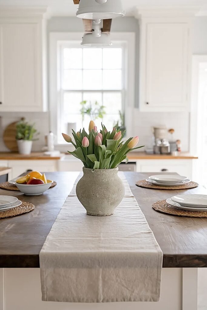
Kitchen islands present unique styling opportunities because they’re viewable from all sides and often serve as social gathering points. The “center strip” concept creates a linear tulip display running the island’s length, anchoring the space without dominating it.
I approach island styling differently than perimeter counters because islands function as both workspace and conversation areas. Your tulip arrangement needs to enhance both purposes without interfering with either.
1. Three-Crock Progression Along Island Centerline
Arrange three identical crocks in a line down the island’s center, spacing them evenly along the length. Each crock holds tulips in the same color but with slightly different stem counts, maybe the center crock has twelve stems while the end crocks each have nine. This creates subtle rhythm through size variation within a consistent framework. I position the crocks about eighteen to twenty-four inches apart, ensuring adequate space between them for placing serving dishes or working on the island surface. The three-point arrangement creates visual interest from every viewing angle while the matching crocks and unified color scheme prevent the display from feeling cluttered or chaotic.
2. Single Elongated Trough with Continuous Tulip Display
Use a long rectangular trough or planter running the island’s center length, filling it with tulips arranged in a continuous line. This creates one unified installation rather than multiple discrete arrangements. I choose troughs approximately twenty-four to thirty-six inches long and six inches wide, filling them with floral foam to support stems at varying heights. The continuous display reads as intentional design statement rather than scattered decoration. This approach works beautifully for longer islands, eight feet or more, where a single conventional crock would look lost but multiple crocks might feel repetitive. The trough format also allows mixing tulip colors along its length, creating gradual transitions from one hue to another.
3. Offset Dual Crock Arrangement with Asymmetric Balance
Position two crocks on the island centerline but offset from perfect alignment, creating asymmetric balance that feels more dynamic than rigid symmetry. I might place one crock about one-third of the island’s length from one end, and the second crock about two-thirds from the same end. This avoids the predictable centered placement while still creating intentional relationship between the two elements. Each crock can hold different tulip colors or mixed combinations, with the offset positioning preventing them from competing visually. This technique suits medium-length islands, six to seven feet, where three crocks would be too many but one feels insufficient.
These island strategies accommodate the unique spatial and functional demands of this kitchen feature, and the guest-ready styling techniques ahead address how to present tulips when company’s coming.
Ways to Style Spring Tulips in a Crock for a “Guests Coming Over” Clean Counter Look
Pre-guest preparations often involve clearing counters of everyday clutter, creating an opportunity to showcase tulip arrangements without visual competition. I approach guest-ready styling with the goal of creating polished impressiveness while maintaining the authentic, lived-in quality that makes kitchens welcoming.
The key lies in editing ruthlessly, removing non-essential items that normally occupy counter space, while presenting your tulip crock as if it naturally commands this prime real estate.
1. Solo Crock Statement with Completely Clear Surrounding Counter
Remove everything from your main counter run except the tulip crock, creating dramatic negative space that emphasizes the flowers’ beauty. Position the crock either centered on the counter length or using the rule of thirds, one-third from either end. The abundant empty counter reads as luxurious and intentional rather than sparse. This approach works brilliantly when your crock holds a generous, full arrangement, fifteen to twenty stems, that justifies its solo status. The cleared counters also signal to guests that your kitchen is pristine and ready for any entertaining needs.
2. Symmetrical Dual Crock Flanking with Central Empty Space
Place matching crocks at opposite ends of your main counter, leaving the entire central span completely clear. This creates bookend effect that frames the counter while maintaining vast functional space between. I use identical crocks with identical tulip colors and similar stem counts for true symmetry. The mirrored placement feels formal and composed, perfect for dinner parties or occasions requiring polish. The central emptiness becomes a design feature rather than void, creating breathing room that sophisticated styling requires.
3. Crock Grouped with Minimal Coordinating Elements
Position your tulip crock alongside just two or three carefully chosen coordinating items, perhaps a small stack of white plates, a linen hand towel draped artfully, or a simple glass canister. This curated grouping creates vignette effect that looks intentional without appearing staged. I limit additional elements to those with cohesive color palette and similar farmhouse aesthetic. The grouping occupies maybe two feet of linear counter space, leaving the remainder completely clear for guest-ready presentation.
4. Single Crock on Tray Platform with Defined Boundary
Place the tulip crock on a rectangular wooden or marble tray, creating a defined platform that contains the arrangement within clear boundaries. The tray sits on otherwise empty counter, its edges establishing exactly how much space the tulip display claims. This technique creates finished, gallery-like presentation that feels considered and sophisticated. I choose trays slightly larger than the crock’s footprint, maybe fourteen by eighteen inches for a ten-inch crock, providing visual breathing room around the vessel. The tray also protects counter surfaces from water rings or drips.
5. Strategic Placement Near but Not Blocking Key Kitchen Features
Position the tulip crock adjacent to but clearly separated from key kitchen features guests will notice, next to the espresso machine, beside the cookbook collection, near the fruit bowl. This placement creates visual association with other attractive elements while ensuring the crock doesn’t obstruct anything functional. The tulips benefit from the borrowed interest of these nearby features, creating richer visual stories than isolated placement would achieve. I maintain at least six inches of separation between the crock and adjacent items, preventing crowded appearance while establishing clear relationship.
These guest-ready approaches demonstrate how editing and intentional placement transform everyday tulip displays into impressive presentations worthy of entertaining.
Conclusion
Styling spring tulips in a crock on your kitchen counter isn’t about following rigid rules, it’s about understanding how these living elements interact with your space’s function, light, and existing aesthetic. The strategies I’ve shared come from years of trial and refinement in my own kitchen, where I’ve learned that successful styling respects both beauty and practicality. Start with one approach that resonates with your specific counter layout and cooking patterns, then adjust based on how the arrangement actually performs in your daily life. Tulips bring irreplaceable freshness to kitchens, and crocks provide the perfect vessels for showcasing them with farmhouse authenticity.
This website contains affiliate links, and some products are gifted by the brand to test. As an Amazon Associate, I earn from qualified purchases. Some of the content on this website was researched and created with the assistance of AI technology.