This website contains affiliate links, and some products are gifted by the brand to test. As an Amazon Associate, I earn from qualified purchases. Some of the content on this website was researched and created with the assistance of AI technology.
Key Takeaways
- Plant-filled homes already have abundant green. The flowers’ job is to add seasonal color, warmth, and autumn character that the plants cannot provide
- Warm flower tones make the surrounding green foliage look richer. Rust, amber, peach, cream, and bronze all amplify the plants around them through contrast
- Avoid foliage-heavy flower arrangements in plant-heavy homes. The plants handle the foliage. The flowers handle the color
- Dark vessels work harder in plant-filled homes than anywhere else because they connect the cut flower display to the plant pot aesthetic
- Blush and peach tones are the most underused fall colors in plant-heavy homes. Both are warm enough to contrast green without visually competing with a room full of living plants
- Neutral fall flower tones, cream, ivory, pale wheat, and statice, create the quietest and most sustainably beautiful displays in a room where plants already carry the decorating weight
Plant-filled homes need flowers that do something the plants cannot. That is the whole brief.
Choosing the best fall flower colors for homes with lots of plants means working with the reality that every room already has a strong visual identity. The plants are already there. They are already creating green, living, organic atmosphere. A cut flower arrangement in that context is not the main event. It is the seasonal edit. The one thing that says October instead of just green-and-growing.
Most people in this situation add more green to the flowers. More foliage, more trailing, more botanical. The plants already handle all of that. What the flowers need to bring is warmth, color, and the specific autumn signal that a living plant cannot provide.
Use this guide to choose Fall Flower colors that work across an entire home filled with plants. Each row matches a color family with the plant setting it helps most, the best supporting accent, and the reason that color keeps shelves, counters, corners, and tables warm, balanced, and easy to style.
Best Fall Flower Colors for Homes With Lots of Plants
Use this table to match flower color families with the plant-filled areas of your home, from shelves and counters to coffee tables and cozy corners.
| Fall Flower Color Family | Best Plant-Filled Home Area | Supporting Accent to Repeat | Why This Color Works |
|---|---|---|---|
| Soft Brightness Cream, ivory, and soft white flowers. | Dark plant corners, deep green shelves, and coffee tables with dense foliage. Best when the home needs a lighter fall look. | Taupe bowls, oatmeal linen, cream pots, and pale sedum. | Cream and ivory brighten green foliage while staying warmer and softer than bright white alone. |
| Earthy Warmth Rust, terracotta, copper, and burnt sienna flowers. | Clay-potted plant groups, woven trays, entry consoles, and trailing plant shelves. Best when greenery needs a clear autumn mood. | Clay planters, warm brown ceramics, cream flowers, and sage accents. | Rust and terracotta warm green leaves without the brightness of basic orange. |
| Rich Depth Burgundy, oxblood, wine, plum, and deep rose flowers. | Glossy plant corners, variegated plant shelves, and warm neutral living rooms. Best when the home can handle stronger contrast. | Cream carnations, ivory mums, taupe vessels, and warm brown dishes. | Deep flowers create drama against green leaves, while cream keeps the display from feeling heavy. |
| Gentle Softness Blush, mauve, dusty rose, lilac, and soft peach flowers. | Plant shelves, neutral bedrooms, soft living rooms, and variegated greenery displays. Best when the home needs a quieter seasonal color. | Sage bowls, oatmeal fabric, pale taupe pots, and neutral books. | Soft colors warm greenery without overpowering leaf patterns or small plant displays. |
| Autumn Glow Bronze, golden yellow, caramel, mustard, and warm brown flowers. | Shaded plant corners, dining surfaces, side tables, and areas with brown decor. Best when the home needs warmth and energy. | Bronze accents, soft brown stoneware, woven trays, and cream flowers. | Bronze and gold add glow against green foliage while staying grounded with warm neutrals. |
Resources:
- 10 Fall Color Trends Designers Love for 2026 | Homes and Gardens
- Use Houseplants to Decorate for Fall – Costa Farms
- What Colors Work Best for Fall Flower Arrangements?
How to Choose Fall Flower Colors for Homes With Lots of Plants
Think about what the room already has.
Lots of green. Lots of organic shape. Lots of living visual energy that changes slowly over time. Now think about what is missing in October that the plants cannot create on their own. Warm color. Seasonal fragrance. The specific amber-and-rust palette that communicates fall at a glance.
That is what the cut flowers provide. And that is why flower color selection in a plant-heavy home matters more, not less, than in a home with fewer plants.
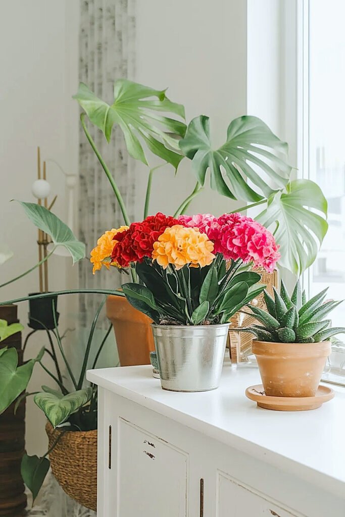
A deep green monstera beside a rust carnation arrangement reads as composed and autumnal. The same monstera beside a green-and-white flower arrangement just reads as more of the same living greenery. The contrast between the static plant and the warm-toned flower is what creates the fall moment. Without that contrast, the arrangement disappears.
The vessel matters in a plant-filled home more than almost anywhere else. The plants already have pots. Dark ceramic, terracotta, woven baskets. The cut flower vessel needs to read as belonging to that same visual family. A clear glass vase among dark plant pots reads as an interruption. A dark crock or a terracotta vessel reads as another considered element in an already-considered room.
For more on specific flower colors that work in rooms with heavy green houseplant presence, including the color temperature rules for different plant foliage tones and the lighting variables that determine which colors perform well, check out best flower colors for rooms with lots of green houseplants. Share this with anyone decorating a plant-heavy home this fall. The specific color list is next.
What Are the Best Fall Flower Colors for Plant-Filled Homes?
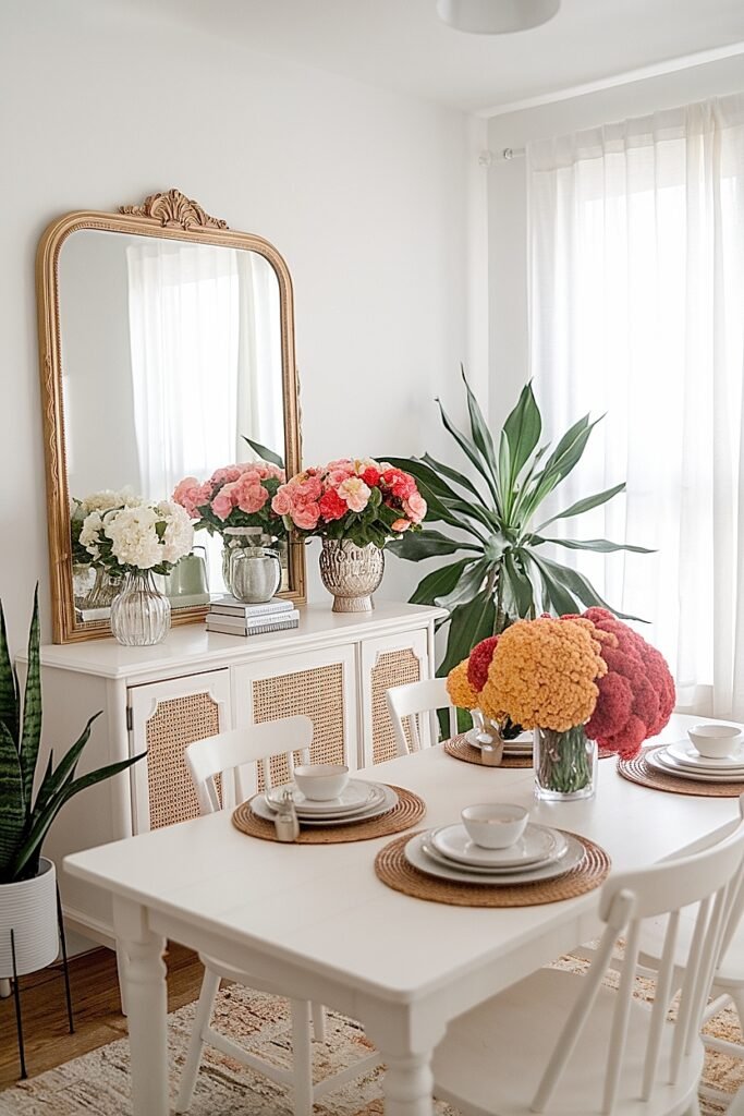
1. Rust Orange Rust orange is the most visually activating fall flower color in a plant-filled home because it sits directly opposite green on the color wheel. Each one makes the other more vivid. Three rust carnation stems in a dark vessel beside a dark-leafed plant: the green goes deeper, the rust reads as richer. No other fall flower color creates as immediate or as strong a contrast with the living green that.
2. Deep Burgundy Burgundy creates the most sophisticated, most interior-design-quality fall flower display in a plant-filled home. The cool dark red tone alongside cool deep green foliage creates depth rather than contrast and energy. It reads as moody and specifically good-looking in ambient indoor light. Burgundy dahlias or wine-red carnations beside a ZZ plant or a cast iron plant with deep waxy leaves: one of the genuinely beautiful combinations available from supermarket materials.
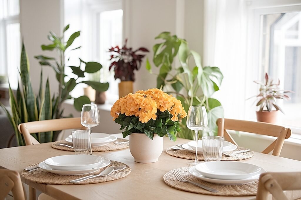
3. Warm Cream Cream flowers in a plant-heavy home create luminosity. The pale warm bloom reflects available room light back toward the viewer and makes both the flowers and the surrounding green foliage appear brighter. A cream pompom mum arrangement beside a dark-leafed rubber plant or a peace lily creates warmth and brightness without competing with any plant in the room. In natural light, the cream shifts toward ivory and the whole display.
4. Bronze Bronze flower tones, dark amber chrysanthemums, copper-toned spray roses, are drier and more specific than standard orange. They read as autumn grain and harvest rather than seasonal decoration. In a plant-filled home, bronze beside dark-leafed plants creates tonal depth. Beside lighter, more yellow-green foliage, bronze creates warm contrast. The specific quality of bronze suits rooms where the decorating aesthetic is already considered and specific.
5. Dusty Mauve Dusty mauve is the quietest fall flower choice for a plant-heavy home. It neither competes with the green foliage nor gets lost in it. It reads as specifically botanical and curated rather than seasonally obvious. Mauve asters beside a trailing pothos or a Swedish ivy: a soft, autumnal combination that sits well in rooms where the plants are already the visual statement and the flowers are the quiet seasonal edit.
6. Soft Blush Pale blush fall flowers, soft pink spray roses or blush carnations, are warm enough to contrast green plant foliage and soft enough not to dominate a room already carrying a lot of visual presence. In a home with large-leafed structural plants, a pale blush arrangement reads as delicate and deliberately soft beside the bold plant forms. In a room with smaller trailing plants, blush reads as warmer and more present.
7. Deep Amber Gold Amber gold fall flowers beside yellow-green or variegated houseplant foliage create tonal harmony where both elements carry warm yellow tone. Beside dark green plants, the same amber gold creates vivid warm contrast. The versatility of amber gold across different plant foliage tones makes it one of the most reliably successful fall flower colors in a home with a variety of plant types in different rooms.
More ahead on bronze specifically, which creates a different effect from any of these seven colors and suits plant-heavy homes in a way that takes some explanation.
How to Use Bronze Fall Flower Colors for Warm Plant-Filled Homes
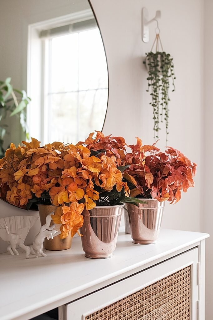
Bronze is not orange. Saying this again because it matters.
Orange is bright and saturated. It energizes a room. Bronze is darker, warmer, and drier. It does not energize a room so much as it deepens it. In a plant-filled home that already has warmth and living presence from the plants themselves, bronze does not add more energy. It adds depth and autumn-grain character.
The specific way to use bronze in a plant-heavy home: choose a vessel that sits in the same warm family. A terracotta pot, a copper pitcher, a warm-toned stoneware crock. The vessel and the bronze flower occupy the same warm zone in the room while the green plants provide the cool contrast. The whole display reads as a warm autumn still life rather than a flower arrangement that happened to be placed near some plants.
Bronze also suits rooms where the plants themselves carry some warm tones. A croton with amber, rust, and green foliage. A ti plant with red-purple leaves. Beside these plants, bronze flowers extend and amplify the warm tones already in the plant foliage rather than introducing a competing color.
Ideas for Cream Fall Flower Colors Across Homes With Lots of Plants
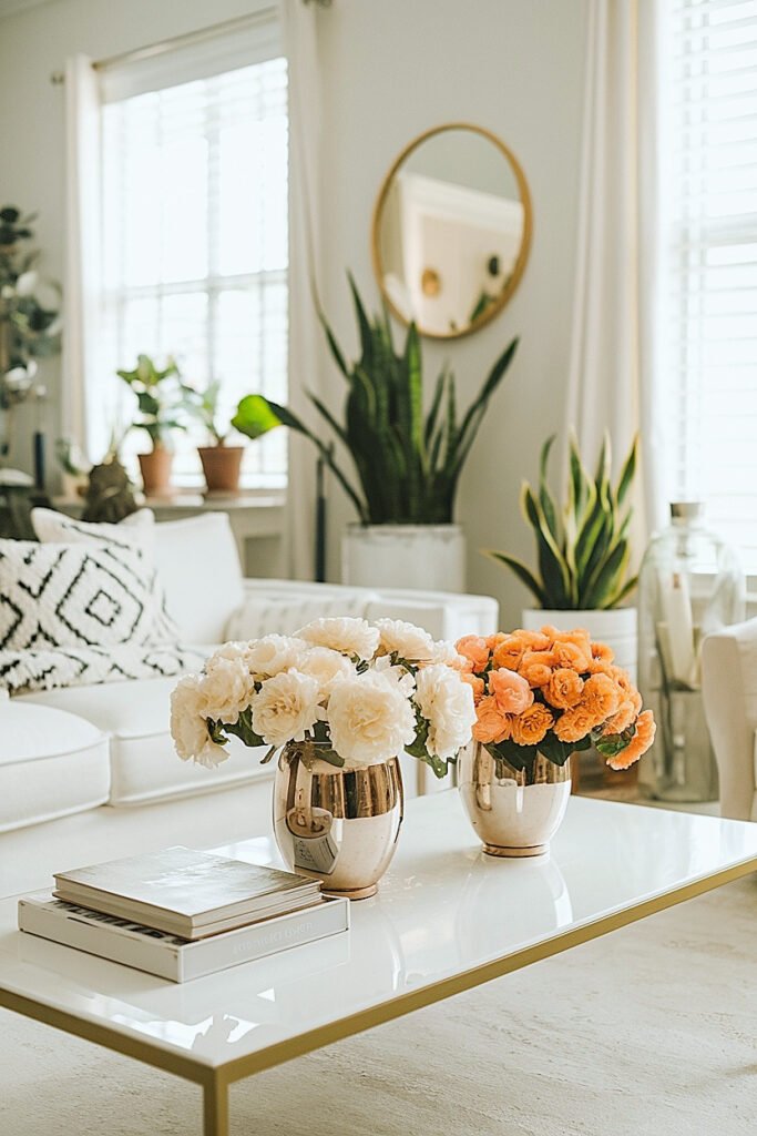
1. Cream Pompom Mums in a Dark Crock Beside a Monstera Five cream pompom mum stems at rim height in a dark navy crock beside a monstera. The monstera’s deep blue-green fenestrated leaves create maximum backdrop contrast for the warm cream blooms. The dark vessel connects to the room’s plant pot aesthetic. The cream mum picks up ambient light and appears.
2. Cream Carnations and Dried Wheat Beside a Snake Plant Four cream carnation stems plus two dried wheat stalks in a short dark vessel at the base of a snake plant. The snake plant’s upright vertical form above and the low horizontal flower arrangement below create a two-level plant-and-flower display. The wheat stalk adds autumn-grain harvest character that cream carnations.
3. Cream Spray Roses and Seeded Eucalyptus Beside a Peace Lily Three cream spray rose sub-stems plus two seeded eucalyptus strands in a dark vessel beside a peace lily. The peace lily’s white spathe relates to the cream spray rose. The eucalyptus silver-grey adds a cool texture. Two plant elements plus one flower arrangement create a layered botanical display.
4. Cream Ranunculus in a Copper Vessel Beside a Rubber Plant Two to three cream ranunculus stems in a small copper vessel beside a rubber plant. The copper vessel adds warm tone that prevents the cream-and-green combination from reading too cool. The rubber plant’s large glossy leaves provide a bold green backdrop for the ranunculus layered petal structure.
5. Cream Lisianthus Beside a Trailing Pothos Two cream lisianthus stems in a slim dark vessel beside a trailing pothos. The pothos trailing foliage frames the arrangement naturally from behind and below. Lisianthus opens progressively across the week, creating daily visual change within a plant display that is otherwise static.
More ahead on blush, which surprises people with how well it works in a room full of living green.
Easy Ideas for Blush Fall Flower Colors in Homes With Many Plants
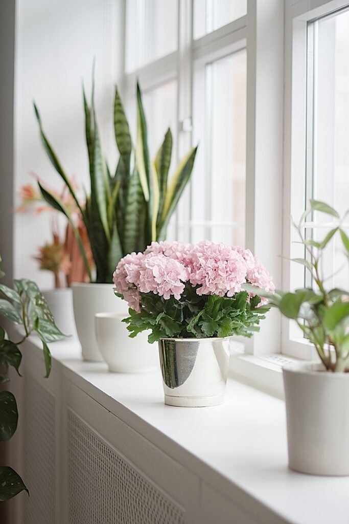
1. Blush Spray Roses Beside a Fiddle Leaf Fig Three blush spray rose sub-stems in a small dark vessel beside a fiddle leaf fig. The fiddle leaf’s large rounded pale-green leaves and the soft blush spray rose blooms create a gentle warm-and-green pairing. Multiple spray rose heads at different opening stages add variety to a plant display that otherwise.
2. Pale Blush Carnations Beside a Bird of Paradise Four pale blush carnation stems in a dark vessel beside a bird of paradise. The bird of paradise’s large structured leaves and the delicate blush bloom create a scale contrast where the arrangement reads as fine detail beside the plant’s bold architecture. The blush tone suits the warm orange-toned bird.
3. Blush Gomphrema Beside Grouped Succulents Eight blush gomphrema ball stems in a small dark vessel beside grouped succulents. The compact ball structure at close range beside the varied succulent rosette forms creates a small-scale composed display. Gomphrema holds two weeks without attention, which suits plant shelves that are not the focus of daily tending.
4. Blush Alstroemeria and Fresh Rosemary Beside a ZZ Plant Two blush alstroemeria stems plus two fresh rosemary sprigs in a dark vessel beside a ZZ plant. The ZZ’s waxy dark leaves create maximum contrast with the soft warm blush alstroemeria. The rosemary fragrance adds a sensory element. Multiple alstroemeria heads add visual progression alongside the static plant foliage.
5. Pale Blush Asters Beside a Chinese Evergreen Six pale blush or pale pink aster stems in a small dark vessel beside a Chinese evergreen. The Chinese evergreen’s pale and dark green patterned leaves suit the soft blush aster bloom at close indoor range. The aster’s small daisy face and warm yellow center add fine botanical detail to.
More ahead on peach, which sits between blush and orange in the best possible way for a plant-heavy home.
Ideas for Peach Fall Flower Colors in Homes With Indoor Greenery
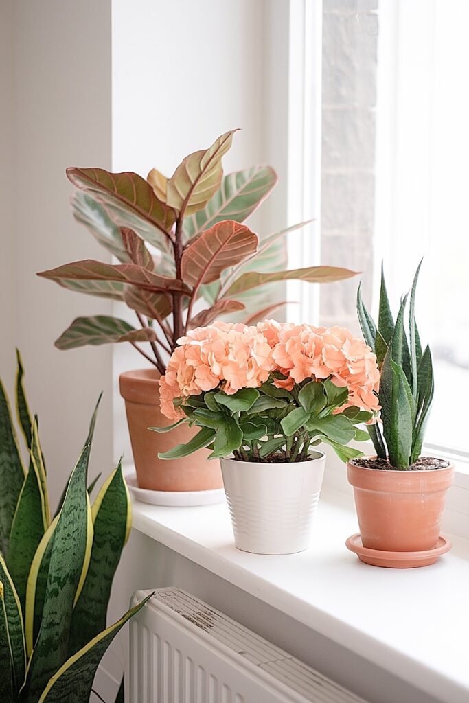
1. Peach Spray Roses Beside a Monstera Three peach spray rose sub-stems in a dark vessel beside a monstera. The monstera’s deep green provides maximum backdrop contrast for the warm peach bloom. The spray rose’s smaller bloom scale suits the monstera’s dramatic leaf form by providing delicate warm detail beside the bold plant architecture.
2. Peach Carnations and Seeded Eucalyptus Beside a Pothos Four peach carnation stems plus two seeded eucalyptus strands in a dark vessel beside a trailing pothos. The pothos frames the arrangement from behind. The peach carnation fringed petal and eucalyptus silver-grey seed cluster create two warm-and-neutral textures alongside the pothos cool green.
3. Peach Alstroemeria in a Terracotta Vessel Beside a Peace Lily Two peach alstroemeria stems in a short terracotta vessel beside a peace lily. The terracotta’s warm buff-orange sits in the same warm family as the peach alstroemeria. The peace lily’s white spathe and dark green leaves provide the cool backdrop. Three tones: warm vessel, warm bloom, cool plant.
4. Peach Pompom Mums Beside a Cast Iron Plant Four peach pompom mum stems at rim height in a wide dark vessel beside a cast iron plant. The cast iron plant’s deep near-black-green leaves create the strongest contrast available for any warm-toned bloom. The peach pompom mum reads as specifically warm and specific against this backdrop in a way.
5. Soft Peach Lisianthus Beside a Rubber Plant Two soft peach lisianthus stems in a slim dark vessel beside a rubber plant. The rubber plant’s large glossy dark leaves provide bold green backdrop. The lisianthus ruffled petal in soft peach adds warmth and gentle autumn character. Lisianthus opens across the week, creating visual progression in an otherwise static.
More ahead on orange, which needs a specific approach in a plant-heavy home to avoid becoming the whole room.
How to Balance Orange Fall Flower Colors in Homes With Many Plants
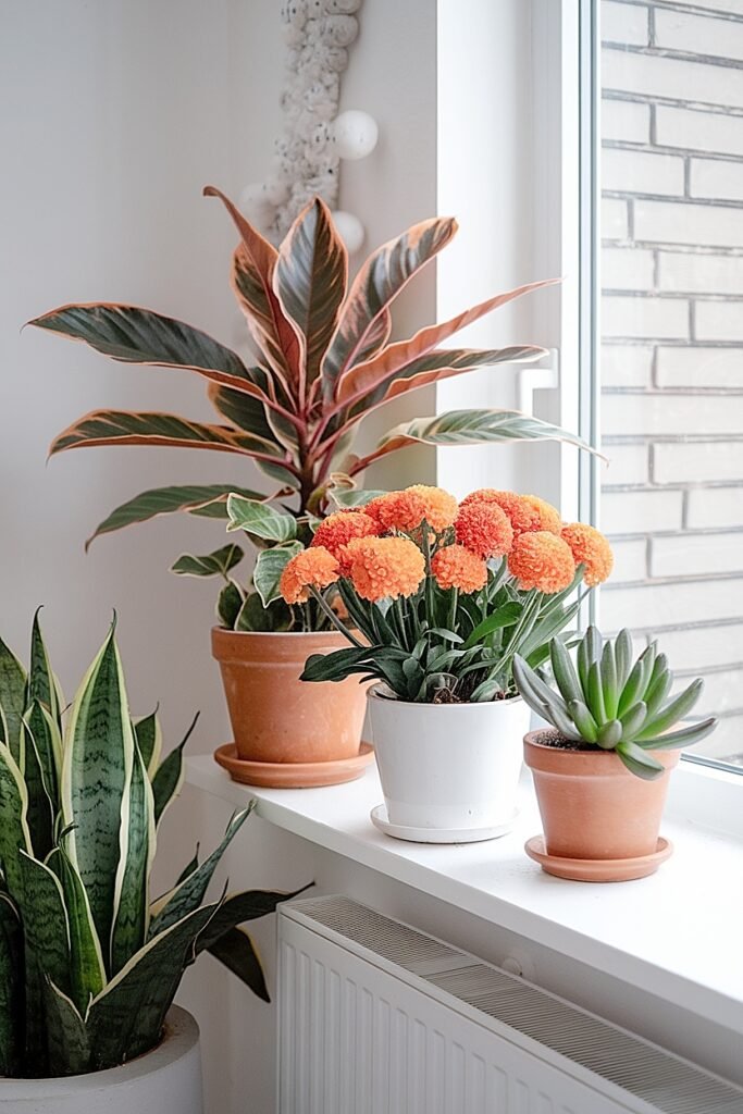
Orange in a plant-heavy home works as an accent, not a main event.
A full orange arrangement in a room full of green plants creates a lot of complementary color contrast energy. Orange and green activate each other. That is visually exciting for about five minutes and then it becomes exhausting. One or two orange stems within a cream or neutral arrangement beside a plant: the orange reads as the specific warm note, the cream reads as the field, the plant reads as the context. That proportion works.
The vessel also moderates orange in a plant-heavy home. Dark vessel, short stems, one or two orange elements among five cream or neutral ones. The dark vessel absorbs some of the orange’s visual intensity. The cream softens the contrast. And the plant behind it provides the cool green that makes the orange orange and the cream cream.
One orange stem. Not five.
What Are the Best Neutral Fall Flower Colors for Plant-Filled Homes?
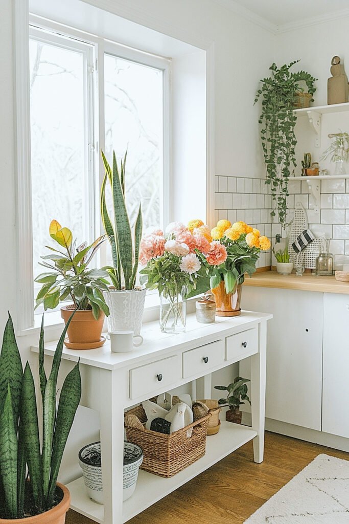
1. Ivory or Warm White Statice Statice holds indefinitely and adds papery botanical texture that reads as natural and harvest-adjacent beside living plants. One statice bunch fills multiple small vessel positions across a plant-filled home. The warm white reads as quiet and specific rather than seasonal-loud. Combined with any fresh flower, it adds instant textural depth.
2. Dried Golden Wheat Stalks One or two dried wheat stalks in a vessel alongside any fresh flower beside a houseplant create autumn grain harvest character that no flower alone produces. The warm amber wheat tone bridges the gap between the living green plant and any warm-toned bloom. Available at craft stores year-round.
3. Pale Cream Button Mums Small pale cream button mum heads create fine-scale textural coverage at close indoor plant-shelf viewing range. The small bloom scale suits the varied plant scale of a multi-plant home without any one arrangement competing with the plants for visual dominance. Holds ten to twelve days in cold water.
4. Seeded Eucalyptus as a Neutral Connector Seeded eucalyptus in any cut flower vessel beside a houseplant creates visual connection between the arrangement and the plants by sharing the green-grey foliage tone of many common indoor plant varieties. The trailing habit relates to trailing plants. The seed clusters add texture. Used in every vessel across a plant-filled.
5. Dried Pampas Grass as a Single Statement One small pampas plume in a narrow dark vessel beside a large structural plant like a bird of paradise or a fiddle leaf fig creates a specific neutral autumn element with height and feathery texture. The pampas sits in the warm cream-white tone range and suits plant-heavy rooms that need.
Conclusion
Plant-filled homes are already beautiful. The fall flowers do not need to compete with that.
Rust carnations beside the monstera. Cream mums beside the peace lily. One wheat stalk in the vessel by the snake plant. These are small additions that do specific work: they communicate the season and they make the plants look better.
Choose warm. Dark vessel. One bunch.
That is enough.
This website contains affiliate links, and some products are gifted by the brand to test. As an Amazon Associate, I earn from qualified purchases. Some of the content on this website was researched and created with the assistance of AI technology.