This website contains affiliate links, and some products are gifted by the brand to test. As an Amazon Associate, I earn from qualified purchases. Some of the content on this website was researched and created with the assistance of AI technology.
Key Takeaways
- Open-concept homes need fall flower colors that read clearly at both close range and across a room. Saturated, warm tones perform better at distance than pale or cool ones
- Choose one or two fall flower colors to use across all zones of the open space rather than a different color in each zone. Visual continuity across zones reads as intentional
- Large structural plants in open areas suit bold, saturated flower colors placed at their base or beside them. Small plants on shelves suit smaller, more compact flower arrangements in matching or complementary tones
- Burgundy, rust, and amber gold are the three fall colors that hold the most visual presence when viewed across an open-concept room rather than at close range
- Mauve is the softer choice that still travels across an open room without becoming invisible. It suits open spaces with a lot of plant variety
- Variegated plants with multi-toned foliage, cream-and-green, yellow-and-green, purple-and-green, actively change which flower colors work best beside them
Open-concept spaces are a completely different decorating problem from single rooms. Most flower advice does not account for that.
Choosing the best fall flower colors for open-concept homes with house plants means thinking about multiple viewing distances simultaneously. In a single room, the flowers are always seen from the same general proximity. In an open-concept space, the kitchen flowers are visible from the living room. The shelf flowers by the staircase are visible from the dining area. The colors need to work up close and across the room at the same time, and they need to work beside multiple different plant types in different zones, often within the same sightline.
The plant-filled open-concept home has one more variable: different zones already have different green presences. Some areas have large structural plants. Some have trailing varieties. Some have small succulents on shelves. The fall flower colors that work in this layered, multi-zone context are the ones that travel well across distance and hold their identity beside different foliage types.
Use this guide to choose Fall Flower colors that flow through open-concept homes with house plants. Each row shows where a color family works best, which plant-filled zone it supports, what accent to repeat nearby, and why the palette keeps kitchen, dining, living, and shelf areas visually connected.
Fall Flower Color Flow for Open-Concept Homes With House Plants
Use this table to choose flower colors that connect visible kitchen, dining, living, shelf, and plant-corner zones without making the open room feel crowded.
| Fall Flower Color Family | Best Open-Concept Zone | Accent to Repeat Nearby | Why This Color Works |
|---|---|---|---|
| Soft Connector Cream, ivory, soft white, and pale neutral flowers. | Kitchen counter, dining sideboard, and coffee table where the same color can repeat. Best for calm color flow. | Taupe bowl, cream planter, oatmeal linen, or pale sedum. | Light neutrals brighten green house plants and connect several open zones without feeling loud. |
| Earthy Warmth Rust, terracotta, copper, and muted orange flowers. | Clay-potted plant corners, entry consoles, dining shelves, and kitchen plant groups. Best for cozy fall warmth. | Clay planter, woven tray, warm brown dish, or cream bloom. | Earthy warm colors echo pots and trays while warming green foliage across the room. |
| Deep Focal Point Burgundy, oxblood, wine, plum, and deep rose flowers. | Dining sideboard, living console, or one visible focal plant area. Best when used sparingly. | Cream carnation, ivory mum, taupe vessel, or warm brown ceramic. | Deep colors contrast strongly with green plants, so one focal bowl can guide the eye. |
| Gentle Softness Blush, mauve, dusty rose, lilac, and soft peach flowers. | Plant shelves, coffee tables, soft seating areas, and visible neutral corners. Best for gentle seasonal color. | Sage bowl, oatmeal fabric, pale taupe pot, or neutral books. | Soft flowers warm the room without overpowering green leaves or open-concept sightlines. |
| Autumn Glow Bronze, golden yellow, caramel, mustard, and warm brown flowers. | Shaded plant corners, side tables, dining surfaces, and darker plant clusters. Best for warmth and lift. | Bronze detail, warm stoneware, cream flowers, or woven tray. | Bronze and gold add warmth against green foliage while staying grounded with neutral accents. |
Resources:
- ENH1164/EP425: Color in the Landscape: Finding Inspiration for a Color Theme
- Houseplant design principles: colour
- Should a living room and kitchen match? Our vital advice | Homes and Gardens
- How to Make an Open Floor Plan Feel Cozy and Defined – The Paint Color Project
How to Choose Fall Flower Colors for Open-Concept Homes With House Plants
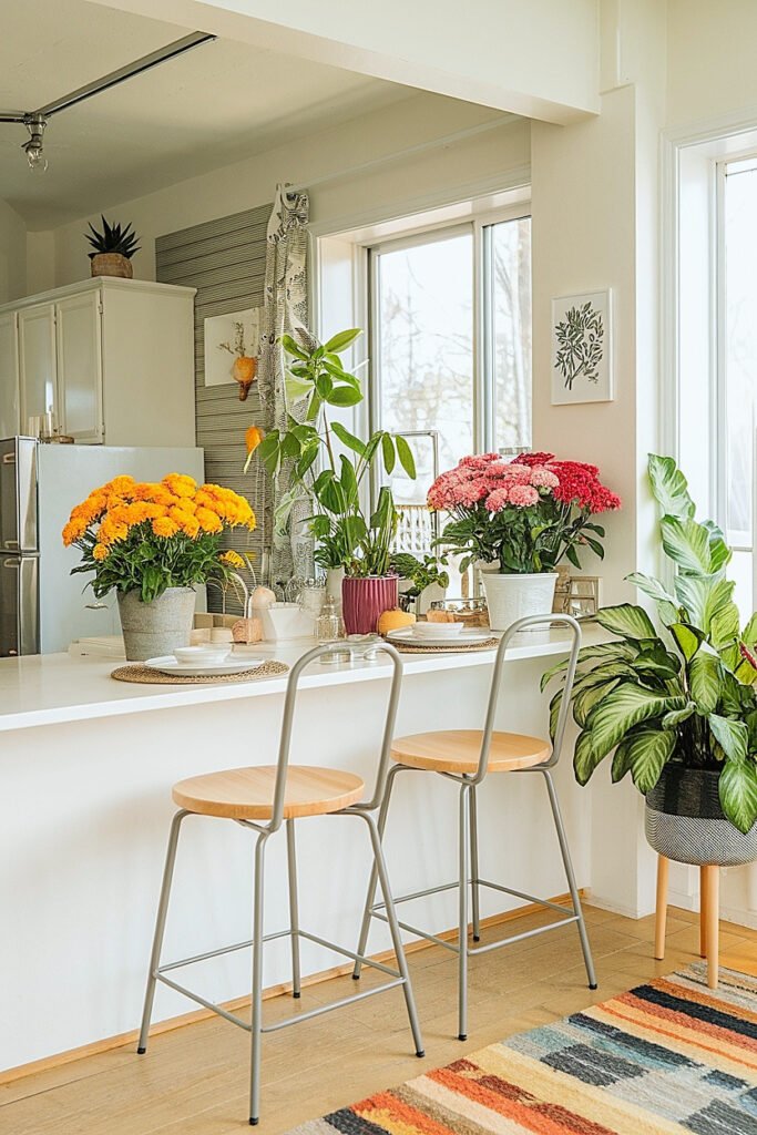
In an open-concept space, color has to work at ten feet, not just at ten inches.
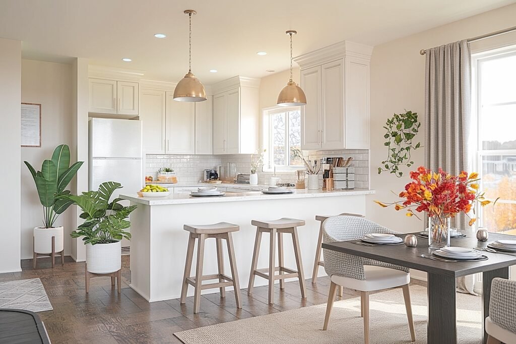
This is the fundamental difference from decorating a single enclosed room. A delicate pale blush arrangement on the kitchen shelf looks beautiful up close. From the sofa fifteen feet away, it disappears into the surrounding wall color or plant foliage and becomes visual noise at best. The fall flower colors that work in open-concept plant-filled spaces are the ones that hold a readable identity at the viewing distances those spaces create.
Warm, medium-to-high-saturation tones perform best. Rust, amber, burgundy, mauve, deep cream. These colors carry visual presence across the space without shouting. Cool pale tones, soft lavender, icy white, very pale pink, get lost in distance and in the visual competition of a room full of living plants.
The other variable in an open-concept plant home: you can see multiple display positions at once. The flowers on the kitchen island, the flowers on the living room shelf beside the monstera, the flowers on the dining table, all visible in one glance from a single seated position. If each zone has a completely different fall flower color, the whole space reads as chaotic. If the same rust or burgundy color appears in each zone, the space reads as coordinated. One or two colors repeated across zones creates the visual thread that makes an open-concept plant home feel specifically dressed for fall rather than randomly decorated.
For more on fall flower color selection in plant-heavy homes across different scenarios, including the color temperature rules for different foliage types and the lighting considerations that change which colors work, check out best fall flower colors for homes with lots of plants. Share this with anyone decorating a plant-filled open home this fall. More on specific colors that actually travel across open spaces is next.
What Are the Best Fall Flower Colors for Open-Concept Plant-Filled Rooms?
1. Deep Burgundy Burgundy holds its color identity across open-concept viewing distances better than almost any other fall flower color. The cool dark red remains readable from fifteen feet and reads as rich and specifically autumnal rather than generic warm. Beside deep green plant foliage, burgundy creates depth and intimacy. Across a large open room, it holds its visual presence as a specific, anchoring color that reads as a decision rather than a.
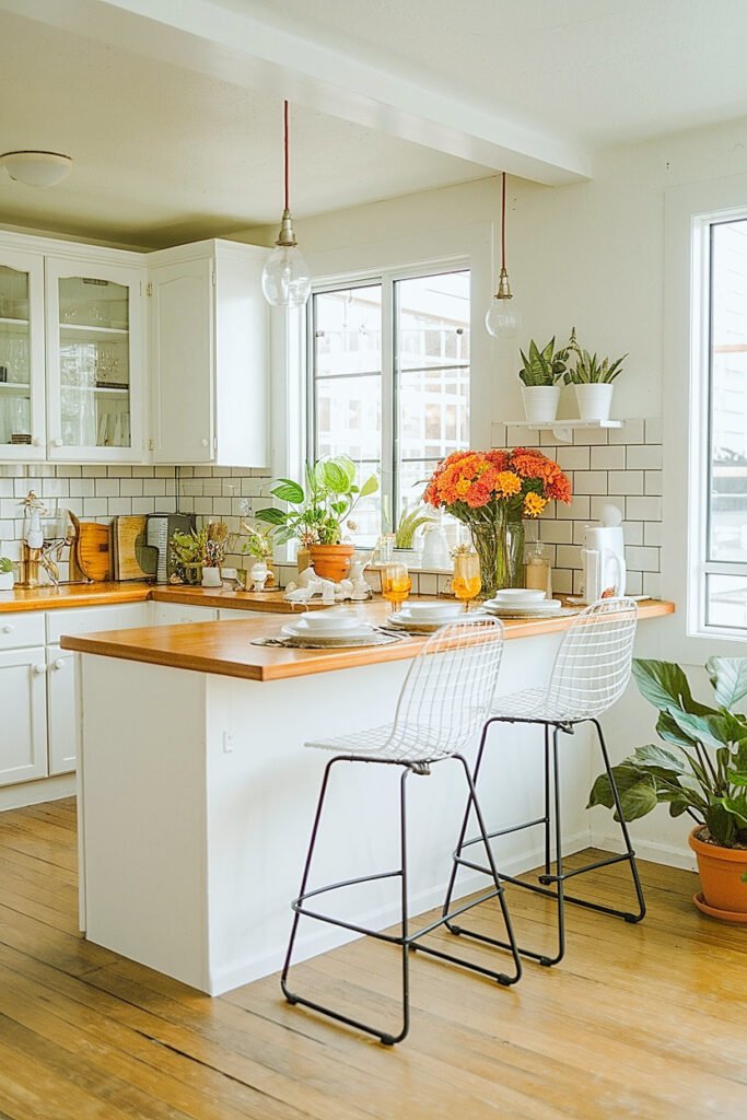
2. Rust Orange Rust is the most visually activating fall color in a plant-filled open-concept space because it creates complementary contrast with the green foliage visible throughout the room. At close range beside a dark-leafed plant, it makes the green richer. Viewed from across the open space, it reads as warm, autumn-specific, and clearly intentional. Two or three rust carnation stems in a dark vessel on the kitchen island are visible and identifiable.
3. Amber Gold Amber gold flower tones travel well across open rooms because their warm yellow warmth reads as specifically harvest-autumnal at any distance. Unlike brighter yellows, which can read as acidic or summery, amber gold always reads as fall. Beside houseplants with variegated or yellow-green foliage, amber gold creates tonal harmony. Beside dark-leafed plants across an open kitchen-to-living space, it creates warm contrast visible from any position in the room.
4. Deep Warm Cream Cream travels well in open spaces with natural light. In south or west-facing open-concept homes, cream flowers catch directional afternoon light and appear to glow from across the room in a way that more saturated colors do not. In lower-light open spaces, cream reads less powerfully at distance and is better used as an accent color alongside one of the more saturated options. In the right light conditions, cream beside.
5. Mauve Mauve is the softer choice that still maintains cross-room readability. It reads as soft and botanical from up close and as a cool autumn tone from across the room. It suits open-concept plant homes with a wide variety of plant types because it does not activate one foliage color against another the way rust and green do. For a plant home with a complex mix of different foliage, mauve creates.
More ahead on orange specifically, which needs a particular approach in an open-concept plant home.
How to Balance Orange Fall Flower Colors in Open-Concept Homes With House Plants
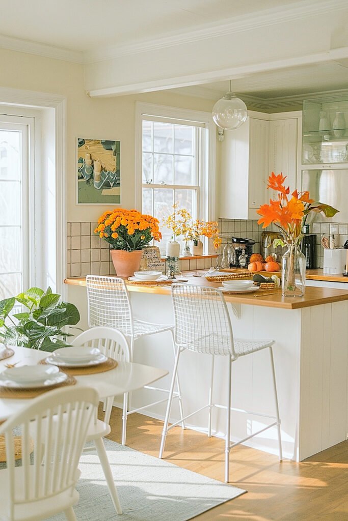
Full saturated orange in an open-concept plant home can become the entire room.
Because the flowers are visible from multiple zones simultaneously, a vivid orange arrangement does not stay at its display position. It visually radiates across the whole open space. In a small single room, orange is bold but contained. In an open-concept space with high ceilings and multiple sight lines, orange becomes the room’s dominant color note from every position.
One or two orange stems within a rust or cream arrangement, not a full orange bunch. In a dark vessel, three cream stems plus two orange stems: the orange reads as the warm accent, the cream reads as the field. From across the open room, the arrangement reads as warm and autumnal. Up close, the orange is visible and specific. That proportion works across open spaces in a way a full orange arrangement does not.
DIY Ideas for Burgundy Fall Flower Colors in Open-Concept Homes With House Plants
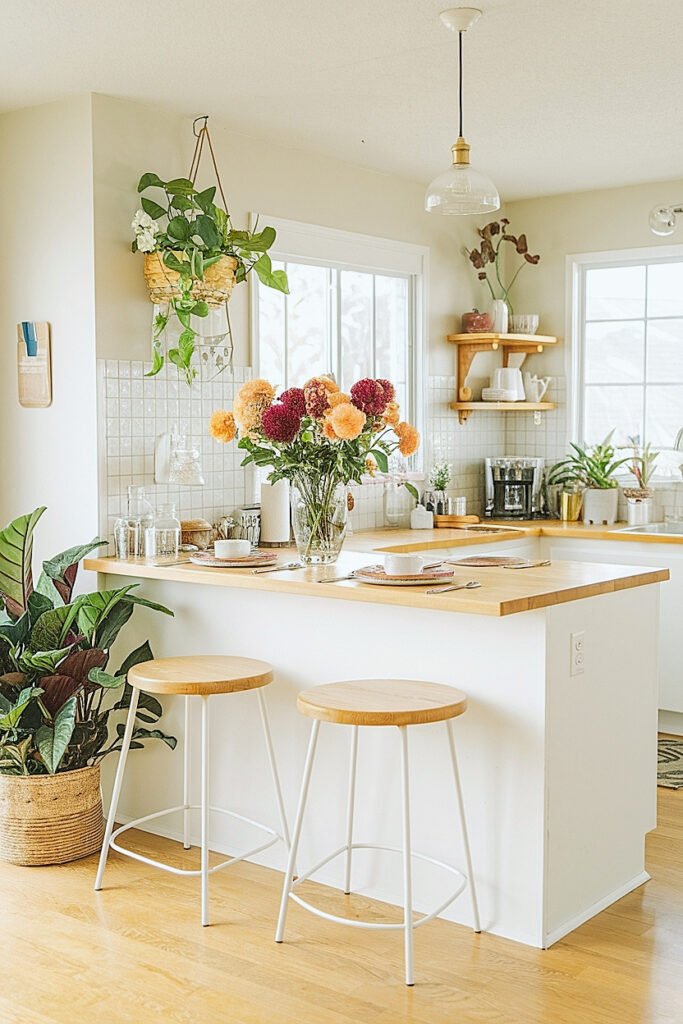
1. Burgundy Pompom Mums in a Dark Vessel on the Kitchen Island Four deep burgundy pompom mum stems at rim height in a wide dark charcoal vessel on the kitchen island, visible from the living zone across the open space. The dark vessel grounds the arrangement at island height. The burgundy reads as a specific warm-dark color from across the room rather.
2. Burgundy Carnations and Dried Wheat in a Crock Beside the Living Zone Plant Four burgundy carnation stems plus two dried wheat stalks in a dark crock beside the living area’s largest plant. The wheat stalk provides the autumn-grain harvest signal visible at both close viewing and from across the open space. The burgundy carnation fringed petal surface adds close-range botanical detail.
3. Burgundy Dahlias in a Dark Vessel Beside the Dining Area Plant Two deep burgundy ball dahlias in a narrow dark vessel beside the dining area plant. The ball dahlia’s dense rounded form creates a clear, readable shape from across an open room. The dark vessel connects visually to the plant pots already in the space.
4. Three Matched Burgundy Arrangements Across Three Open-Concept Zones Three matched dark vessels, one in the kitchen zone, one in the living zone, one in the dining zone, each holding three burgundy carnation stems. The repeated color across all three positions creates the visual thread that reads as coordinated rather than coincidental across the open space. Total cost under.
5. Burgundy and Cream Mixed Arrangement as the Room’s Anchor Five burgundy stem positions plus three cream stem positions in one wider dark vessel placed at the main visual anchor point of the open space, often the kitchen island or the central living area table. The two-tone combination travels across the open room at medium saturation rather than at the.
More ahead on mauve, which is the choice that unifies a mixed-plant open-concept home without activating any one plant foliage against another.
Creative Ways to Use Mauve Fall Flower Colors Across Open-Concept Plant Zones
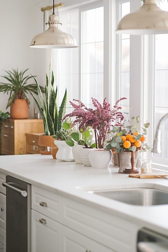
1. Mauve Asters in Small Vessels at Each Zone Transition Point Three mauve aster stems in a small dark vessel at each visual transition between zones in the open space, kitchen-to-living, living-to-dining. The small vessel scale suits the transition position. The repeated mauve tone at each transition creates a color thread that pulls the eye across the whole open space.
2. Mauve Carnations and Sage in a Wide Dark Bowl Beside the Main Living Plant Five mauve carnation stems plus two fresh sage sprigs in a wide dark bowl beside the largest plant in the living zone. The sage fragrance at close range adds a sensory anchor to the main gathering zone. The mauve tone reads as soft and botanical from across the open kitchen.
3. Dusty Mauve Spray Mum Sub-Stems Across Multiple Small Shelf Positions Two to three dusty mauve spray mum sub-stems in each of several small dark bud vases distributed across open shelf positions throughout the open space. The distributed small positions create a mauve color note visible from multiple angles across the room simultaneously. Spray mum sub-stems from one bunch fill all.
4. Mauve Alstroemeria and Seeded Eucalyptus in a Vessel Beside Each Zone Plant One mauve alstroemeria stem plus two seeded eucalyptus strands in a dark vessel beside the main plant in each zone. The eucalyptus creates visual consistency across positions because it reads as a foliage element related to the plants themselves. The mauve alstroemeria adds the warm fall color note.
5. Mauve Pompom Mums in a Wide Dark Bowl as the Open Room Focal Point Six mauve pompom mum stems at rim height in a wide dark stoneware bowl at the main focal surface of the open space. Mauve at sufficient density in a wide vessel reads with enough visual presence to hold the room’s attention from any position in the open space without the.
More ahead on golden tones, which suit open-concept homes with mixed plant types particularly well.
Easy Ideas for Golden Fall Flower Colors in Open-Concept Homes With Plants
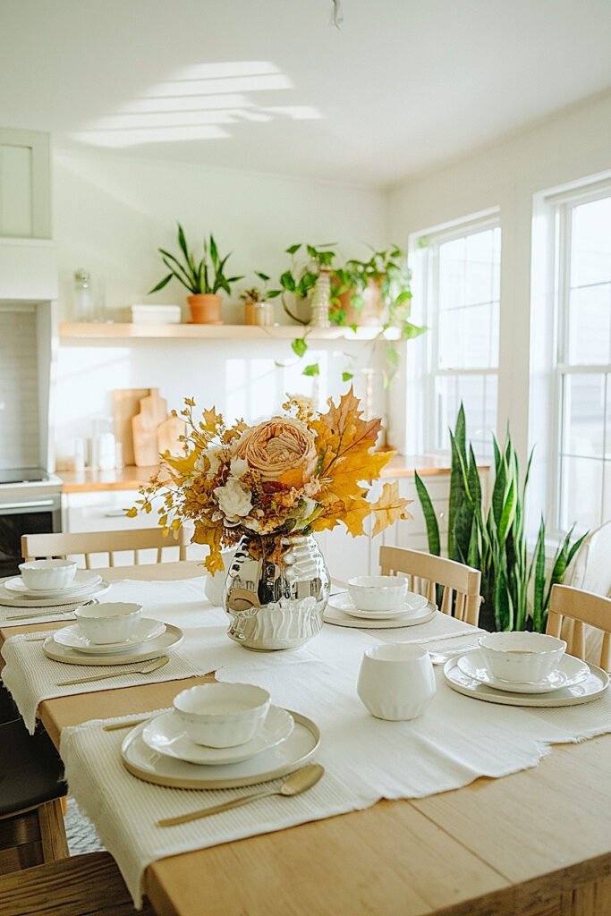
1. Amber Alstroemeria Beside the Kitchen Zone Plant Two amber alstroemeria stems in a dark vessel beside the kitchen zone plant. The alstroemeria’s multiple bloom heads at different opening stages create visual interest visible from the living zone across the open space. The amber tone reads as specifically harvest-autumnal from any position in the room.
2. Golden Yellow Button Mums in a Row of Matched Vessels Three small dark vessels, each with three golden button mum stems, placed in a low row along a kitchen shelf or island edge. The row format creates a horizontal color band visible at counter height from across the living zone. Golden yellow button mums travel well across open rooms because.
3. Amber Carnations and Wheat in a Dark Crock Beside the Living Zone Monstera Four amber carnation stems plus two dried wheat stalks in a dark crock beside the monstera. The monstera’s deep blue-green leaves create maximum color contrast with the warm amber carnation tone. From across the open kitchen, the warm amber arrangement and the dramatic monstera leaves together create a clearly readable.
4. Golden Chrysanthemums as the Dining Area Color Anchor Five golden yellow chrysanthemum stems in a wide dark bowl at the dining area as the third position in a three-zone open-concept color system. Kitchen: burgundy. Living: mauve. Dining: golden. Three distinct but harmonious warm autumn tones across the three main zones of the open space.
5. Amber Spray Roses on the Entry Shelf Visible From the Open Space Two to three amber spray rose sub-stems in a small dark vessel on the entry shelf or first visible shelf in the open concept home. The entry position creates the first color signal for anyone entering the space and also serves as a visible autumn color note from deeper within.
More ahead on variegated plants, which change the flower color calculation significantly in open-concept spaces.
How to Choose Fall Flower Colors for Open-Concept Homes With Variegated Plants
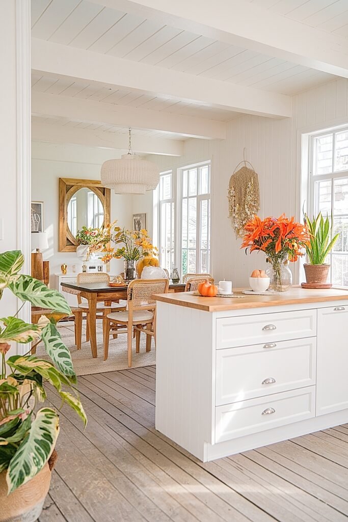
Variegated plants already contain multiple tones. The flowers beside them need to work with the specific tones in the leaves, not just with generic green.
A golden pothos carries yellow-green and mid-green tones. Amber gold flowers beside it create warm tonal harmony. A cream-and-green calathea or a white-edged spider plant carries pale neutral tones alongside the green. Cream or warm white flowers beside these plants create a tone-on-tone effect that reads as specifically considered. A purple-leafed tradescantia carries cool red-purple tones. Rust or deep burgundy flowers beside it reinforce the plant’s own warm-cool character.
The practical rule for variegated plants in an open-concept space: pick up one tone from the plant leaf and find it in the flower color. Then the flower and plant read as related rather than adjacent. From across the open room, the plant-and-flower vignette holds together visually because the connection between the two elements is visible even at distance.
Easy Ideas for Rust and Blush Fall Flower Colors in Open-Concept House Plant Decor
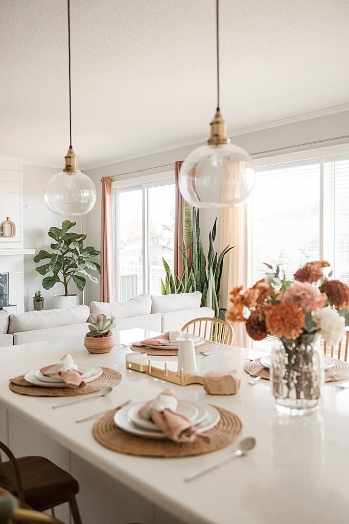
1. Rust Carnations at the Main Living Zone Plant, Blush Carnations at the Shelf Four rust carnation stems in a dark vessel beside the living zone’s main plant, two blush carnation stems in a slim bud vase on a nearby shelf. The two related tones, warm and soft, at two different positions in the same zone create variation within consistency. Both read as fall.
2. Rust and Blush Spray Mum Sub-Stems Mixed in One Wide Dark Bowl Four rust spray mum sub-stems plus three blush spray mum sub-stems in a wide dark bowl at the main focal surface. The two tones mixed in one vessel read as a warm-and-soft combined color note from across the open space. Up close, the rust and blush create a warm gradient.
3. Alternating Rust and Blush Vessels Across the Open Shelf Three small matched dark vessels on a shelf in the open space, alternating rust carnation stems and blush spray rose sub-stems. The alternating color rhythm creates a visual pattern visible from across the open room. Each vessel holds two to three stems. One bunch of each color covers the full.
4. Rust Arrangement at Kitchen Zone, Blush Arrangement at Dining Zone Two arrangements in two zones, rust at the kitchen position and blush at the dining position. The two related warm tones across two zones read as a coordinated color story across the full open space rather than two separate decorating decisions.
5. Single Rust Stem and Single Blush Stem Per Plant Throughout the Open Space One rust carnation stem plus one blush carnation stem in a small dark bud vase beside each of the main plants distributed throughout the open space. Every plant position gets the same color combination. The repetition reads as specifically designed across the whole open-concept space from any position in the.
Conclusion
Open-concept plant homes need fall flower colors that do two things at once.
Work up close beside the plant. And work across the room from every other position in the space.
Rust, burgundy, amber gold, and mauve all do both. Pick one or two, repeat them across every zone, and the whole open space reads as dressed for fall rather than decorated room by room.
That is the difference between a fall home and a few fall flower purchases.
This website contains affiliate links, and some products are gifted by the brand to test. As an Amazon Associate, I earn from qualified purchases. Some of the content on this website was researched and created with the assistance of AI technology.